Blazor - Roadmap 2020 (Mid-Year Update)

In January 2020, we published our Blazor UI - 2020 Roadmap for the first half of 2020. Based on survey results and Support Center feedback, we’ve finalized our 2020.2 Roadmap. We want to thank you for your continued support and for your insightful comments.
New Components
Memo control
We're creating a new editor component that allows you to display and edit multi-line text. Our Blazor Memo component will ship with both data binding and validation support.
Drop Down Button
Our new Drop Down Button will allow your end-users to select from a list of items.
Drop Down Edit
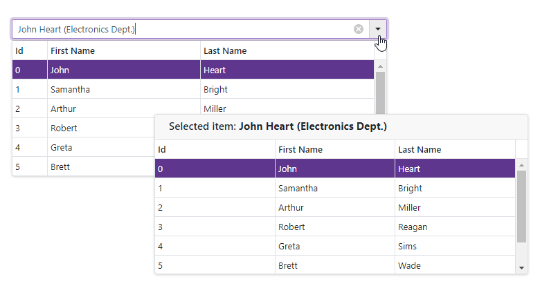
The Drop Down Edit component will be able to display custom content within its list.
Page Layout
Our Blazor Page Layout component will help you create custom page layouts with ease.
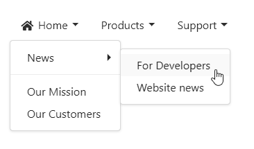
Menu
The DevExpress Blazor Menu component will include support for hierarchical items, items group, left and right item alignment, and templates.
Navigation Bar
Our new Blazor Navigation Bar component will include built-in templates so you can create custom navigation items as needed.
Data Grid
Total Summaries
We're adding a set of predefined total summaries (Min, Max, Sum, Average, etc.) These aggregate function values are calculated against all rows in the grid and displayed within the Blazor Grid’s footer.
We're also adding custom summary support so you can calculate summaries against records that meet specific criteria. You will also be able to use multiple data fields in your calculations.
Group Summaries
We expect to add a set of predefined summaries and a custom summary for the Blazor Grid’s group row or its group footer.
Column Customization
A new property will allow you to improve column appearance by assigning custom CSS classes to column markup.
Popup Edit
A new edit mode will allow your end users to edit cell values inside a popup edit form.
Inline Edit
Our Blazor Grid’s Inline Edit mode will allow your end user to edit cell values within the current edit row.
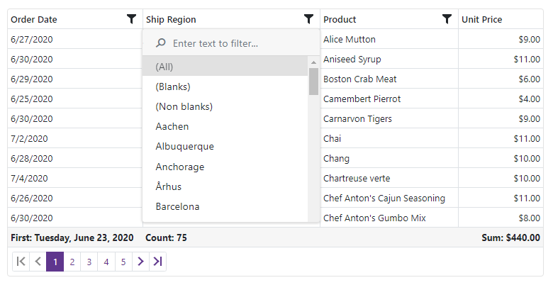
Filter Enhancements
We'll introduce the following new filter options to our Blazor Grid:
- Popup Header Filter
- Search Panel
- Advanced Filter API
Frozen Columns
Our Grid will ship with support for Frozen columns. This will allow end-users to lock columns in one area and keep this area visible during horizontal scroll operations.
Column Resize
With our new column resize feature, your end-users can easily modify column width via the mouse.
Automatic Data Updates (Observable)
Our Blazor Grid will allow you to bind to ObservableCollection and implement the INotifyPropertyChanged interface. The Grid will automatically update when changes are made to the observable collection.
Scheduler
Custom Fields
Our Blazor Scheduler control will support custom (data bound) fields so you can display and save custom information within an appointment form.
Custom Appointment Form
The Scheduler will allow you to customize the layout of the appointment edit form.
Filter and Group by Resources
The Scheduler will include an option to filter and group appointments by resources (for example employees, hotel rooms, etc.).
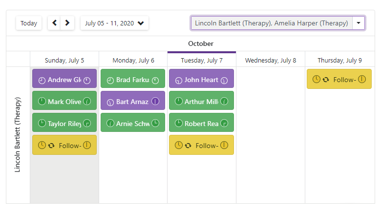
Timeline View
Blazor Scheduler will ship with a new Timeline View. The timeline will display appointments/events as horizontal bars along its timescale. This new UI paradigm will give end-users a clearer picture of upcoming/past events.
Data Editors Enhancement
Multiple Columns
The ComboBox, List Box, and TagBox components will include support for multiple columns (display list data across multiple columns).
Two-Way Binding
With two-way binding, you will have the option to bind a value from the ComboBox and TagBox with either a stand-alone variable or your Model's property.
Masked Input
Our Blazor Text Box, ComboBox and data editors that include a text field will support custom Masks (to help you manage user input).
Focus an Editor in Code
We're enhancing our editor's API so you can set focus on the data editor within code.
Item Template
Our List Box and ComboBox will include a new template region. You will be able to display custom information within this region as needed (will include support for an image within the input box).
Time Section in Date Edit
The Date Edit component will incorporate a time edit section and allow end-users to set time values alongside dates.
ComboBox Drop Down Width
We're adding an option to control the width of the ComboBox's drop down. The drop down's width will be calculated from either the:
- drop down content width
- entire width of the editor
Alternatively, you can use the expandable option. This option will allow width to increase or decrease as necessary.
Adaptivity Enhancements
For mobile devices, we're adding a popup and modal mode for the drop down window. These modes mimic the behavior of a standard drop down control on mobile browsers.
Visual Studio Integration
To help you get started with our Blazor UI components, we're creating new Project templates for both Blazor Server and Blazor WebAssembly applications.
Before we let you go
Your feedback matters a great deal. Please help us further improve DevExpress UI Components for Blazor by answering the following survey questions:
Free DevExpress Products - Get Your Copy Today
 The DevExpress Team