Hope you are all doing well. I wanted to quickly summarize some of the new features introduced in our most recent minor update (v20.2.6). Please note that our next major update (v21.1) is expected to ship in May. I’ll post an update on all the capabilities we expect to release next month, but if you’d like, feel free to review our Blazor Roadmap for more information today.
Data Grid
Drop-Down Width Modes for Combobox Columns
We've added the DropDownWidthMode property to our Data Grid's combobox column. Use this property to set the width of the combobox column editor’s drop-down list. This editor is displayed within the filter row and edit form. The following three modes are available:
ContentOrEditorWidth (Default) - Item text is fully displayed. Minimum list width matches the editor.ContentWidth - List width equals the width of the longest list item.EditorWidth - List width matches the editor. List items are truncated if they do not fit.
Fixed Memory Issues
We have also addressed a few critical issues related to memory leaks. These fixes address issues related to data refresh and component dispose.
Scheduler
New API to Track StartDate Changes
The StartDate property now supports two-way binding to the data field. A new StartDateChanged event allows you to track StartDate property changes and perform any necessary custom actions.
Common Settings for Recurrent Appointments
We added a new DxSchedulerRecurrenceSettings class that allows you to specify common values for appointment recurrence properties. You can specify an instance of this class with your own configuration to the new RecurrenceSettings property of the Scheduler Data Storage.
Chart
Grid Lines
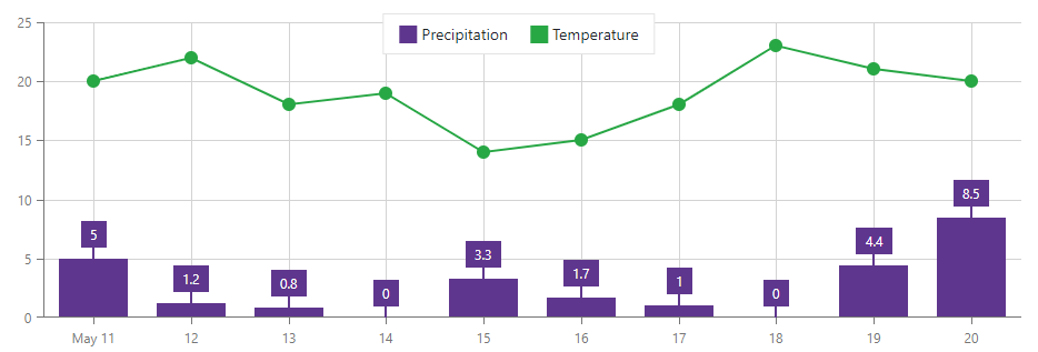
A new DxChartAxisGridLines.Visible property allows you to display or hide grid lines (per axis). By default, our Blazor Chart displays grid lines for the value axis but hides them for the argument axis. To change grid line visibility for an axis, add the DxChartAxisGridLines component and set the Visibility property.
The code below demonstrates how to display both horizontal and vertical Chart grid lines:
<DxChartArgumentAxis>
  <DxChartAxisGridLines Visible="true" />
</DxChartArgumentAxis>

<DxChartValueAxis>
  <DxChartAxisGridLines Visible="true" />
</DxChartValueAxis>

Tooltip Position
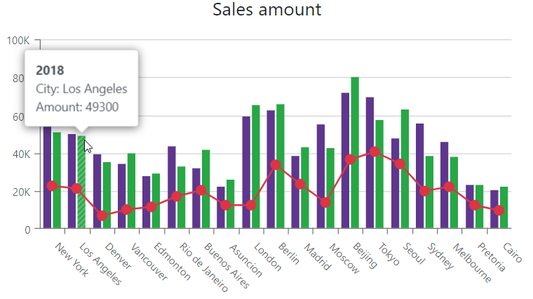
You can display the DxChartTooltip component inside or outside a series using our new Position property:

Data Editors
HTML Events
DevExpress Blazor Editors ship with a comprehensive API (properties, methods, and events) to help you configure and customize our components. For more information, refer to the component’s description.
If the included API does not meet your requirements, rest assured, you can use standard HTML attributes and event handlers to further configure our Blazor components. HTML event handlers are automatically assigned to the component’s input element. This ensures that events such as onblur or onfocus work seamlessly with our components:
<DxTextBox @onblur="OnBlur" />
@code {
  void OnBlur() {
    //…
  }
}
For a complete list of data editors and supported event handlers, refer to the following help topic: HTML Attributes and Events.
IDE Productivity Tool
CodeRush for Visual Studio and Visual Studio Code now ships with templates to help you to quickly create popular DevExpress components for Blazor:

For more information, refer to the following help topic: Templates for DevExpress Components.
Free DevExpress Products - Get Your Copy Today
The following free DevExpress product offers remain available. Should you have any questions about the free offers below, please submit a ticket via the
DevExpress Support Center at your convenience. We'll be happy to follow-up.