.NET MAUI Mobile — Collection Filtering Best Practices

In this post, I’ll guide you through common design patterns when building mobile data filtering interfaces. I’ll discuss design options for specific usage scenarios and show you which DevExpress controls/features are available to you.
Let’s start with simple patterns and then explore more robust/flexible solutions.
Search Input Field
When it comes to locating text-based items quickly, a simple search input field proves to be remarkably effective. Placing a search editor at the top of a page allows for intuitive search operations (instantly filter a collection as search values change). This common UI pattern is particularly useful for apps that display simple text values.
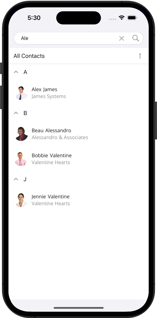
GitHub Example: DataGrid for .NET MAUI - Search Bar
One way to implement this type of interface is to use our FilterString property (available in both the DevExpress DXCollectionView and DataGrid). You simply need to construct a filter when a user updates the search text value and assign it to FilterString:
private void SearchTextChanged(object sender, EventArgs e) {
    string searchText = ((TextEdit)sender).Text;
    dataGrid.FilterString = $"Contains([FirstName], '{searchText}') or Contains([LastName], '{searchText}')";
}
FilterString accepts formatted strings (based on our Criteria Language Syntax). With this syntax, you can create filters with functions such as 'contains,' 'starts with,' and more. You can incorporate AND/OR group operators and multiple fields to further customize your filters.
Pros:
- Easy-to-use with text data
- Users can initiate search operations quickly – and continue to refine search input until they locate the required entity
Cons:
- Can’t filter numeric, DateTime and other data types
- Users need to enter text instead of selecting a value (requires more taps)
Chips with Predefined Filters
Another straightforward yet highly effective technique is to offer users a list of pre-defined filters. This solution is excellent when you are familiar with user preferences and can anticipate which filters are likely to be utilized.
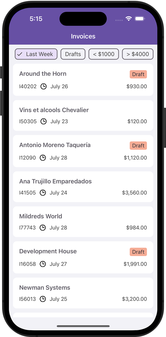
GitHub Example: Chip Filters for a CollectionView
We designed the DevExpress FilterChipGroup specifically for this usage scenario. This component supports the MVVM design pattern, so you can bind available filters to the ItemsSource property. Once implemented, the FilterChipGroup will automatically generate Chips to represent available filters. To further improve filtering options, you can give users the ability to add custom filters to the Chips panel. To accomplish this, you need to add a new filter item to the collection bound to ItemsSource, and the FilterChipGroup will dynamically create a corresponding Chip.
Pros:
- A single tap applies a filter
- Users can combine multiple predefined filters
Cons:
- You need to implement a filter customization view if users wish to filter data based on their own rules
Filtering UI Bottom Sheet
When users need to filter against multiple columns and values, you may want to display filter settings within a Bottom Sheet. A common UI pattern uses Chips to invoke a Bottom Sheet.
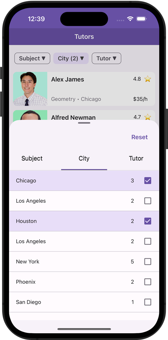
GitHub Example: Display Filtering UI Elements in a BottomSheet
This technique allows users to access desired filters with just one click.
Let’s explore the view structure to describe the purpose of each element.
- Chips help users browse through available filter categories and see applied filters. The dropdown arrow indicates that a chip is not a predefined filter, but an element invoking a Bottom Sheet.
- The Bottom Sheet contains filtering elements. We use the Bottom Sheet in modal mode to close it automatically when a user starts interacting with the CollectionView.
- TabView in the Bottom Sheet helps users switch between filtering categories (if users need to apply multiple filters).
- Filtering UI Elements represent controls for filter modification. Filtering Elements automatically create a filter criterion based on user input and pass it to the data control (Data Grid or DXCollectionView). Our .NET MAUI suite offers numerous Filtering Elements:
To ensure an exceptional user experience, it’s important to choose appropriate Filtering Elements based on user behavior/expectations. For instance, in the sample application demonstrated above, we expect that students using the app will not typically need to search tutors for multiple subjects simultaneously. As such, we opted for a FilterRadioListItem, with a straightforward single-selection option. On the other hand, since students may wish to locate tutors in multiple cities (remote lessons), we chose a FilterCheckedListItem with multiple selection support. This allows users to select multiple cities simultaneously. You can also enable a search function if you have a long list of filter values.
Pros:
- Allows users to create comprehensive filters (to locate exact entity values)
- Filtering elements in the Bottom Sheet display a list of available values and the number of repeated values to help users predict results
- Chips help users navigate directly to a filter
Cons:
- Users need additional taps when creating a filter against multiple fields
- Text input fields may be cumbersome to use within a half-expanded Bottom Sheet, because the virtual keyboard may overlap
- Filtering elements with nested dialogs are typically not utilized within a Bottom Sheet (FilterRadioListPickerItem and FilterCheckedListPickerItem)
Filtering UI Page
In business applications, data objects often include multiple fields and complex structures. To locate a required item, users may need to specify multiple filters simultaneously. Creating a separate filtering page is an excellent choice for this usage scenario. This allows users to fine-tune multiple filters with minimal clicks, review all filter selections, and then transition to browsing results.
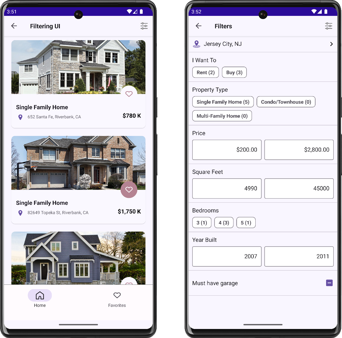
GitHub Example: DevExpress CollectionView for .NET MAUI - Create a Filter UI Form
Both our DXCollectionView and Data Grid offer a FilteringUITemplate property (to define a filtering view). You don’t need to implement page navigation - DXCollectionView and DataGrid handle this automatically and initiate navigation when you need it. Filtering elements are specified as follows:
<dxcv:DXCollectionView>
    <dxcv:DXCollectionView.FilteringUITemplate>
        <DataTemplate>
            <VerticalStackLayout>
                <dxe:FilterChipGroupItem Text="I Want To" FieldName="Status" AllowDeselect="True"/>
                <dxe:FilterCheckedChipGroupItem Text="Property Type" FieldName="Type" CustomDisplayText="OnCustomDisplayText"/>
                <dxe:FilterNumericRangeItem Text="Price" FieldName="Price" EditorDisplayFormat="c0"/>
                <!--...-->
            </VerticalStackLayout>
        </DataTemplate>
    </dxcv:DXCollectionView.FilteringUITemplate>
</dxcv:DXCollectionView>
Pros:
- Allows users to generate comprehensive filters and find exact entity values
- Elements in the filtering view display a list of available values/number of repeated values to help users predict results
- It’s easy to review the entire filter on one screen and modify it when necessary
- There are no UX restrictions related to nested dialogs and input fields
Cons:
- Users can’t see results until they navigate back to the Collection View
- It’s more difficult for users to navigate to a desired filter if you have multiple filtering elements on one page
I hope this overview of filter-related design patterns was of value. Of course, other patterns do exist – if you wish to use a pattern not listed in this post, please submit a ticket via the DevExpress Support Center.
