.NET MAUI — Creating Profile Settings Page with Form Items

A profile settings/profile configuration page is common to many mobile apps. If you're targeting .NET MAUI, our distribution includes a set of Form Item components to help you construct intuitive settings/config pages.
In this post, I’ll highlight the flexibility of DevExpress .NET MAUI Form Items and illustrate how to create mobile interfaces to address a variety of usage scenarios:
- Settings pages
- Navigation menus
- Data editing screens
- Action sheets
Let's start with a simple settings page for illustration purposes. To implement such a page, you will generally need to use icons as labels, create groups, react to taps, and update selected values. To select a value from a list, you will need to manually display a popup or a separate page and replicate this functionality for similar items. Needless to say, this process can be quite time consuming. Our .NET MAUI Form Item components were designed to simplify the steps involved and reduce code duplication.

The demo app showcased in this post is available on GitHub: DevExpress Form Items for .NET MAUI.
You can also watch a step-by-step tutorial video on YouTube:
Basic Form Item
The FormItem control implements the basic functionality required to generate items within a settings list. It can include the following elements:
-
Leading image. In our demo app, we’ll use this image to display a person’s avatar and icons to visually inform users about the purpose of a given item.
We'll use our new
ImageEditcomponent to integrate edit functionality to the form item image. For instance, we'll specify theFormItemBase.ImageTemplateproperty to display an “edit” icon over the avatar image. Once complete, you can assign aTapGestureRecognizerto handle user taps. On tap, you can invoke a separate page or popup with an ImageEdit. In both instances, ImageEdit and FormItem use the same image as a source.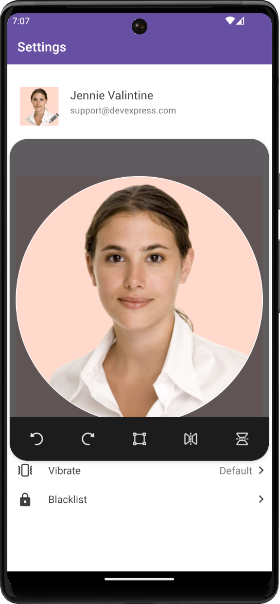
The following GitHub repo illustrates how to integrate an
ImageEditinto an app: DataFormView for .NET MAUI - Edit a Contact’s Data. -
Text: In most cases, this element displays item headline and contains the setting’s name.
-
Detail: Can include supporting description/additional info. In our example, we use
Detailto display an editable text field where users can input biographic information. -
Content & InlineContent: These options allow you to display additional custom content in the item. In this demo, we use
ContentandInlineContentto display selected values as trailing content in a form item.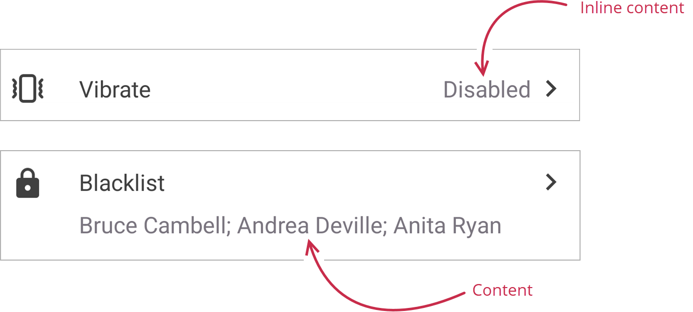
-
Arrow. This element prompts users to tap the form item to execute an action. In some instances, you may invoke a popup with radio buttons or a detached edit page. If you would like to limit user selection options to a predefined list, consider using the next form item on our list – FormListPickerItem.
Form Item with Picker List
FormListPickerItem allows you to select an option from a list. Its PickerShowMode setting defines how to display options: in a detached page, popup, or bottom sheet:
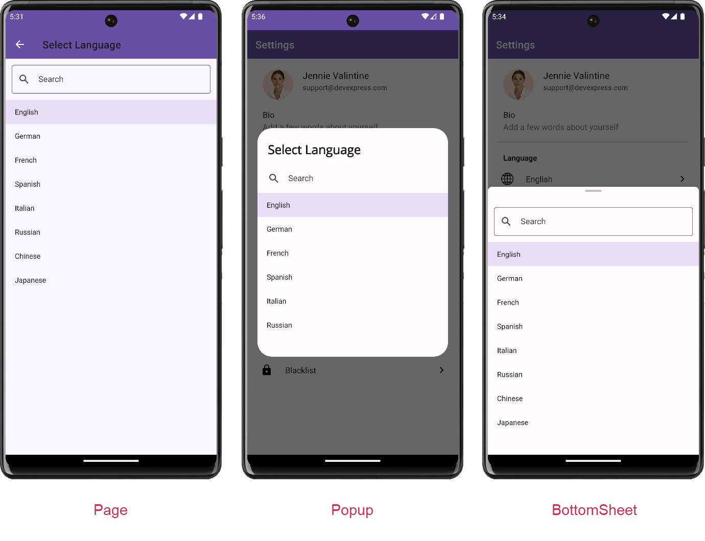
You do not need to create and configure picker container control (Page, Popup, or BottomSheet) - you simply need to specify the ItemsSource property. FormListPickerItem will handle all navigation configurations for you.
Note: Each show mode supports search and allows you to display a built-in search bar if your options list is lengthy.
The FormListPickerItem supports different selection modes (single and multiple). The IsMultipleSelectionEnabled setting allows you to switch modes as needed. In single selection mode, the FormListPickerItem control closes the picker once a user selects an option (to reduce unnecessary OK button taps).
Another customization option includes the manner in which the FormListPickerItem displays its selected items. In Single selection mode, the selected option is displayed as form item InlineContent and multiple selected options are displayed as tokens in the Content. So you can customize the InlineContent or Content property to customize the appearance of selected items. In our demo, we replaced tokens with a simple list of strings separated by a semicolon.
<dxe:FormListPickerItem ...
    Content="{Binding Blacklist, Converter={helpers:BlacklistCollectionConverter}, Mode=TwoWay}">
public class BlacklistCollectionConverter : IValueConverter {
    public object Convert(object value, Type targetType, object parameter, CultureInfo culture) {
        if (value is IList<string> contacts) {
            return String.Join("; ", contacts.Select(x => x));
        }
        return String.Empty;
    }
}
Check Box & Switch Form Items
The FormCheckItem control includes the same functionality found in FormItem but displays a combo box instead of an arrow. The FormCheckItem allows you to select three possible state values: Enabled, Disabled, or Indeterminate. The indeterminate state can be useful when you need to indicate that a setting is not set.
FormSwitchItem supports the same functionality as FormItem but displays a switch instead of an arrow. The FormSwitchItem control may be the best choice when a user needs to enable/disable an option.
Invoke an Edit Page
You can respond to user taps on a form item. In this example, users can tap the form item to update bio info in a separate edit form. The advantages of a separate form are:
- Best for editing multi-line text.
- You can include prompts as to what is expected for input, and in so doing, reduce clutter on the main page.
- Users can save changes on the edit page for each individual setting.

<dxe:FormItem AllowTap="True" Detail="{Binding Bio, Converter={helpers:BioDetailsConverter}, Mode=OneWay}" DetailColor="Gray" TapCommand="{Binding EditBioCommand}" Text="{Binding Bio, Converter={helpers:BioTextConverter}, Mode=OneWay}">
</dxe:FormItem>
<ContentPage
    x:Class="FormItemExample.Views.EditBioPage"
    xmlns="http://schemas.microsoft.com/dotnet/2021/maui"
    xmlns:x="http://schemas.microsoft.com/winfx/2009/xaml"
    xmlns:dxe="clr-namespace:DevExpress.Maui.Editors;assembly=DevExpress.Maui.Editors"
    xmlns:helpers="clr-namespace:FormItemExample.Helpers"
    Title="Bio">
    <ContentPage.ToolbarItems>
        <ToolbarItem Clicked="OnAccept" IconImageSource="check_24px" />
    </ContentPage.ToolbarItems>
    <VerticalStackLayout>
        <dxe:MultilineEdit Loaded="bioEditor_Loaded" BackgroundColor="Transparent" x:Name="bioEditor" Margin="5" BoxMode="Filled"
            HelpText="{x:Static helpers:BioHelper.detailText}" HelpTextColor="Gray" MaxCharacterCount="100" />
    </VerticalStackLayout>
</ContentPage>
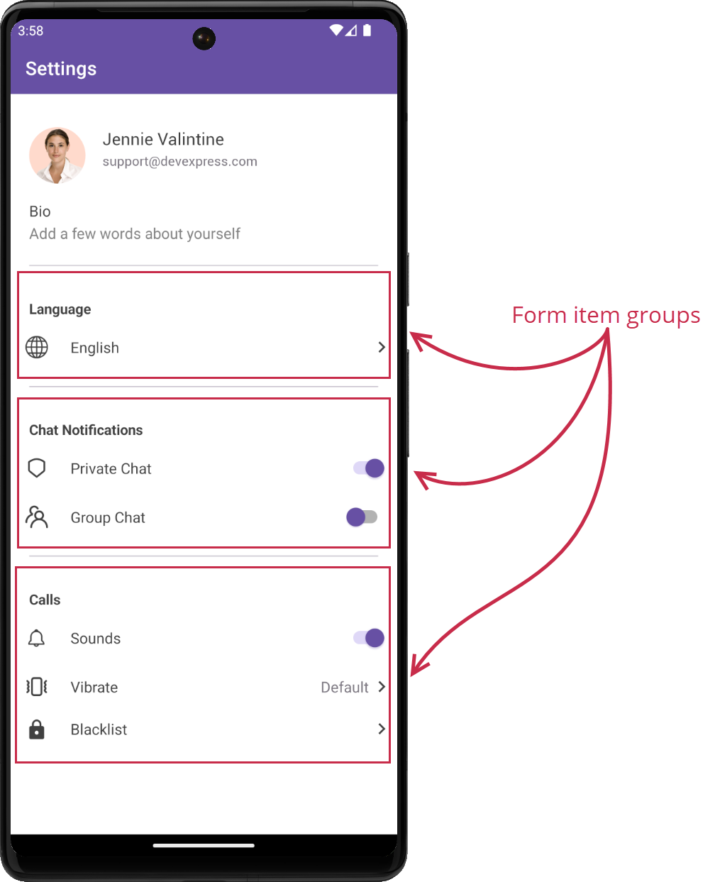
Grouping Form Items with Group Form Item
Once we design a settings page (with a variety of different form item options), we can combine them into logical categories. The FormGroupItem control can address this requirement since it allows you to organize form items into groups and assign a specific name to each group. To create groups of form items, place FormItem controls within <FormGroupItem>…</FormGroupItem> tags and use the group item’s Header property to specify group captions.
Apply Color Themes
The DevExpress .NET MAUI UI Suite v23.2 includes a new theming mechanism. To learn more, please visit: Color Themes for DevExpress .NET MAUI Controls.
If you are new to .NET MAUI or considering our .NET MAUI UI Suite for a future project, please review the following posts for additional UX related samples/guidance:
- .NET MAUI — 3 ComboBox Dropdown Alternatives for User-Friendly Item Selection within a Mobile App
- .NET MAUI — Incorporate CRUD Operations in Your Mobile App with DevExpress CollectionView
- .NET MAUI Mobile — Collection Filtering Best Practices
