The first Beta version of the DevExtreme React Grid is now available!
We have already talked about some new features of the React Grid in our recent blog posts. If you’ve missed them, you can follow these links to read about the Material Design integration and some new capabilities for data processing customization. In this post I’ll sum up other improvements that we’ve made between the very first CTP release and the Beta. In this post I’ll be using the Bootstrap version for the visual examples.
Paging control improvements
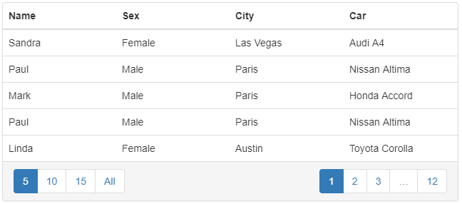
Page size selector
We have introduced a page size selector control that appears in the Grid footer side by side with the page switcher. It allows the user to change the number of rows visible on a single page. It also can be configured to contain an ‘All Rows’ item to show all rows at once.
Please refer to the data paging guide for demos and more details.
Responsive mobile-friendly paging panel
Mobile devices have become the primary channel for consuming digital information and working with data online. To provide the best possible experience on such devices, we have made the React Grid paging controls responsive and usable on small screen sizes.
New configuration features for end users
Column reordering and resizing
Our React Data Grid allows the end user to configure many aspects of structural data appearance: sorting, grouping and others. Since the very first release we’ve introduced column resizing and column reordering functionality.
Please refer to the column reordering and column resizing guides for demos and more details.
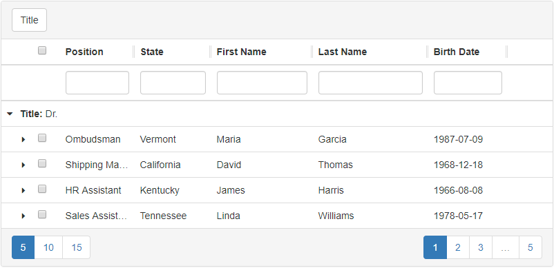
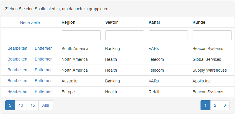
Configuration via Drag-and-Drop
Some end user configuration tasks can naturally be performed via drag-and-drop. For instance, an end user might want to change the column order by dragging a column to the desired position. We have introduced this functionality recently: now it’s possible to reorder columns by drag-and-drop, and to change column sizes by dragging a column’s resizing grip (see the screencast above this paragraph). It is now also possible to group and ungroup fields by dragging and dropping a column header to or from the Grid grouping panel. This capability is optional, and it is possible to disable drag-and-drop customization, and to enable column grouping buttons instead or in addition.

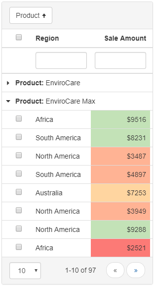
Column chooser
In a real-world web application data structures are often complex, with large numbers of properties, resulting in large numbers of Grid columns. End users may need to see only certain subsets of all available columns for specific use cases. The ColumnChooser component allows the user to set up the visible columns. It works with the TableColumnVisibility React Grid plugin. You have full control over the column chooser, and where or when to make it visible within your app. You can also control Grid column visibility without using the column chooser, perhaps with the help of your own custom UI component. Please refer to the Controlling Column Visibility guide for demos and more details.

Cancel column sorting with the Ctrl or Command key
A minor but important improvement: sorting can be canceled for a specific column by clicking its header cell with the Ctrl key pressed (Command on Mac).
Before the React Grid Beta release, the virtual scrolling feature was only available for the Bootstrap grid. We can now announce that virtual scrolling is supported for Material UI. Hundreds of thousands of records can be shown without pagination.
Try it yourself in our demo (switch to Material UI).
Localization
All built-in React Data Grid text resources are now localizable via the messages properties on the plugins. It’s also possible to configure data formatting with the help of the DataTypeProvider plugin. That means you can use any localization library you like, or the built-in Intl localization capabilities of the browser.
Please refer to the localization and data types guides for demos and more details.
Accessibility and other improvements
We have spent some time making the Grid more accessible. The first step is keyboard navigation. It is now possible to work with the Grid, in a desktop scenario, without using a mouse. We also plan to support the WIA-ARIA standard in future releases.
You might find other minor improvements in our Grid for React that are not mentioned in this post.
Feel free to download your copy from npm and let us know what you think. Your feedback is highly appreciated and will help us ship a stable RTM release without bugs or API inconveniences, as soon as possible.
Free DevExpress Products - Get Your Copy Today
The following free DevExpress product offers remain available. Should you have any questions about the free offers below, please submit a ticket via the
DevExpress Support Center at your convenience. We'll be happy to follow-up.