US Election Results - WinForms Data Visualization
With the US Presidential Election right around the corner, we thought it appropriate to create a simple tracker app with our WinForms controls. As you can see, the two primary controls used were our WinForms Map Control and our WinForms Grid Control. (download demo source code)
Here's a quick walk-through as to what you'll need to do to create a similar solution.
Step 1 - Obtain Map Data
Our first step was to obtain State and county map data from the U.S. Census Bureau (maps - https://www.census.gov/geo/maps-data/data/cbf/cbf_counties.html, codes https://www.census.gov/geo/reference/codes/cou.html, etc).
We then used QGIS to update our maps for improved visualization (move/resize Alaska and Hawaii)
Step 2 - Collect Election Data
Our next step was to collect election results from the Federal Election Commission and detailed county level voting data from The Guardian.
Step 3 - Normalize Election Data
At this point, we needed to normalize data so that it could be used within our sample application and to ensure that future election results can be integrated without direct modification of our app. And since we want to create a web version of the same demo, we chose to store election results in JSON format.
Step 4 - Create the App
As I mentioned earlier, to visualize data and create an interactive user experience, we used both our WinForms Map and WinForms Grid Control.
User Interface Elements
Data Grid
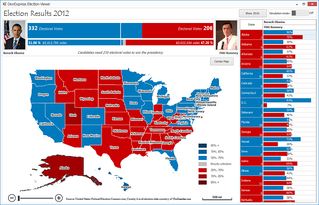
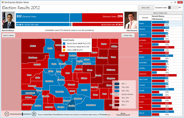
To display vote totals at either the National level (when the map is zoomed out - displaying all States) or at the State level (when a State is selected within the map), we use our Grid Control with its Banded View enabled. Those familiar with the Grid already know that it supports use of Progress Bars within its cells...and in our case, we've used progress bars to visualize the vote totals.
Map
We used a U.S. shapefile and colored each State based upon election results - blue if the Electoral College votes were allocated to the Democratic Party and red if the votes were allocated to the Republican party. You'll note that we use colors to differentiate the margin of victory in each State. The darker a color, the larger the margin of victory for a given candidate in that State.
For the tooltip, we're using our “SuperTip” and ToolTipController.

When you click an individual State, the app drills into the available data and lists voting by individual counties within that State (and the Grid content is updated to display vote totals for each county by party).
Custom UI Elements
The only custom UI element used is the Electoral Vote bar at the top of the app. This particular UI element is a standard UserControl with two LabelControls and simple custom draw to paint results. It's used to display both Electoral Vote count and the total number of votes for each candidate.
And finally - to help you predict the 2016 election (as if anyone can actually do that), we added a simulation mode option. Give it a try and see if you can guess who'll be our next President.
Candidate photos courtesy of: Pete Souza, The Obama-Biden Transition Project and Gage Skidmore
Free DevExpress Products - Get Your Copy Today
The following free DevExpress product offers remain available. Should you have any questions about the free offers below, please submit a ticket via the DevExpress Support Center at your convenience. We'll be happy to follow-up.

Recent Posts
Ray Navasarkian (DevExpress)
Ray Navasarkian (DevExpress)
Ray Navasarkian (DevExpress)
Ray Navasarkian (DevExpress)
Ray Navasarkian (DevExpress)