WinForms — Early Access Preview (v24.1)

Our next major update (v24.1) is a couple of months away. As such, we wanted to preview the features we expect to ship this spring and invite all active DevExpress Universal or DXperience subscriber to download and install our Early Access Preview (EAP) today (visit the DevExpress Download Manager to obtain our EAP build).
Early Access and CTP builds are provided solely for early testing purposes and are not ready for production use. This build can be installed side by side with other major versions of DevExpress products. Please backup your project and other important data before installing Early Access and CTP builds.
This EAP may not include all features/products we expect to ship in our v24.1 release cycle. As its name implies, the EAP offers an early preview of what we expect to ship in two months. For additional information on what you can expect, refer to our Mid-Year 2024.1 Roadmap.
DateOnly & TimeOnly Support
DevExpress WinForms data-aware UI controls (such as Data Grid, TreeList, Editors) now support DateOnly and TimeOnly data types (in .NET and .NET Framework applications). These types offer the following advantages over the traditional DateTime type: usage clarity, improved database compatibility, less space during serialization, and the ability to mitigate potential errors/inconsistencies related to different time zones.
Built-in DateOnly and TimeOnly supports extends to:
- Filtering-related UI elements (Column Filter Popup, Filter Editor, Automatic Filter Row)
- Conditional Formatting Rules
- Criteria Operators
- Expression Editor
- Unbound Columns
- Search
- Summary
- Grouping
- Masks
We also expect to extend DateOnly and TimeOnly data type support across our data editors library (including the DevExpress WinForms DateEdit and TimeEdit control) in future updates.
WinForms Data Grid
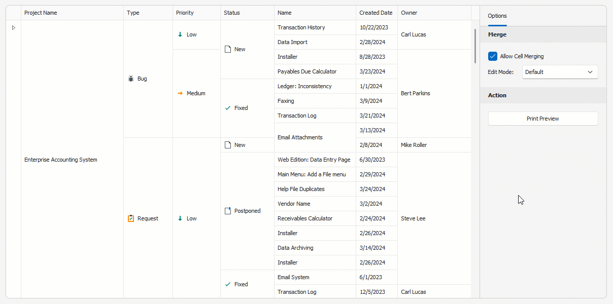
Merged Cell Editing
As its name suggests, users can now simultaneously edit all cells in a merged range or modify separate cells (in GridView and BandedGridView) as needs dictate. Use the new MergedCellEditMode property to enable this feature and specify how users edit merged cell data.
Options include:
VisibleCells— Edits data cells in a merged range.FocusedCell— Edits data cells in a merged range for the focused row.Disabled
using DevExpress.XtraGrid.Views.Grid;

// Allows users to edit data cells in a merged range.
gridView1.OptionsView.MergedCellEditMode = MergedCellEditMode.VisibleCells;
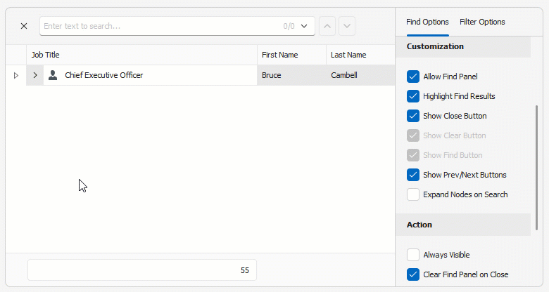
Display Custom UI Elements within the Find Panel
This release includes new APIs to display predefined and/or custom UI controls within the Find Panel. With this new option, you can build fully customizable/personalized interfaces when using the DevExpress Find Panel.
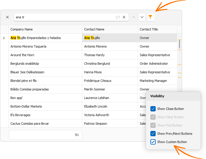
Use FilterPanelItems to introduce custom Find Panel UI elements in your WinForms app:
- AddControl — Displays the specified UI control.
- AddButton — Displays a button.
- AddCheckButton — Displays a checked button.
- AutoHeight — Updates Find Panel height to match UI elements.
- RemoveItem / RemoveItems – Removes the specified UI element(s) from the Find Panel.
// This code snippet comes from the Find Panel module in our WinForms Data Grid demo (v24.1).
CheckButton showCustomButton = null;
void ceShowCustomButton_CheckedChanged(object sender, EventArgs e) {
    CheckEdit customButton = sender as CheckEdit;
    if(customButton.Checked) {
        showCustomButton = view.FindPanelItems.AddCheckButton(customButtonName, null, view.OptionsFind.Behavior != FindPanelBehavior.Search,
            (button, args) => {
                CheckButton checkButton = button as CheckButton;
                view.OptionsFind.Behavior = checkButton.Checked ? FindPanelBehavior.Filter : FindPanelBehavior.Search;
                checkButton.ToolTip = "Find Panel Mode";
                icbFindPanelBehavior.EditValue = view.OptionsFind.Behavior;
            });
        showCustomButton.ImageOptions.ImageUri.Uri = "Filter;Size16x16;Svg";
    }
    else {
        showCustomButton = null;
        view.FindPanelItems.RemoveItem(customButtonName);
    }
    icbFindPanelBehavior.Enabled = showCustomButton == null;
}
Context Menu API Enhancements
We’ve made it easier to display the DevExpress PopupMenu for individual Data Grid UI elements.
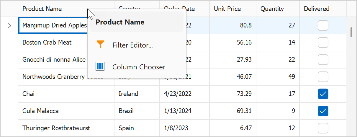
In previous versions, you had to customize the built-in menu (add, remove menu items) within the control’s "PopupMenuShowing" event. With v24.1, you can easily display your custom menu (created and customized at design or runtime) using the new e.ShowCustomMenu method:
void gridView1_PopupMenuShowing(object sender, PopupMenuShowingEventArgs e) {
    if (e.MenuType == GridMenuType.Column) {
        popupMenu_Column.Tag = e.HitInfo;
        popupMenu_Column.MenuCaption = $"{e.HitInfo.Column}";

        e.ShowCustomMenu(popupMenu_Column);
    }
}
API enhancements extend to: DevExpress TreeList, Vertical Grid (Property Grid), and Pivot Grid.
How to: Implement a Custom Menu in the DevExpress WinForms Data Grid
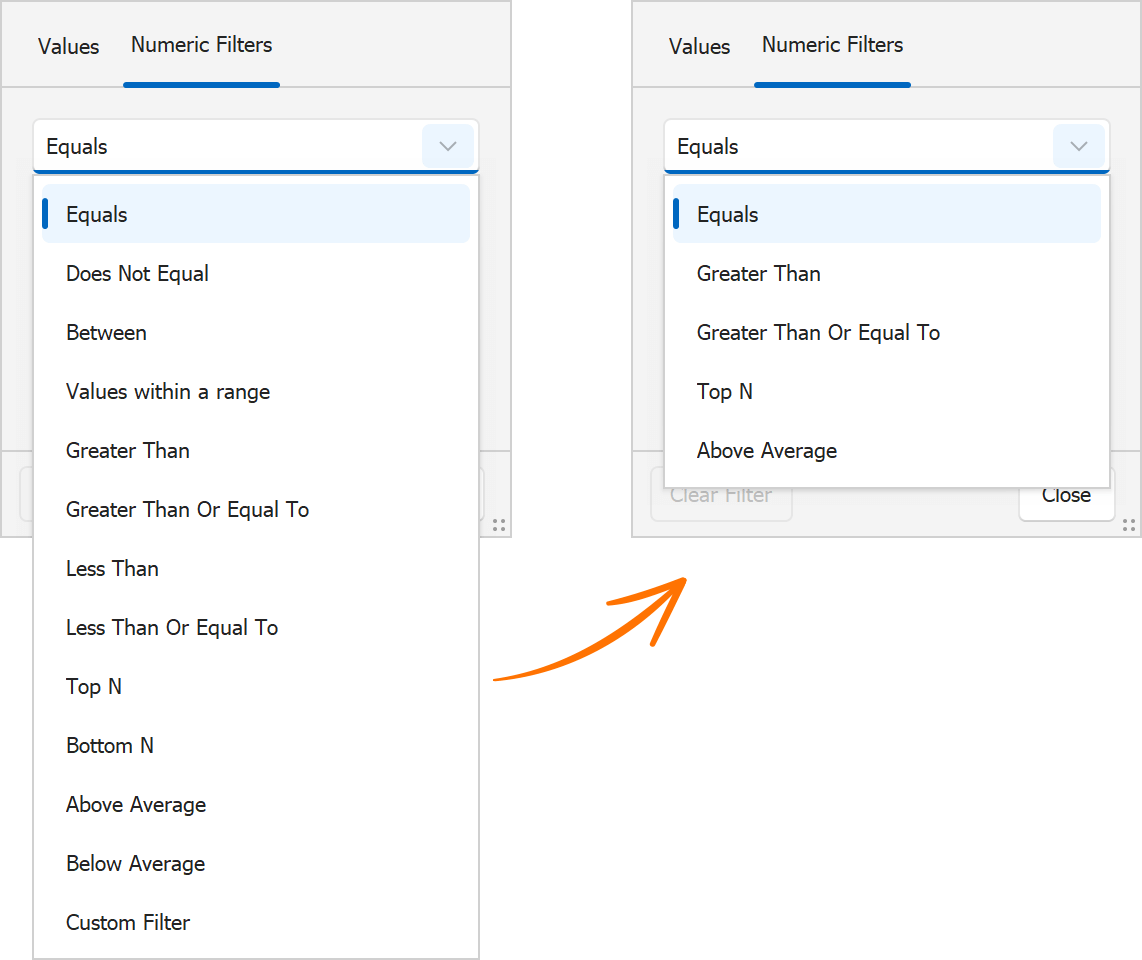
Excel Column Filter Customization
The WinForms Data Grid control includes a ShowFilterPopupExcel event designed to hide specific filter options from the “Filters” and “Values” tabs of our Excel-inspired Filter Dropdown. v24.1 adds a e.HideFilter(filterType) method to event arguments for flexible filter customization. With this method, you can hide specific filter items from the “Filters” tab (to limit options and simplify the UI).
void gridView1_ShowFilterPopupExcel(object sender, DevExpress.XtraGrid.Views.Grid.FilterPopupExcelEventArgs e) {
    if (e.Column.FieldName == "UnitPrice") {
        e.HideFilter(DevExpress.Utils.Filtering.Internal.CustomUIFilterType.BelowAverage);
        e.HideFilter(DevExpress.Utils.Filtering.Internal.CustomUIFilterType.Between);
        e.HideFilter(DevExpress.Utils.Filtering.Internal.CustomUIFilterType.BottomN);
        // ...
    }
}
Calculate the Best Size
Designed to address common layout-related dev tasks, the new CalcBestSize(maxSize, checkScrollInfo) method calculates the maximum allowable size of the Grid Control (to display as many data rows and columns as possible).
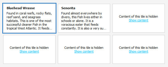
Custom Tile Painting for the DevExpress TileView (Kanban)
You can now customize tile appearance by handling the new TileView.CustomDrawTile event. With its comprehensive event arguments (APIs), you can easily change border shape and color or draw custom UI elements to address specific design requirements/user preferences.
And yes, you can render HTML and CSS templates inside tiles as needs dictate.
WinForms TreeList
Expand Nodes on Search
With this new feature, users can effortlessly locate specific TreeList nodes, even if they are collapsed within a complex hierarchy. When users initiate a search within the TreeList, the DevExpress WinForms TreeList automatically expands relevant nodes to display search results (in previous versions, you could only search through expanded Tree List nodes).
Use the TreeList's OptionsFind.ExpandNodesOnSearch setting to enable/disable the "Expand Nodes on Search" feature.
Auto-Filter Row Focus Retention
This addition to our WinForms TreeList control ensures that user focus remains uninterrupted on the Auto-Filter Row, even during data updates.
In previous versions, the TreeList automatically closed the active editor in Auto-Filter Row when updating data. In v24.1, the editor remains active (users can edit filter criteria during data updates).
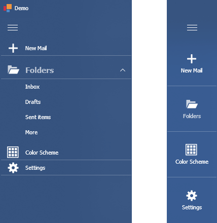
WinForms Accordion Control
Display Item Captions in a Minimized State
We added a new CaptionShowMode property that controls item caption display options when the Accordion control is minimized. Options include:
- Below Image
- Above Image
- None
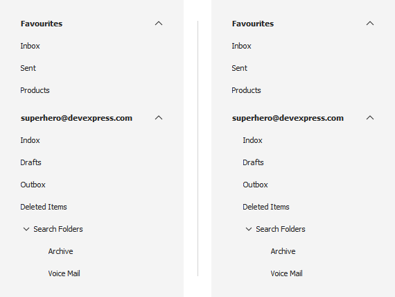
Configurable Item Indents
With this new option, you can introduce fully personalized side navigation logic. We added a new ChildIndentStartLevel property that specifies the hierarchy level used for child element indent. We also implemented a new QueryElementIndent event that allows you to adjust the indent used of specific accordion items based on design preferences/requirements.
WinForms Ribbon & Bars
Page Key Tips
We added a new ShowPageKeyTipsMode property. This setting allows you to configure the display of page key tips within the Ribbon UI, so that users who prefer to use keyboard shortcuts instead of mouse input can quickly navigate through different sections of the Ribbon and access specific commands (without unnecessary keystrokes).
Options include:
- Hide — Hides key tips for all Ribbon pages.
- ShowOnMultiplePages — Displays key tips only if the Ribbon UI displays multiple pages.
- Show (Default) — Displays key tips for all visible Ribbon pages and for the selected page (even if it is hidden).
BarCheckItem – Checked-state Image
You can now specify different images (bitmap or SVG) for checked and unchecked states of the BarCheckItem.
New APIs include:
- CheckedImage / CheckedImageIndex / CheckImageKey
- CheckedLargeImage / CheckedLargeImageIndex / CheckLargeImageKey
- CheckedSVGImage
WinForms Data Editors
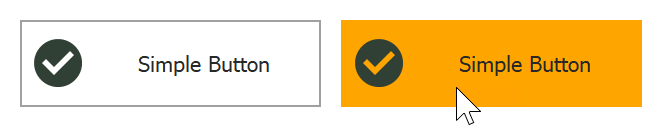
Simple Button – Custom Painting
We implemented a new CustomDraw event to paint our WinForms Simple Button manually.
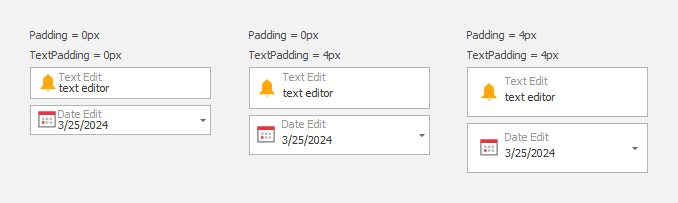
Unified Padding Settings for Textbox-based Editors
In our v24.1 release cycle, we introduced padding settings that are consistent across all types of DevExpress Textbox-based data editors (such as TextEdit, SpintEdit, DateEdit, MemoEdit, etc.). These settings allow you to maintain a consistent appearance without having to specify different padding options for different editor types.
Use Properties.TextPadding and Properties.Padding properties to specify text and content paddings within the text box.
WinForms Document Manager
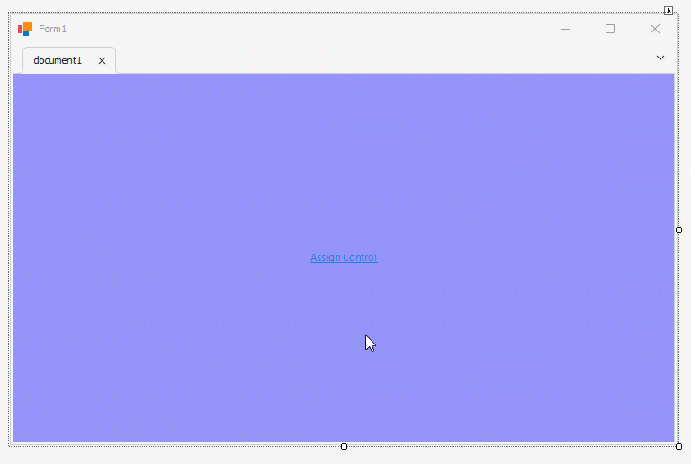
Adding Content at Design-Time
Our Document Manager supports deferred loading. To leverage this capability, document content must be generated at runtime in the QueryControl event handler. While this technique offers flexibility and performance benefits, it may be complicated for simple usage scenarios (where all documents are known at design-time).
v24.1 gives you the ability to add User Controls and Forms to documents using the designer.
SVG Cursors
WinForms data-aware controls with scrollable content now include DPI-independent SVG cursors, providing smooth and precise navigation regardless of screen resolution.
Accessibility and UI Automation
Accessible Keyboard Navigation
TabPane & NavigationPane
We added keyboard navigation support to our WinForms TabPane and Navigation Pane controls (much like that of the XtraTabControl). Keyboard focus is now managed as follows:
- Right/Left Arrows — Activates the Next/Previous page.
- Ctrl+Tab/Ctrl+Shift+Tab — Activates the Next/Previous page and focuses the tab header or UI control displayed on the page.
- Home — Activates the first page.
- End — Activates the last page.
Additional API includes:
AllowNavigationThroughPages— Activate this option to focus the tab header (rather than the UI control displayed on the page) when users navigate using the Tab key. This setting is disabled by default.ShowHeaderFocus— Displays/hides the focus rectangle.
TextBox-based Data Editors in BarEditItems
We improved keyboard navigation within the Ribbon UI. Keyboard focus is now appropriately managed to mimic behaviors found in Microsoft Word. Specifically, when the BarEditItem has focus and the user presses an arrow key, the BarEditItem retains focus, allowing navigation within the editor.
WinForms TileView (Kanban)
End-users can now focus tile group header and footer buttons with the keyboard.
Column Filter Popup
When a user opens an Excel Filter Popup, the popup window automatically receives focus. Users can navigate between the UI elements of a popup window using the keyboard.
Screen Reader Related Enhancements
We continue to improve accessibility across our WinForms UI control library. Screen readers (such as Narrator and NVDA) can now pronounce the following user actions:
- Checking an item in the Data Grid Column Customization Menu
- Expanding/collapsing an item in the Accordion Control
We expect to introduce additional accessibility-related enhancements in our official release (v24.1).
You Feedback Matters
Free DevExpress Products - Get Your Copy Today
 Bogdan Kharchenko (DevExpress)