WinForms - New CheckEdit Styles

Once upon a time in the distant past, when the grass was greener and the world was young (and all of us were, too!), our designers created sixteen styles for our CheckEdit control. Using the CheckStyle property a developer was able to select one of these styles, but as time moved on so did our aesthetic standards together with those of other Windows application designers. The styles started looking increasingly weird and outdated and we ended up making those enum values invisible …. but they are still around for those brave enough to look for them!
By setting CheckStyle to one of the old values you can create check edits that look like these:
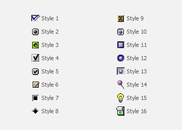
Times are a-changing
Now, I’m not telling this story to scare anybody. I thought it was worth a look back to point out our commitment to legacy functionality - we hate breaking your code! I’m sure there are applications around today that use these old styles, please feel free to comment and let us know if you maintain one of them!
Meanwhile, our designers and developers got their heads together and decided it was high time to introduce some pretty new vector based styles. Here’s what they came up with:
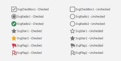
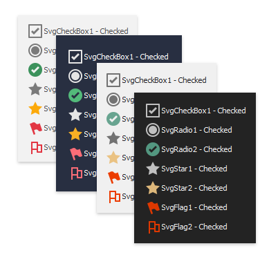
These styles will be available starting with v18.2 (in addition to the old ones, I should add!), and of course they come with all the usual benefits of vector images: they scale up and down without loss of quality, and the can adapt their colors to skins or palettes.
What do you think?
We are publishing this post early in the development cycle for v18.2 because we hope to receive some feedback from you! There are several questions and concerns we have. For a start: do you need additional styles? For instance, the old Style 15 was a light bulb. Do you need a replacement for that? Or do you have a completely different style in mind that we should introduce?
Another perhaps more important question has to do with the indeterminate state that indicates partly checked elements, often hierarchies or groups.
Obviously simple check and radio styles need to support this indeterminate state. But we can’t figure out what this state should look like for, say, a star or a flag. We assume right now that indeterminate states don’t make sense for such styles. Please let us know your thoughts or approaches you have taken before and we will make sure to provide the best possible solutions for your real-world projects!
Free DevExpress Products - Get Your Copy Today
 Oliver Sturm (DevExpress)