It’s been over a month since we published our official 2020 WinForms Roadmap. Despite the short time frame, we've managed to implement quite a few features that we hope you’ll find valuable. In this post, I’ll summarize what we expect to include in our WinForms Early Access Preview (v20.1).
Please remember that pre-release builds are designed to collect feedback. If you find any of the features in this post promising (and if you own an active Universal or DXperience Subscription), please download the build by pointing your browser to the Download Manager.
Your Feedback Matters
We realize beta-testing is a time consuming process and we are eternally grateful to those who invest time with our preview builds. Find the current implementation lacking flexibility? Feel we've overlooked a valuable usage scenario? Does our current implementation fail to address your business requirements? Please post your thoughts in the comment section below or create a Support Center ticket. We will happily follow-up and do what we can to extend the capabilities of our new products/features.
If you currently own a WinForms Subscription and are considering an upgrade to DevExpress Universal or DXperience, email us at clientservices@devexpress.com for preferential upgrade pricing.
Early Access and CTP builds are provided solely for early testing purposes and are not ready for production use. This build can be installed side by side with other major versions of DevExpress products. Please backup your project and other important data before installing Early Access and CTP builds.
This EAP may not include all features/products we expect to ship in our v20.1 release cycle. As its name implies, the EAP offers an early preview of what we expect to ship in two months.
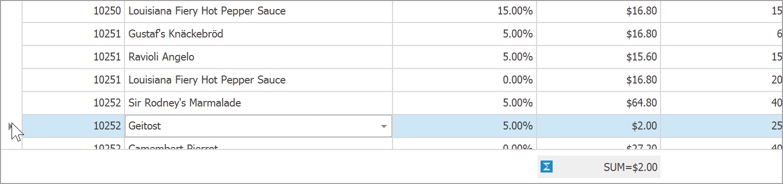
WinForms Data Grid
Summary by Selection
WinForms Grid summary Items now include the Mode property. Use it to calculate summaries against currently selected rows.
You can choose between three operational modes:
- All rows - summaries are calculated against all rows;
- Selection - summaries are calculated only against selected rows;
- Mixed - acts as "All rows" when only one row is selected, switches to "Selection" mode when a user selects two or more rows.
At runtime, users can right-click a summary item to specify the desired selection mode.

New summary calculation modes work for both data and group rows. In the figure below, two group rows are selected. Summaries for the "Unit Price" and "Quantity" columns calculate their values only for records within these groups.

Demo Documentation
WinForms Data Grid Kanban Board Enhancements
This release extends the capabilities of our Data Grid's TileView Kanban mode with the following features:
- Auto-height - Tiles can now span different heights. You can enable auto-height mode for tile template rows that display lengthy text strings or large images. To limit the maximum number of text lines, you can use the new
MaxLineCount option.
- Each Kanban group can display a button at the bottom. You can control text and visibility of this button for individual groups. Handle the
GroupFooterButtonClick event to execute actions when the button is clicked.
- The Kanban board allows you to manually create groups, and control group visibility/order. This feature allows you to retain empty groups after a user drags all their tiles away.
- Group headers now accept custom buttons. These buttons can be either constantly visible, or appear only when a user hovers over headers.
- You can now highlight Kanban group backgrounds with custom colors.
- Kanban Group headers now support HTML Formatting.
Launch our updated Tile View Kanban Board demo to explore these features in greater detail.

Demo Documentation (AutoHeight) Documentation (Groups)
WinForms Gantt Control
Runtime Editing and Task Dependencies
Our WinForms Gantt Control now supports interactive editing. Users can move a task to a new time slot, resize it, or change dependency type (Start-To-Start, Finish-To-Start) with a pointing device in the task chart. All changes are automatically reflected in the task list.

Demo Documentation
AutoScheduling
When a user edits a task at runtime, the control automatically re-calculates the entire process and modifies start and end dates of other tasks.
Demo Documentation
WinForms Tree List - New Item Row
Our WinForms TreeList control can now display an empty row. This empty row can be used to quickly add new records to the underlying data set.

The TreeList’s New Item Row replicates all the features we currently ship in our Data Grid.
- Set the
OptionsView.NewItemRowPosition property to choose New Item Row position: top, bottom, or none (hidden).
- The
TreeList.InitNewRow event allows you to automatically set initial cell values for new rows.
- Localization services allow you to modify the default "Click here to add a new row" text. text string. If you do not need to localize your app, modify the
TreeList.NewItemRowText property instead.
When the New Item Row is enabled, the Tree List displays "Add Node" and "Add Child Node" options when a user right-clicks a node.

Enable the OptionsMenu.ShowAddNodeItems setting to show these menu items regardless of the New Item Row visibility.
Demo Documentation
WinForms Pivot Grid - Pinned (Fixed) Columns
You can now pin Pivot Grid field values so that they remain visible when a user scrolls through control data.

To pin a value in code, add a new FixedFieldValue object to the FixedColumnFieldValues collection. The Conditions specifies the field values to be pinned. For instance, the code below pins "fieldQuantity" field values that belong to the "February 2015" interval.
var info = new FixedFieldValue(fieldQuantity);
info.Conditions.Add(
	new FixedFieldValueCondition(fieldYear, new DateTime(2015, 2, 1)));
pivotGridControl1.FixedColumnFieldValues.Add(info);
If you specify no conditions, the "Grand Total" column is pinned.
pivotGridControl1.FixedColumnFieldValues.Add(new FixedFieldValue(fieldQuantity));

Demo Documentation
WinForms Diagram Control
Text Tool
Our new Text Tool allows you and your users to add text labels to your diagram.

DirectX Support
The diagram rendering engine now supports DirectX hardware acceleration. This improves the performance for diagrams with a large amount of items and diagrams that contain complex SVG shapes.
Documentation
DataTable Support
We have updated our Data Binding and Org Chart controllers to support DataTable and DataSet sources.
Property Panel Localization API
We have extended the DevExpress.Diagram.Core.Localization.DiagramControlStringId class so you can localize property names in the Property Panel.
WinForms Stack and Table Panel Enhancements
This release incorporates enhancements to StackPanel and TablePanel containters.
StackPanel Demo TablePanel Demo
Auto-Size Functionality
Both panels can now automatically shrink and expand to fit all nested controls (use the control's AutoSize and AutoSizeMode). Note that individual rows and columns also support AutoSize mode.

Documentation (StackPanel) Documentation (TablePanel)
Right-to-left Support
The panels now reverse the layout of nested controls when RTL mode is detected.

Documentation
Automatic Tab Order
The new AutoTabOrder property allows you to automate tab order for controls hosted within panels.
Documentation
Row and Column Visibility Settings
Columns and Rows inside a Table Panel support the Visible property.

New Label Alignment Mode
The new LabelVertAlignment property allows you to vertically align labels relative to controls displayed in adjacent cells.

Documentation
HiDPI Support
Both panels now support Per-Monitor v2 DPI Awareness mode.
WinForms SvgImageBox - DirectX Rendering
Our recently released SvgImageBox control can now use DirectX hardware accelleration to render vector images. This improves control performance when you need to draw a complex image with a large amount of vector elements.
New WinForms Splash Screens
This release introduces two new splash screens:
- Fluent Splash Screen - a Windows 10-inspired splash screen that features an Acrylic material effect (a partially transparent texture)
- Skin Splash Screen - a Splash Screen that auto-adjusts its appearance based on the current skin

To display these splash screens, call the static SplashScreenManager.ShowFluentSplashScreen and SplashScreenManager.ShowSkinSplashScreen methods.
Additionally, we have revamped the appearance of standard Splash Screen.

Demo
Free DevExpress Products - Get Your Copy Today
The following free DevExpress product offers remain available. Should you have any questions about the free offers below, please submit a ticket via the
DevExpress Support Center at your convenience. We'll be happy to follow-up.