DevExpress WinForms Controls – New Ways to Address Old UI Requirements

We are working hard to make our next WinForms release (v20.2) the best ever. We have a lot of information to share about v20.2 and I will blog about release plans in August. For this post, I wanted to share a few ideas/UI suggestions and demonstrate how our WinForms products have evolved in recent release cycles.
Side Navigation
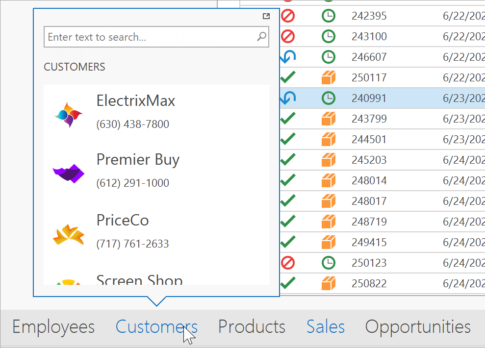
In times past, apps that required “side navigation” functionality often relied on the DevExpress WinForms NavBar Control was your way-to-go pick for many years. to do the heavy-lifting. Our NavBar control shipped with everything one would expect from a navigation bar. It allowed you to create empty items or populate them with custom content. It allowed you to add items that mimicked buttons or incorporate selectable items that retained user focus. The NavBar allowed you to categorize elements into groups, choose one of three behavior modes, auto-populate the Office Navigation Bar with NavBarControl groups, etc. Yes, the NavBar control was (and is) awesome. The good news is that all major NavBar related functionality is now available in its heir apparent – the DevExpress WinForms Accordion Control.
In addition to all the things mentioned above, our Accordion UI component also offers:
- custom header buttons inside items and groups;
- an embedded Find Panel to help users locate information in an intuitive manner;
- web-inspired Hamburger style menu;
- improved high-DPI support, and much more.
If the Accordion’s built-in advantages have yet to convince you of its utility, consider the following. When you place an Accordion Control inside a Fluent Design Form, it can do what no other navigation control can: stretch vertically across the entire form, overlapping its title bar. It will also automatically expand or collapse based on current form width. Thanks to its semi-transparent Acrylic Material support (powered by DevExpress DirectX Hardware Acceleration), it does all this in a highly elegant manner.
Alerts & Notifications
Traditional Alert Windows managed by our WinForms AlertControl are simple message boxes with custom styling. They appear and disappear without a trace when a user closes the alert. Though Alert Windows can service certain needs, we think a better alternative exists... Toast Notifications.
Toast Notifications were first introduced in Microsoft Windows 8 and are much more powerful than traditional “alert windows”. Toast notifications are stored in the Windows Notification Center and allow users to read unread messages in a centralized location. Native Toast Notifications can use system colors and sound settings. These notifications can also display UI elements (to help your app interact with the user) and support the all-important "Snooze" command (delay the notification for a later time).
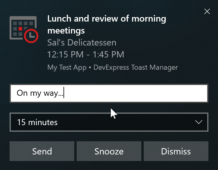
The DevExpress Toast Notification Manager component uses Microsoft’s Windows API and allows you to create native Toast Notifications with absolute ease. A few months ago we published a comprehensive tutorial for this component. If notifications play an important role in your app, please review the following blog post to learn more: How to Display Toast Notifications in WinForms Apps.
Unbound Data
All of our market-leading data-aware controls (WinForms Data Grid, Tree List, Vertical Grid, etc.) fully support unbound data operations. In unbound mode, records are not retrieved from a data source – they are passed to the UI control manually.
So how can you pass unbound data to a data-aware control? It’s simple – for example, to populate our WinForms Data Grid with unbound data, you need to create unbound columns and handle the CustomUnboundColumnData event.
Though you can still use Unbound column events, our DevExpress WinForms Controls suite now ships with a special data source component designed to facilitate unbound data management. This control – the UnboundSource component - fires two events: ValueNeeded (when a data-aware control requires new data) and ValuePushed (when control data has changed and requires you to save modifications). Unbound Source repeatedly fires the ValueNeeded event until record number reaches the number assigned via the SetRowCount method. This straightforward approach allows you to easily scale the data passed to your data-aware control and instantly clear it (by passing zero as the method value). If you’re ready to explore the capabilities of UnboundsSource, feel free to review the following help topic for more information: Unbound Sources.
In addition to UnboundSource, the DevExpress WinForms suite includes an event-based VirtualServerModeSource component. This component allows you to load large data sets in small portions. When used, data-aware controls leverage our Infinite Scrolling mode (an alternative to traditional record paging).
Flyouts
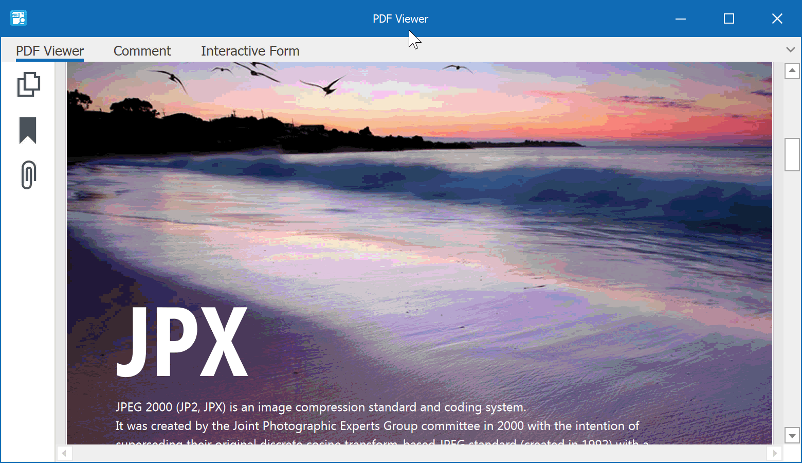
While the word "flyout" may be a relatively new term in the DevExpress WinForms vocabulary, the idea of small panels that pop up in the corner of the screen is nothing new. Years ago you had to use custom floating forms to display such panels. With our WinForms Flyout Panel, you can now incorporate this capability quite easily. Simply drop the Flyout Panel onto your form, choose its position and animation effects, populate it with content and call the ShowPopup / HidePopup methods to toggle panel visibility. The animation below illustrates how we use the Flyout Panel within the DevExpress PDF Viewer (to display a Find panel).
Flyout Panels support an alternate "Beak Panel" style. “Break Panel” allows you to display interactive hints for any UI element on your form. To open a Flyout Panel in “Break Panel” mode, call the ShowBeakForm method instead of ShowPopup.
Buttons
As you know, WinForms buttons can include shadows, rounded corners, convex backgrounds, etc. Though these UI elements are somewhat new, nothing innovative has been introduced for a Windows button in quite some time. A button is basically a border, an image, a text string, and a single "Click" event.
Thanks to the evolution of UI design (and of course, the PaintStyle property implemented by our developers), you can now eliminate Simple Button borders. This simple change adds elegance to an app and allows you to use Simple Buttons for completely new usage scenarios. For instance, by eliminating borders, you can now create flat toolbars without a need for our WinForms Bar Manager component.
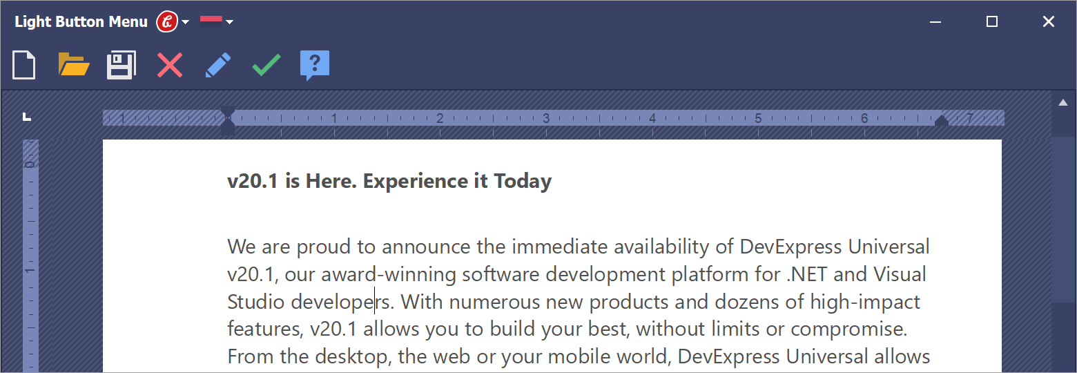
The image below is a screenshot of a sample app I recently sent to one of our customers. He wanted to create a custom vertical toolbar with folding categories. As you can see, our Accordion Control delivers the required element hierarchy. Its content container items host WinForms Stack Panels, and each Panel includes a collection of Simple Buttons with a Light paint style. If you have a similar UI requirement, implementation is a breeze.
Your Turn
In my next post, I’ll discuss other new UI controls you may want to consider for upcoming WinForms projects. In the meantime, please comment below and let me know which new WinForms control you’ve used recently and why. Long live WinForms!
Free DevExpress Products - Get Your Copy Today
 The DevExpress Team