Our next major update v23.1 is a couple of months away. As such, we wanted to preview the features we expect to ship this Spring and invite all active DevExpress Universal subscribers to download our Early Access Preview (EAP). Your feedback will help us refine the features described below and allow us to ship the best possible royalty-free BI Dashboard platform in the marketplace.
Early Access and CTP builds are provided solely for early testing purposes and are not ready for production use. This build can be installed side by side with other major versions of DevExpress products. Please backup your project and other important data before installing Early Access and CTP builds.
This EAP may not include all features/products we expect to ship in our v23.1 release cycle. As its name implies, the EAP offers an early preview of what we expect to ship later this year.
Custom Items — Export to Excel
v23.1 ships with extended custom dashboard item export capabilities for both WinForms and Web platforms. For the WinForms platform, the Export To drop-down (located within a custom dashboard item’s caption) now includes an Export To Excel option:
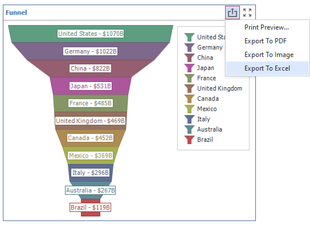
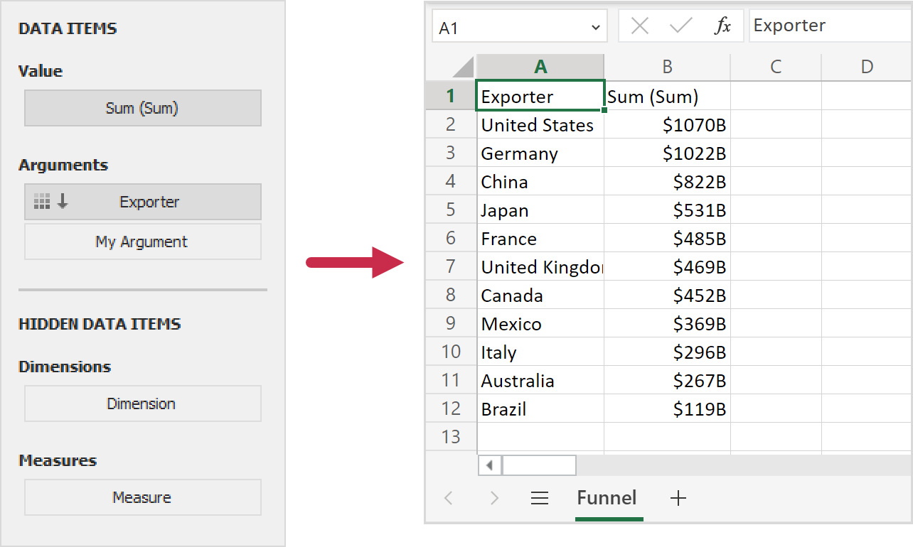
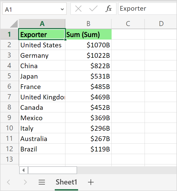
The Dashboard control exports custom item data in a tabular format - where each column corresponds to a data item.
In Web platforms, you can display the Export To option for an individual custom dashboard item within your browser-based BI Dashboard by overriding the allowExportSingleItem method in the item’s configuration file:
class FunnelChartItemViewer extends Dashboard.CustomItemViewer {
   //...
    allowExportSingleItem() {
        return true;
    }
}
Refer to the following GitHub examples for more information (do not forget to install v23.1 first and convert examples). To share feedback, simply create a new DevExpress Support Center ticket.
Customize Exported Documents
You can now customize generated documents (for custom dashboard items) when handling the control’s CustomizeExportDocument event. To help you obtain custom item data and modify the layout of the generated document, we added the following methods in event arguments:
The code snippets below demonstrate how you can generate an XLSX document using the Spreadsheet Document API (included in our Office File API suite).
WinForms
-
Download and convert to v23.1 the following example: Dashboard for WinForms - Custom Items.
- Add the
DevExpress.Spreadsheet.v23.1.Core.dll and DevExpress.Docs.v23.1.dll assemblies to the project.
- Handle the DashboardDesigner.CustomizeExportDocument event and use the code below to customize headers:
using System;
using System.Collections.Generic;
using System.Collections.ObjectModel;
using System.Drawing;
using System.Linq;
using System.Windows.Forms;
using DevExpress.DashboardCommon;
using DevExpress.DashboardCommon.ViewerData;
using DevExpress.Spreadsheet;
// ...
dashboardDesigner1.CustomizeExportDocument += DashboardDesigner1_CustomizeExportDocument;
// ...
 private void DashboardDesigner1_CustomizeExportDocument(object sender, CustomizeExportDocumentEventArgs e){
    CustomDashboardItem item = dashboardDesigner1.Dashboard.Items.FirstOrDefault(i => i.ComponentName == e.ItemComponentName) as CustomDashboardItem;

    if (item != null) {
        DevExpress.Spreadsheet.Workbook workbook = new DevExpress.Spreadsheet.Workbook();
        Worksheet worksheet = workbook.Worksheets[0];

        MultiDimensionalData itemData = e.GetItemData(e.ItemComponentName);
         CustomItemData customItemData = new CustomItemData(item, itemData);

        DashboardFlatDataSource flatData = customItemData.GetFlatData();
        IList<DashboardFlatDataColumn> columns = flatData.GetColumns();
        for (int colIndex = 0; colIndex < columns.Count; colIndex++){
            worksheet.Cells[0, colIndex].Value = columns[colIndex].DisplayName;
            worksheet.Cells[0, colIndex].FillColor = Color.LightGreen;
            worksheet.Cells[0, colIndex].Font.FontStyle = SpreadsheetFontStyle.Bold;
            int headerOffset = 1;
            for (int rowIndex = 0; rowIndex < flatData.Count; rowIndex++)
                worksheet.Cells[rowIndex + headerOffset, colIndex].Value = flatData.GetDisplayText(columns[colIndex].Name, rowIndex);
        }
        workbook.SaveDocument(e.Stream, DocumentFormat.Xlsx);
    }
}
Web
- Download and convert to v23.1 the following example: Dashboard for ASP.NET Core - Custom Item Gallery
- Install the
DevExpress.Document.Processor NuGet package. - Handle the DashboardConfigurator.CustomizeExportDocument event and use the code below to customize headers:
using DevExpress.DashboardAspNetCore;
using DevExpress.DashboardCommon;
using DevExpress.DashboardCommon.ViewerData;
using DevExpress.DashboardWeb;
using DevExpress.Spreadsheet;
using System.Collections.Generic;
using System.Drawing;
// ...
    public void ConfigureServices(IServiceCollection services) {
        //...
        services.AddScoped<DashboardConfigurator>((IServiceProvider serviceProvider) => {
            DashboardConfigurator configurator = new DashboardConfigurator();
            // ...
            configurator.CustomizeExportDocument += Configurator_CustomizeExportDocument;

            return configurator;
        });

    private void Configurator_CustomizeExportDocument(object sender, CustomizeExportDocumentWebEventArgs e) {
        CustomDashboardItem item = e.GetDashboardItem("customItemDashboardItem2") as CustomDashboardItem;

        if (item != null) {
            DevExpress.Spreadsheet.Workbook workbook = new DevExpress.Spreadsheet.Workbook();
            Worksheet worksheet = workbook.Worksheets[0];

            MultiDimensionalData itemData = e.GetItemData(e.ItemComponentName);
            CustomItemData customItemData = new CustomItemData(item, itemData);

            DashboardFlatDataSource flatData = customItemData.GetFlatData();
            IList<DashboardFlatDataColumn> columns = flatData.GetColumns();
            for (int colIndex = 0; colIndex < columns.Count; colIndex++) {
                worksheet.Cells[0, colIndex].Value = columns[colIndex].DisplayName;
                worksheet.Cells[0, colIndex].FillColor = Color.LightGreen;
                worksheet.Cells[0, colIndex].Font.FontStyle = SpreadsheetFontStyle.Bold;
                int headerOffset = 1;
                for (int rowIndex = 0; rowIndex < flatData.Count; rowIndex++)
                    worksheet.Cells[rowIndex + headerOffset, colIndex].Value = flatData.GetDisplayText(columns[colIndex].Name, rowIndex);

            }
            workbook.SaveDocument(e.Stream, DocumentFormat.Xlsx);
        }
    }
Improved Content Security Policy Support for ASP.NET Core Applications
As you may already know, a Content Security Policy (CSP) is an additional layer of security that allows the browser to recognize and mitigate certain types of risks. In our previous release (v22.2), we modified our source code to refuse script execution on the client, so you no longer need to specify the script-src 'unsafe-eval' CSP directive. The remaining exceptions are to specify the unsafe-inline keyword for the script-src and style-src directives for our components to work correctly.
In our upcoming release (v23.1), we implemented a nonce-based approach for ASP.NET Core applications. This will allow you to disable inline styles and execution of inline scripts (i.e., to remove the unsafe-inline keyword for script-src and style-src directives). With this approach, we generate a cryptographic nonce (“number used once”), include it in our CSP, and add the nonce value in the nonce attribute in every script/style tag. The browser will only execute inline code that includes the correct nonce value. With this approach, a threat actor cannot include/run a malicious script, because they can’t guess the nonce value. The nonce value regenerates each time you reload the page.
To disable inline styles and execution of inline scripts, use the new Nonce method at the Web Dashboard component level. Refer to the following GitHub example to implement nonce-based CSP in your BI Dashboard ASP.NET Core application:
Dashboard for Web — Custom Style Editor
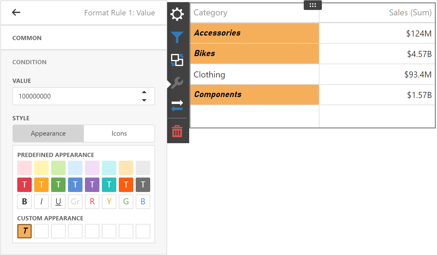
v23.1 will allow you to define a custom style for format rules used within Grid, Pivot and Card dashboard items.
When you create a format rule, click on a blank square in the Custom Appearance section to create a custom style:
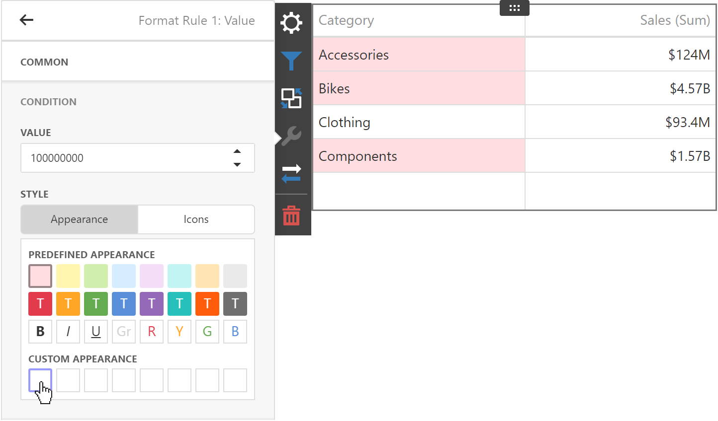
This action invokes the Custom Style Editor. In it, you can specify text color, background color, and font settings used for the format rule:
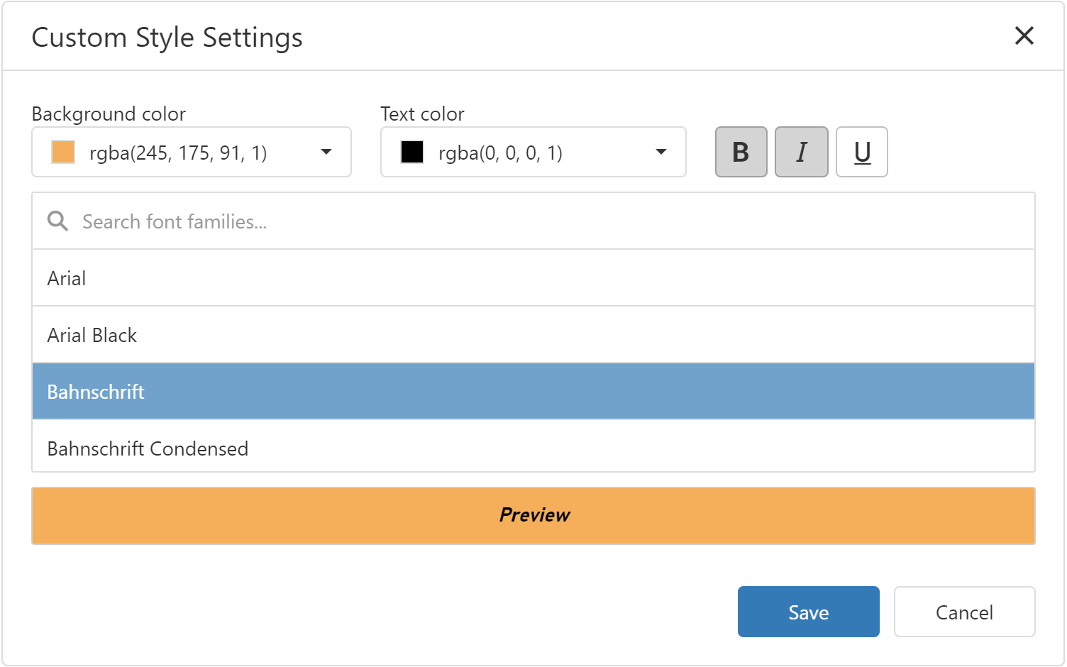
Click Save to save the style and apply your settings to the dashboard item:
Online Demo
We published an online demo to illustrate the potential of this feature: BI Dashboard — Demo. The demo allows you to create a format rule for a Grid, Card, or Pivot dashboard item using our new Custom Style Editor. To share feedback, simply create a new DevExpress Support Center ticket.
Dashboard for WinForms — Merged Data Source Wizard Page
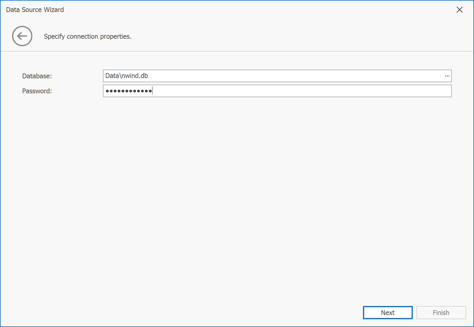
We merged the first two pages of our BI Dashboard’s Data Source Wizard. Pages previously used to select data source type and database provider have been replaced with a single page that displays a flat list of all supported data sources.
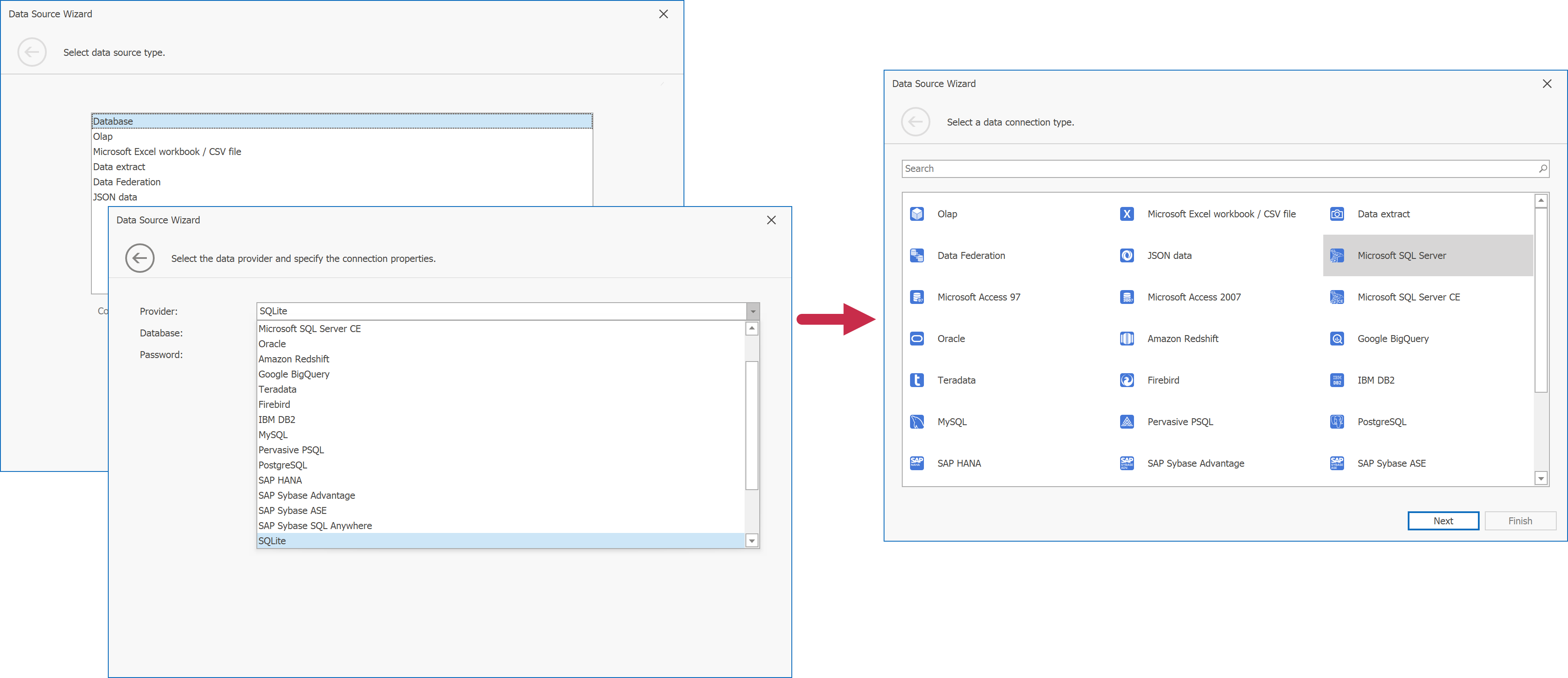
To invoke the Data Source Wizard, click the New Data Source button in the Data Source Ribbon tab.
We also integrated a search bar to locate a required data source:
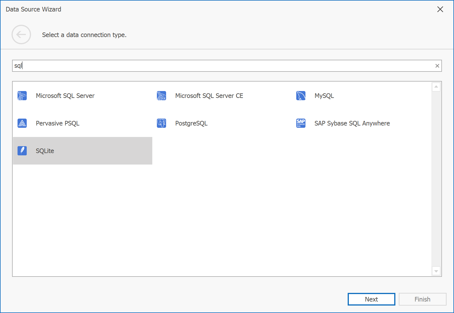
The next wizard page now contains connection settings specific to the selected data connection type:
The following Data Source Wizard Customization API members define the new wizard page:
We also added the UseMergedProviderList property for backward compatibility. Set UseMergedProviderList to false to use our previous wizard design.
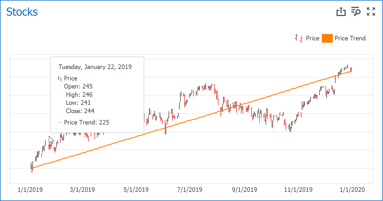
Chart Dashboard Item — Trend Indicators
v23.1 will allow you to create and display different trend indicator types within Chart dashboard items (across all supported platforms). Trend indicators are statistical tools used to analyze data and identify patterns or relationships between variables.
In this Early Access Preview release, we added support for two types of trend indicators (WinForms): Trend lines and Regression lines.
A Trend line displays the general direction of associated points. It is often used to identify existing data trends and can help forecast future trends.
Unlike a Trend line, a Regression line visualizes data using a mathematical formula that minimizes the distance between the line itself and associated data points. It is used to model the relationship between two variables and can be used to make predictions about one variable based on the value of the other variable.
We are also working to create custom trend indicators and expect to add this functionality once we officially release v23.1.
End-User Experience
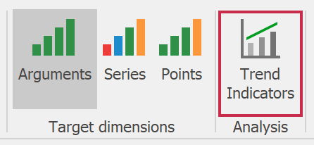
The new Trend Indicator button is available in the Ribbon’s Data contextual page (for a Chart dashboard item).
This button opens a new editor window and allows you to create a new Trend Indicator with desired settings:
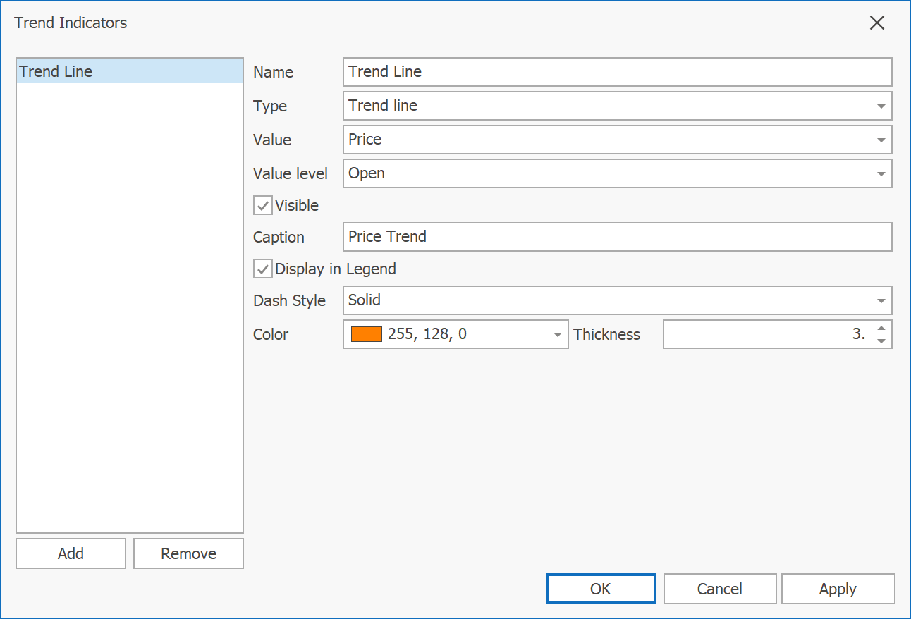
The following indicator settings are available:
- Name - Sets indicator name within the indicators collection.
- Type - Specifies indicator type - Trend line or Regression Line.
- Value - Sets the data item from the Value section (used to calculate an indicator).
- Value Level - Specifies a data point’s value (based on series type). For example, if you use
CandleStickSeriesView, you can specify the value used to draw the indicator: Open, High, or Close. - Visible - Specifies whether indicator is displayed within a chart dashboard item.
- Caption - Specifies the indicator’s caption displayed in the legend.
- Display in Legend - Specifies whether to display the indicator’s caption in the legend.
- Dash Style - Sets the dash style used to paint the line.
- Color - Specifies line color.
- Thickness - Specifies line thickness.
Once you specify all settings, click Apply to display the indicator within a chart dashboard item:
Runtime
At runtime, you need to create a ChartTrendLine or ChartRegressionLine object and add it to ChartDashboardItem.Indicators. Once complete, use the following API to specify indicator settings described above:
Use the following settings to configure trend indicator appearance:
The following code snippet adds the same trend indicator displayed above in code:
using DevExpress.DashboardCommon;
using DevExpress.XtraCharts;

//...

private void btnDrawTrend_Click(object sender, System.EventArgs e) {
    ChartDashboardItem chart = dashboardDesigner.Dashboard.Items.FindFirst(x => x.ComponentName == "chartDashboardItem2") as ChartDashboardItem;
    if (chart != null) {
        dashboardDesigner.Dashboard.BeginUpdate();
        ChartTrendLine trend = new ChartTrendLine();
        OpenHighLowCloseSeries simpleSeries = chart.Panes[0].Series[0] as OpenHighLowCloseSeries;
        if (simpleSeries != null) {
            trend.Value = simpleSeries.Open.UniqueId;
        }
        trend.Name = "trend";
        trend.Color = System.Drawing.Color.Orange;
        trend.ValueLevel = ValueLevel.Value;
        chart.Indicators.Add(trend);
        dashboardDesigner.Dashboard.EndUpdate();
    }
}
Your Feedback Matters
We realize beta-testing is a time-consuming process and we are grateful to those who invest time with our EAP builds. Find the current implementation lacking flexibility? Feel we’ve overlooked a valuable usage scenario? Does our current implementation fail to address your business requirements?
Please post your thoughts in our roadmap survey (if you have not yet voted) OR create a Support Center ticket. We will happily follow up and do what we can to extend the capabilities of our new products/features.
Free DevExpress Products - Get Your Copy Today
The following free DevExpress product offers remain available. Should you have any questions about the free offers below, please submit a ticket via the
DevExpress Support Center at your convenience. We'll be happy to follow-up.