With the official release of v18.2 right around the corner, we’ve compiled a list of the major features/products we expect to ship in mid-November. If you are an active Universal subscriber and would like to test our most recent features prior to official
release, please email our support team at support@devexpress.com or create a private support ticket in the DevExpress Support Center. Once we verify that you own an active Universal Subscription, we'll get you access to the v18.2 CTP. Feel free
to test any of the following features and share your feedback with us!
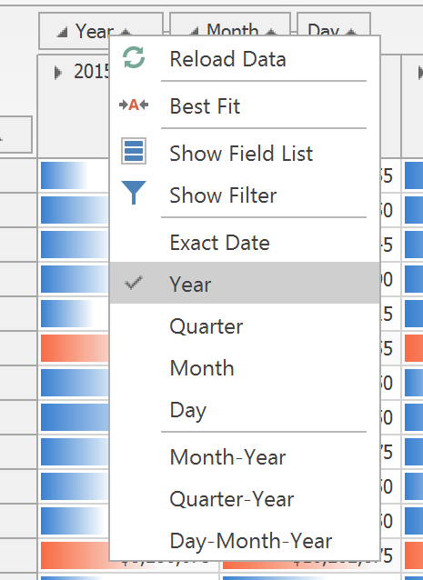
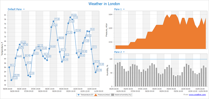
Inspired by Visual Studio, our WinForms Grid Control now supports annotations - colored markers arranged along the vertical scrollbar designed to visualize:
- Cells with validation errors
- Focused/Selected record range
- Records that match search results
- Custom data/information
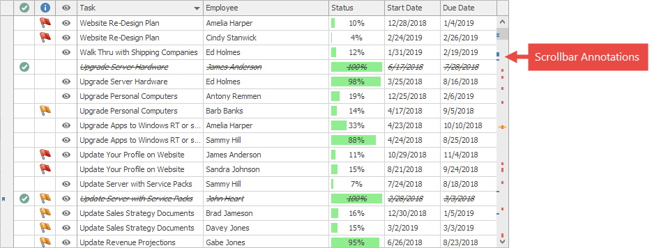
To enable annotations, navigate to the GridView.OptionsScrollAnnotations section and specify the desired annotations you’d like to display within your Grid.
Demo (requires v18.2)
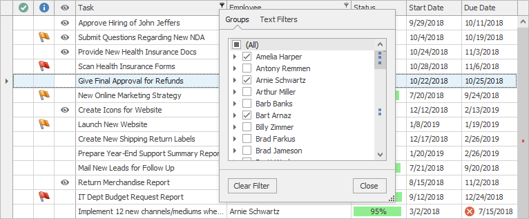
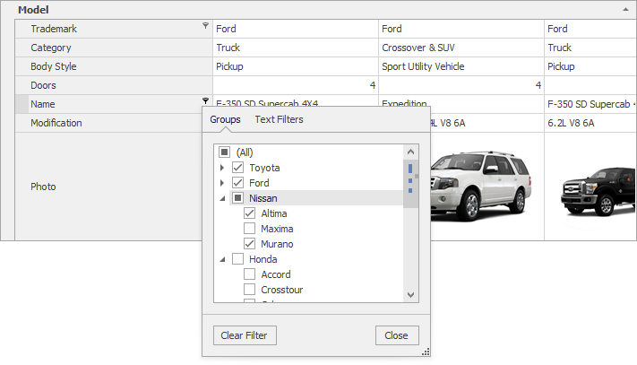
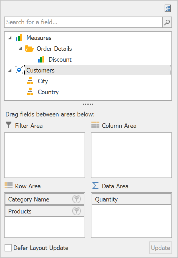
Excel-style Group Filters for Data & Vertical Grid Controls
Three months ago we asked whether you’d like to see merged group filters within our WinForms Data Grid. This filter
menu style has been added to both our Data Grid and our WinForms Vertical Grid. For those unfamiliar with this feature, Excel-style Group filters merge values from multiple columns into a single menu so that end-users can filter data against multiple columns
when working in a single panel.
Demo (requires v18.2)
Demo (requires v18.2)
These filters can retrieve data source records asynchronously and are functional when the control operates in both Instant Feedback and Server-side modes.
Excel Filters Improvements
A set of miscellaneous tweaks that improve Excel Filters in all controls that support them:
- Excel filters now automatically recognize whether an enumeration is nullable, and display or hide the “Is Null” / ”Is Not Null” items accordingly.
- “Values” and “Filters” tabs now account for inplace ImageComboBox editor settings.
- Scrollbars for tabs with checkboxes can now display scroll annotations (see above - Data Grid Scroll Annotations)
FilteringUIContext improvements
- The ResetBindings/ResetBinding method pair allows you to manually refresh editor values.
- The new AddField method allows you to add custom editors bound to desired data model fields.
- Now it’s possible to customize items in the Filtering Events via the WithDataItems method. For example, here is how
you can assign a custom HTML Text to display item images:
   void filteringUIContext_QueryLookupData(object sender, DevExpress.Utils.Filtering.QueryLookupDataEventArgs e)
        {
            if (e.PropertyPath == "Company")
            {
                e.WithDataItems(dataItems =>
                {
                    foreach (ExcelFilterDataItem item in dataItems)
                    {
                        string companyName = (string)item.Value;
                        item.HtmlText = BuildHtmlText(item.Text);
                    }
                    dataItems.HtmlImages = images;
                });
            }
        }
Demo (requires v18.2)
Skin Colors
With our upcoming release, you no longer need to hunt for a perfect hue to match an existing application theme each time you set a custom background/foreground color for a UI element. “Skin Colors” is a set of pre-defined colors that match the currently
applied skin and/or skin palette. To select a color from this set, switch to the “DX Skins” tab at design time:
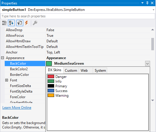
Skin Colors are always consistent with the currently applied application theme.
We limited background Skin Colors to a limited set of controls – those who would benefit from this option:
- Simple Button
- Grid column headers
- Tabs
- Group Control
- Dock Panels
Foreground Skin Colors, however, are available platform-wide.
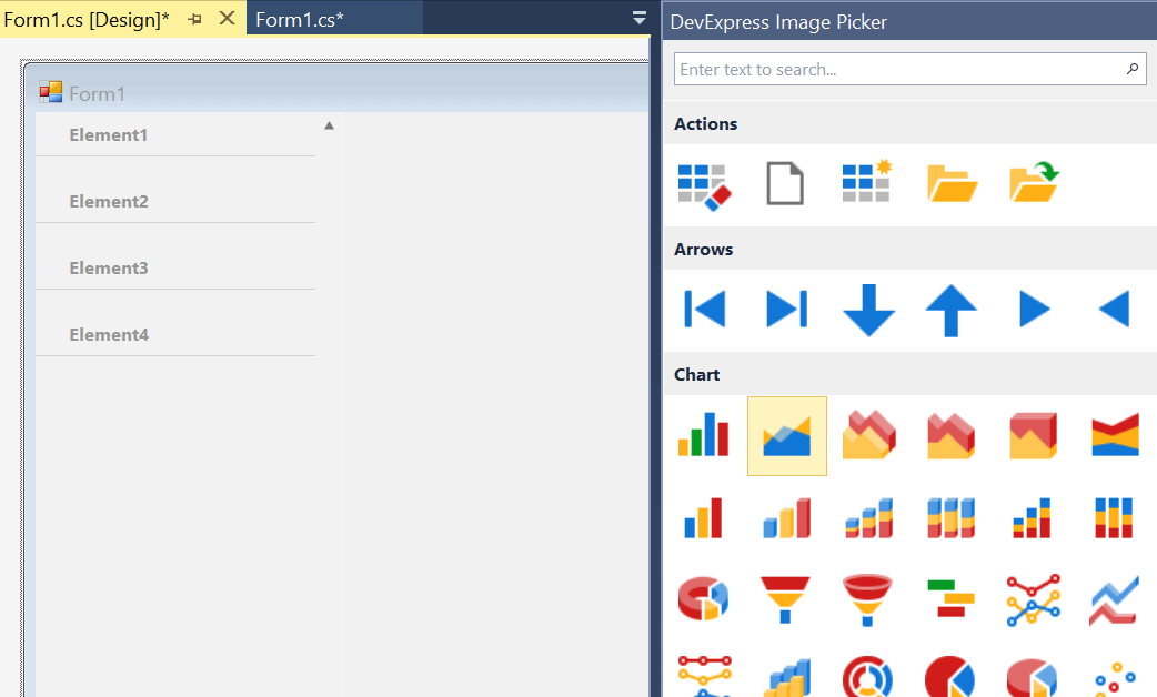
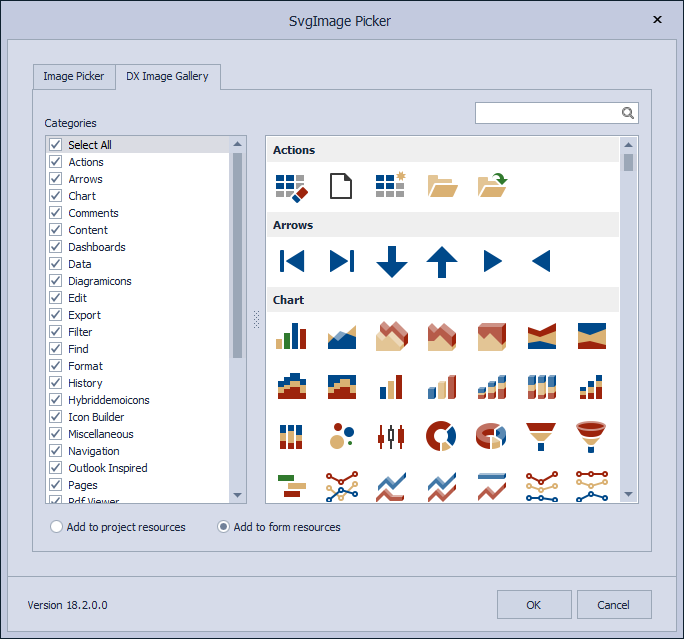
Advanced design-time image picker
If your application has many forms with a large number of controls, replacing their raster icons with vectors will require a lot of time and effort. Our new Image Picker simplifies this process. It allows you to drag-and-drop icons onto controls and
employs smart search to quickly locate desired icons.
Skin Improvements
Numerous new Skin Editor features and improvements
- Custom skins now store only differences from the source (template) skin and weigh 90% less.
- Custom skins no longer store the parent’s skin version. This means that you can create a custom skin once and it will automatically obtain all updates from its parent skin should you upgrade your DevExpress installation.
- The "External Application Preview" feature allows you to preview custom skins in any C#/VB application you choose.
- The palette editor (press F7) allows you to preview custom palette colors before you click "OK".
Extended SVG Icons support
We continue to extend use of SVG icons across all controls. In v18.2, we replaced old bitmap icons in our editors, dialogs and forms. Also, items from the list below now support multiple visual states - normal, hovered, pressed, etc. Once we ship v18.2,
you will be able to assign individual vector icons for the following states.
- BackstageViewControl items
- RecentItemControl items
- Context Buttons
Note that this feature is used exclusively for those scenarios where you need to replace icons based on item state. If all you need is to use a greyed-out icon when a button is disabled, and a highlighted icon when a button is pressed, assign a default
icon for the Normal state and the DevExpress WinForms drawing engine will automatically re-paint it when necessary.
SVG Icons Collection
v18.2 ships with an extended vector icon set and an easy-to-use Image Picker dialog so you can locate the desired icon at design time.
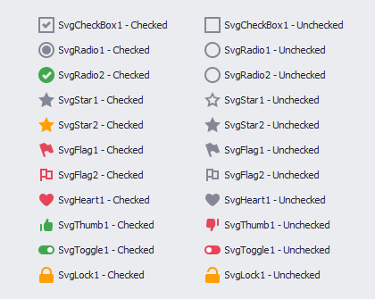
New CheckEdit styles
We have extended our CheckEdit vector image-based check styles – as you can see, they are more attractive and support all the benefits that come with use of SVG icons: they scale up and down without loss of quality, and can adapt colors to skins or
palettes. See this blogpost to learn more:
https://community.devexpress.com/blogs/winforms/archive/2018/07/26/winforms-new-checkedit-styles.aspx
Demo (requires v18.2)
Ribbon Control Enhancements
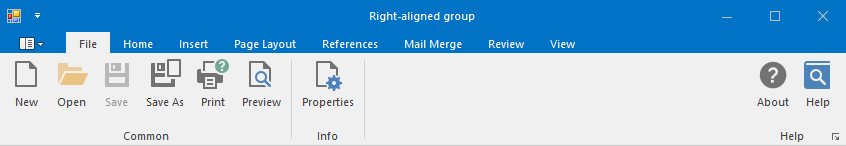
Right-aligned groups
Ribbon page groups expose a new Alignment property, which allows you to anchor these groups to the right side. This property is in effect for all Ribbon styles except for the TabletOffice style.
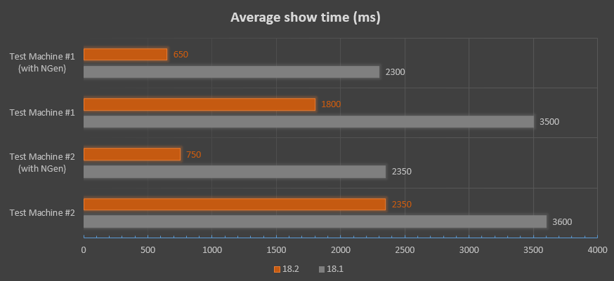
We overhauled and fine-tuned Ribbon UI generation engine for our Office controls (RTF Editor (Word Processor), Spreadsheet, BI Dashboard, etc). As a result, display time has improved by 15-80% (based on usage scenario). Learn more in the following blogpost: https://community.devexpress.com/blogs/winforms/archive/2018/08/23/winforms-ribbon-performance-improvements.aspx
PivotGrid Improvements
In-place editors for Pivot Grid
We continue to extend consistency across all our Windows Forms control libraries. Starting with v18.2, our Pivot Grid will be a descendant of the EditorContainer class – this means you can assign editor Repository Items in the same manner as you would
with our WinForms Data Grid, WinForms Tree List, and other data-aware controls. Invoke the Pivot Grid designer and switch to its “In-place Editor Repository” tab to create and tweak editors. To assign these editors to data fields, go to the Fields section
and specify fields’ FieldEdit properties.
Data Processing Enhancements
We will update the DevExpress Pivot Grid to fully support our new in-memory data processing engine (up to 10x faster than its predecessor) across all usage scenarios including:
- Custom Types
- Custom Totals
- UseNativeTypeForAggregates
- CustomSummary event
- CustomGroupInterval event
- Legacy TopN
- CustomUnboundFieldData event
- Case-sensitive data binding
Unbound Column for OLAP Data Source
You will be able to add an Unbound Column for the Pivot Grid connected to an OLAP Data Source in code. After you assign an MDX expression string to your column, its values will be calculated on the Analysis Services side.
Other PivotGrid Enhancements
- Our WinForms PivotGrid now supports HTML formatting - you can add supported HTML tags to field values and row headers as needed.
- Enable the new OptionsMenu.ShowDateTimeGroupIntervalItems property to add a “Group Interval” sub-menu to the group context menu. Items in this sub-menu allow users to toggle the group interval between day, month, year, and other ranges
- Customization forms have been slightly reworked to improve the end-user experience.
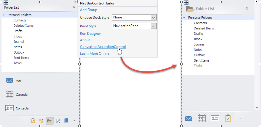
NavBarControl to AccordionControl converter
You can now convert our NavBarControl to the AccordionControl using a single click via it’s Smart Tag.
Paint Style and other NavBarControl settings are retained during conversion - the generated AccordionControl looks and behaves as close to the source control as possible. Note, however, that you will still need to handle all item interaction events
manually.
Toast Notifications Improvements
The Generic template released in version 18.1 allows you to use XML syntax to create buttons on the toast notification surface. With v18.2, you can
handle these button clicks via the toastNotificationsManager.Activated event as detailed below:
        //handle the button click
        private void ToastNotificationsManager1_Activated(object sender, DevExpress.XtraBars.ToastNotifications.ToastNotificationEventArgs e)
        {
            if (((ToastNotificationActivatedEventArgs) e).Arguments.Contains("viewdetails")) {
                //do something
            }
        }
The static WindowsFormsSettings.ScrollUIMode property now accepts a new "Fluent" value which activates the Fluent UI-inspired mode for all DevExpress scroll bars. When used, a scroll bar is collapsed to a thin stripe when
not active, and expands to a semi-transparent bar when a user hovers the mouse pointer over it.
TreeList Improvements
We have rewritten the TreeList calculation engine to speed performance. The most common operations like repainting, scrolling and data operations are now much faster.
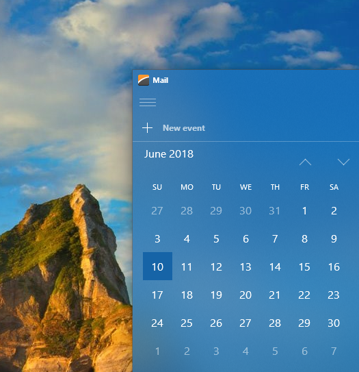
Calendar - Fluent View
Our new FluentUI View for the Calendar Control supports Acrylic and Reveal Highlight effects and allows you to mirror the appearance of a Windows 10 calendar.
Scheduler - Google Calendar Sync
With v18.2 WinForms Scheduler can automatically synchronize appointments with Google Calendar.
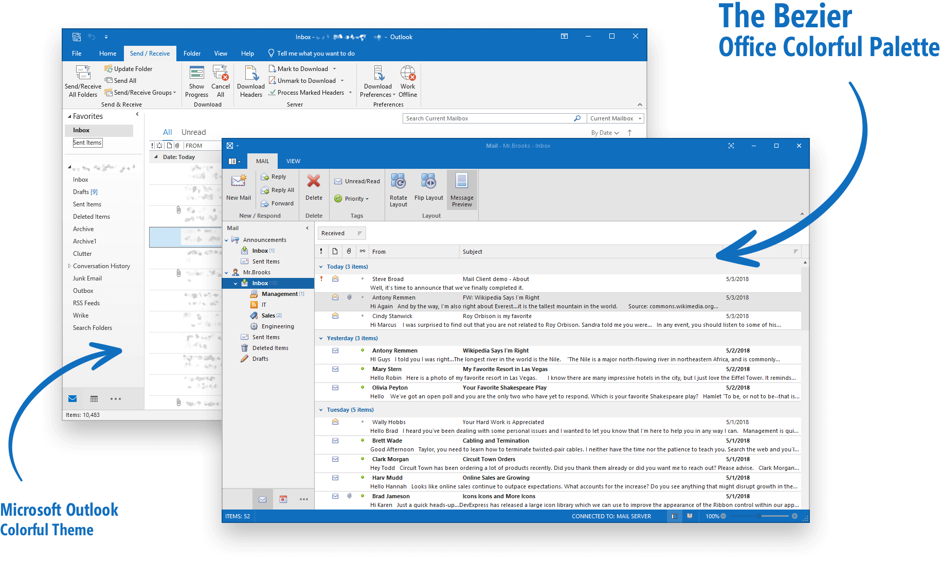
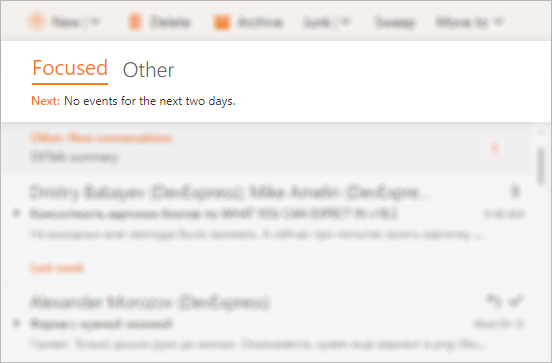
Office Navigation Bar - Tab Navigation View
With v18.2, you can easily create tab navigation like those found in Microsoft Outlook and Visual Studio – user experiences with sleek element appearance and borderless tab headers.
Print and Export Improvements
Data-aware controls that support HTML text can now be printed and exported in both DataAware and WYSIWYG modes.
Rich Edit Control Enhancements
RTL support
With our upcoming release, the DevExpress WinForms Rich Edit Control will be able to correctly display, print, and export documents with RTL content:
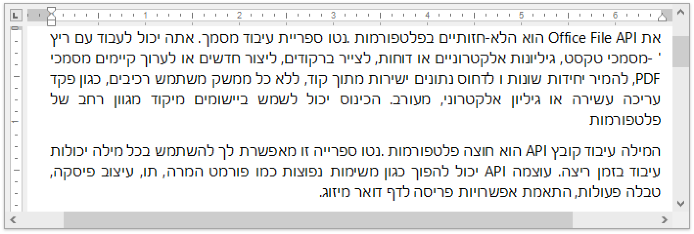
Creating a full RTL engine is a complex task, so this release will not include all RTL related features (e.g., we cannot reorder table columns in RTL documents). Other restrictions will apply. We will describe limitations as we get closer to official
release.
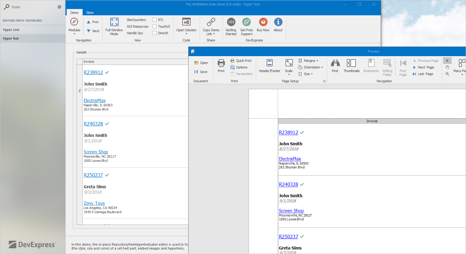
Shapes
Over the last few years, we have received many requests from our users to support shapes. So here we are: RichEditControl will support major shape types.
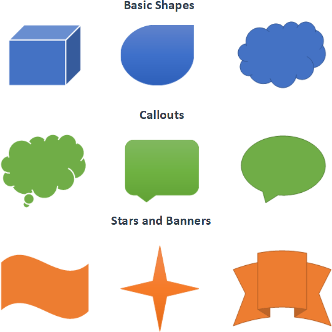
You can view, print and export (PDF) documents that contain shapes. Our upcoming release will not provide an API to manage shapes in code.
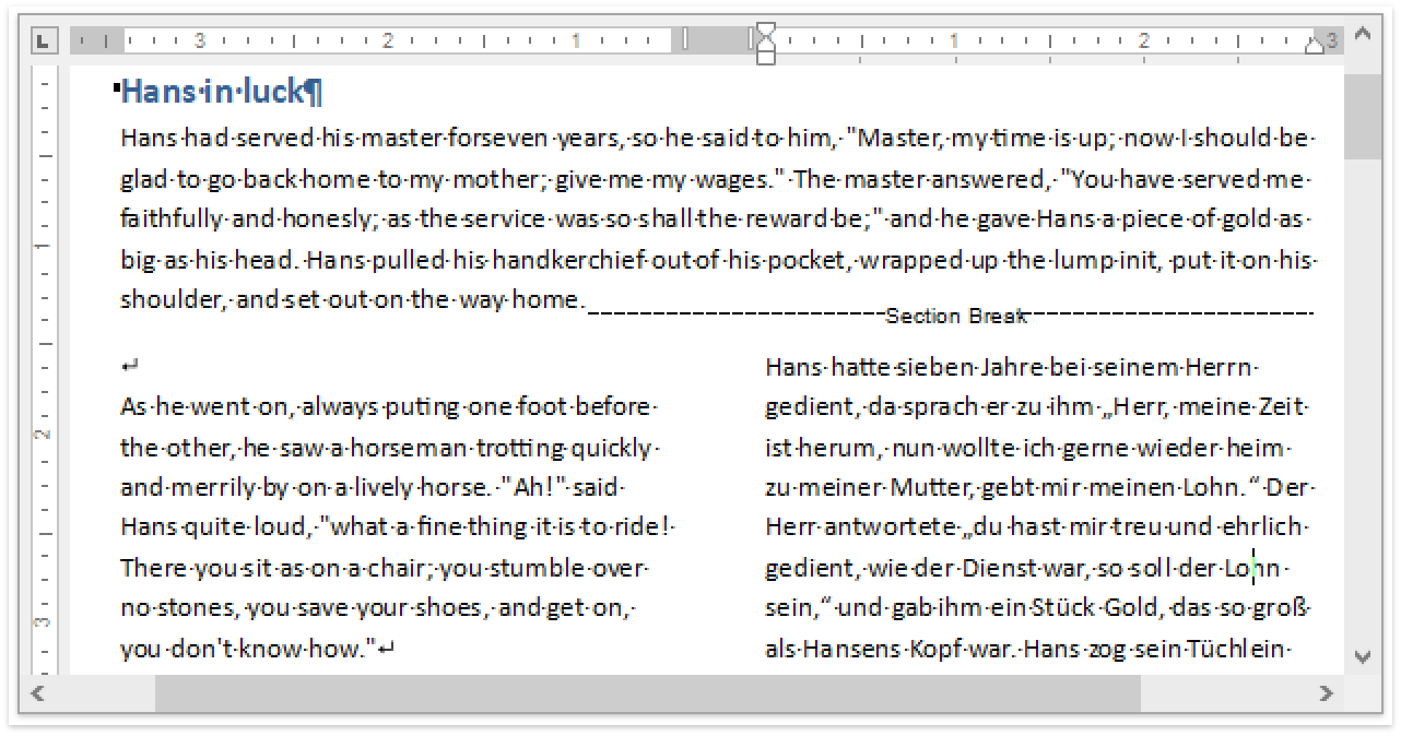
Continuous Section Breaks
In v18.2, the DevExpress RichEdit Control will allow you to load, view, print and export documents with continuous section breaks. You can control this option in code using our implemented API.
Paragraph Options
This release will include a group of new and improved paragraph options:
Widow/Orphan Lines Control
You can now use the Widow/Orphan Control feature to prevent the first or last paragraph line from appearing at the bottom or top of a page.
Keep Lines Together and Keep with Next Options
We have improved our "Keep lines together" option so that it mirrors Microsoft Word. In addition, we’ve introduced a new Use the ParagraphProperties.KeepWithNext option so you can keep multiple paragraphs on the same page.
Paragraph Borders
In version 18.2 you will be able to load/save, display, print and export (to PDF) documents with paragraph borders.
Spreadsheet Control – Synchronization with Office File API features
- Shapes API – You can now programmatically create new shapes, connect and group them, change a shape’s fill and outline settings, add text to a shape, and remove shapes from a document.
- Sparklines - with this release, sparklines can be printed and exported to PDF.

Chart Control Enhancements
Advanced Pane Layout
Diagram Pane items now support a tabular layout mode. Every Pane will have a title element and an expand/collapse button that allows you to maximize a specific chart region. With this feature, it will be easier to build a dashboard-like layout by grouping
Series into separate Panes and maximizing a Series group at runtime.
Crosshair Panel Enhancements
It is now possible to show Indicator data in the Crosshair Panel.
Diagram
RightAngle Connector Splitting
When the DevExpress WinForms Diagram Control calculates routes for RightAngle connectors, it tries to find the closest route from start to finish. This can result in overlaps when multiple connectors originate from the same point. Many of you have asked us to
deliver an alternative solution to help reduce confusion.
In v18.2, we will add an option that allows you to split connectors and define the minimum acceptable distance between them.
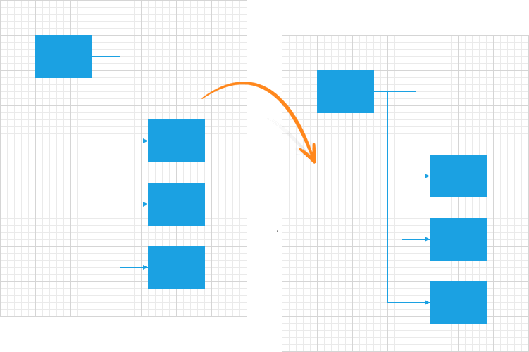
Diagram Viewer
Many of you have asked us to create a Diagram Viewer and give you the ability to display a non-editable diagram – either static, generated in code, or based on a data source. You can currently configure a diagram as read-only, but it does require that
you write some code.
Once we release the Viewer, you will be able to switch to viewing mode and disable all operations that can affect the diagram itself. We will provide a set of options that will help you define allowed operations and automatically hide UI elements that
are not.
Pan & Zoom Window
Diagram Control will be able to display a preview of its content in a separate window where you can change its zoom factor and navigate to a specific area.

Single, Multiple, and None Selection Modes
Currently, the Diagram Control allows you to select multiple items using its selection rectangle or modifier keys (Extended mode). In v18.2, we will introduce additional selection modes:
- None – selection is disabled
- Single – only one item can be selected
- Multiple – multiple items can be selected/deselected by clicking them
Free DevExpress Products - Get Your Copy Today
The following free DevExpress product offers remain available. Should you have any questions about the free offers below, please submit a ticket via the
DevExpress Support Center at your convenience. We'll be happy to follow-up.