Blazor — Year-End 2026 Roadmap (v26.2)

In this blog post, we'll outline Blazor features/capabilities we expect to ship in our year-end release (v26.2 — December 2026). Our key focus areas will be right-to-left support, official release of our Icon Library, and the first set of components for our new styling/layout foundation. As always, you can expect additional enhancements across our entire range of Blazor components.
.NET 11 Support
We will support .NET 11 across our Blazor component suite (v26.2 and v26.1) after November 2026. We will also add support for .NET 11 previews for v26.1 (for early adopter testing). If you'd like to learn more about Blazor-specific enhancements in .NET 11, please review the following Microsoft document: What's New in ASP.NET Core 11.
.NET 10 will be the Minimum Supported Version for DevExpress Libraries in v26.2
As you may know, .NET 8 and .NET 9 will reach end of support on November 10, 2026. We will therefore raise our minimum supported .NET version to .NET 10 once we release v26.2 in December.
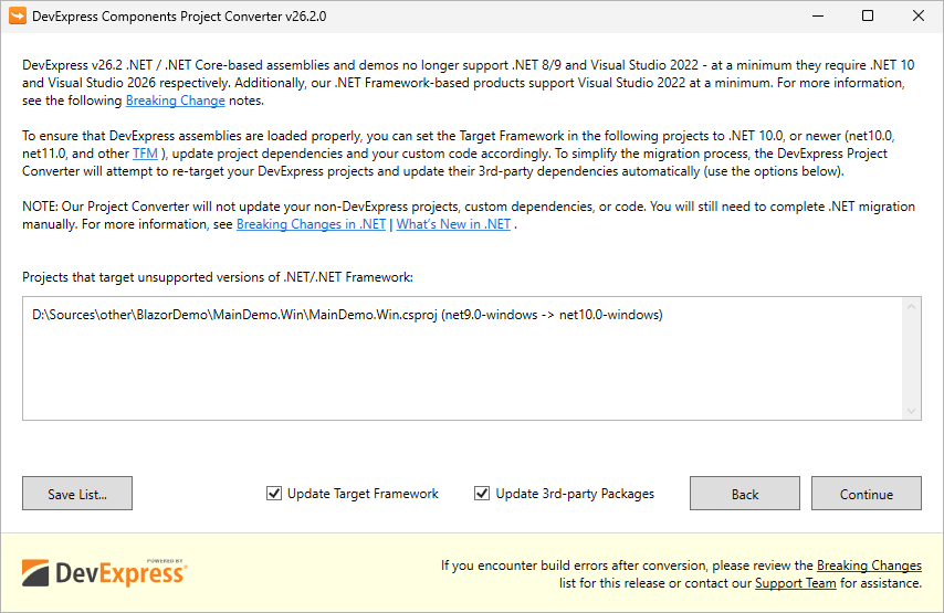
Automatically Re-target DevExpress-based Projects to .NET 10 and Update 3rd Party NuGet Packages
For .NET/.NET Core, we recommend using the DevExpress Project Converter to update all DevExpress-related and third-party project references, packages, and configurations automatically. See also a related Breaking Change notice.
Separate NuGet Packages for Different .NET Versions (.NET 10, .NET 11, etc.)
Today, third-party dependencies are automatically patched after a detected vulnerability (for example, a vulnerability in System.Security.Cryptography.Xml) only for the minimally supported .NET version (today it's .NET 8). Today (with v26.1, v25.2, v25.1, v24.2), manual version pinning (Solutions #1 or #2 from this article) may still be required for .NET 9/10-based projects depending on their exact TFM and project SDK. We will provide .NET-specific dependency groups in DevExpress NuGet packages, which will simplify use of v26.2.
DateTimeOffset Support
We will introduce support for DateTimeOffset values across DevExpress Blazor UI components. Our components will preserve the original offset when displaying, filtering, and grouping these values.
A new global option will allow you to apply or disregard offset values across all Blazor components.
Note: We do not plan to support DateTimeOffset within the DevExpress Blazor Scheduler v26.2. To display appointments in a specific time zone, you can set DataStorage.TimeZone to that zone and convert time values back in the AppointmentUpdating event handler.
Security — SBOMs and CRA Readiness
If you deliver software in the EU, the Cyber Resilience Act (CRA) will require a Software Bill of Materials (SBOM — an inventory of every component inside your solution) as part of your conformity documentation. The CRA and its associated regulatory regime will go into effect on December 2027. Each software application/solution manufacturer must fulfil SBOM-related obligations. DevExpress-authored SBOMs will help customers document/inventory DevExpress libraries used within a DevExpress-powered app.
- Components embedded inside a package. Some DevExpress NuGet packages bundle fonts and third-party JavaScript libraries. Package metadata has no way to declare them, so a scanner never reports them — even though their licenses and vulnerabilities are as real as those of any declared dependency.
- Developer dependencies. Libraries we use to build our products never reach users, so we mark them with
scope: "excluded". We list these libraries regardless, because all vulnerabilities should be documented.
New Blazor App Bar
Much like the command bar in modern Microsoft Office applications, our new Blazor App Bar will serve as an application's "top bar." The App Bar will offer quick access to global commands such as search, account, settings, and theme selection.
Key features will include:
- A title area able to display text, image, or custom content.
- An optional hamburger button.
- Standard items with text, icons, images, tooltips, and enabled/visible states.
- A search item that can expand/shrink within specified width limits.
- An avatar item designed to display an image, initials, or fallback icon (with a dropdown).
- Built-in adaptivity (moves items to an overflow menu when space is limited).
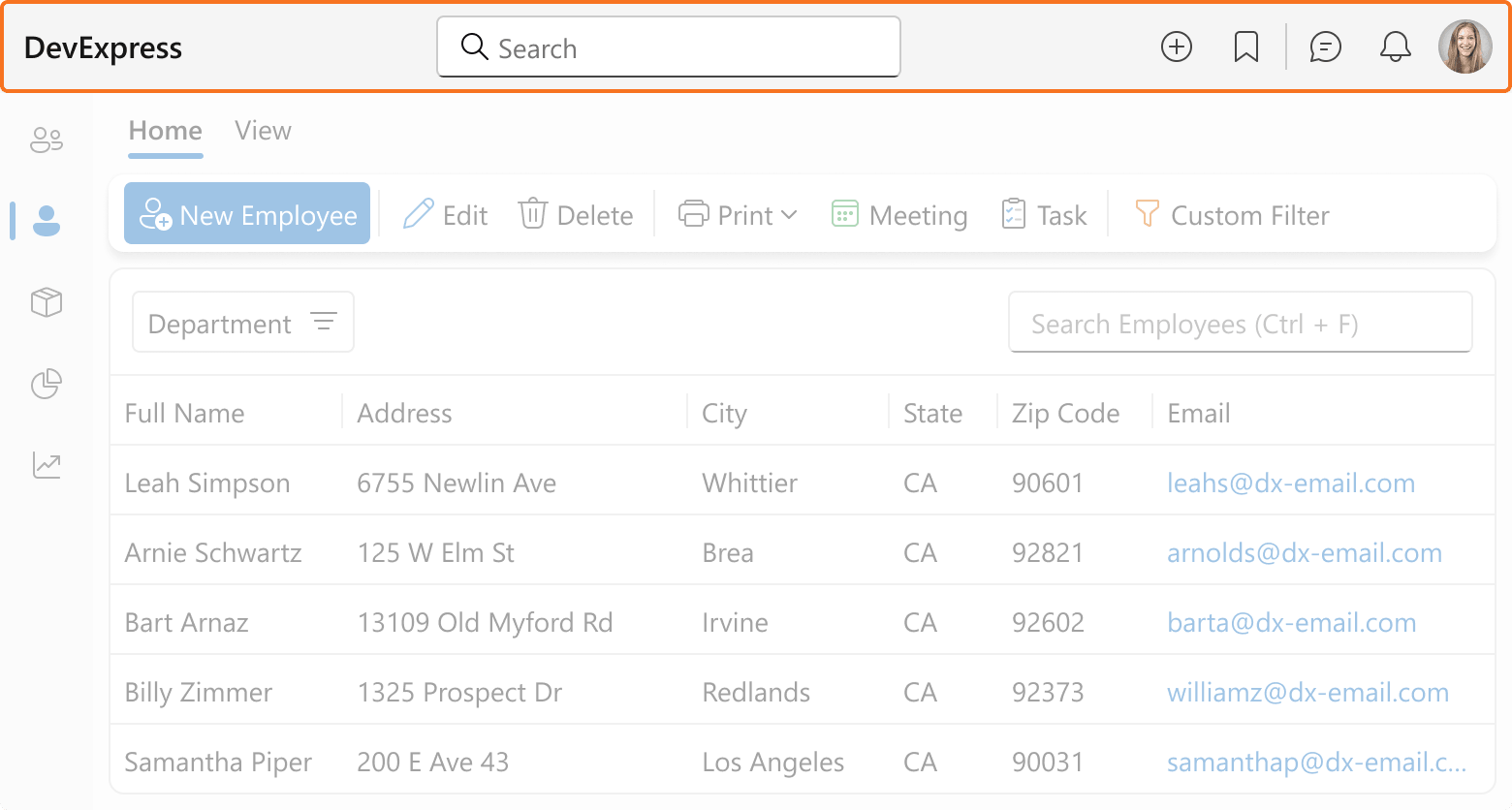 App Bar — Global command strip
New Blazor Side Bar
Applications often include top-level areas with frequently used commands, such as Mail, Calendar, and Contacts. Our new Blazor Side Bar will offer a vertical, icon-based navigation strip inspired by Microsoft Office applications.
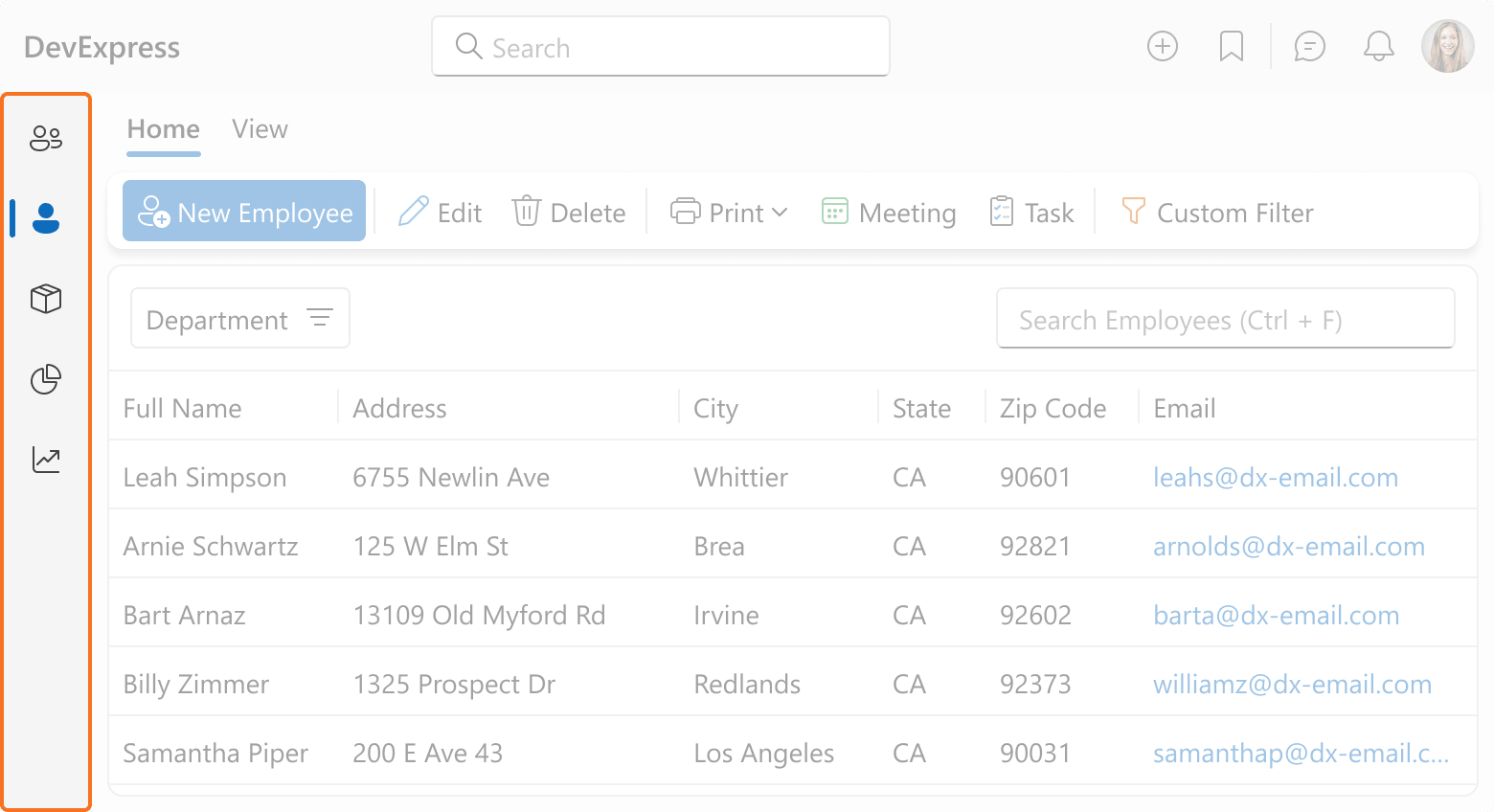 Side Bar — Vertical navigation strip
RTL Support (CTP)
Right-to-left (RTL) support will ship as a Community Technology Preview in v26.2. As with any CTP, functional limitations will apply. We encourage you to test RTL support in your applications and share your feedback as we continue to refine our implementation.
Our initial implementation will address three use cases:
- Switch an entire application to right-to-left layout.
- Build custom RTL UI blocks alongside DevExpress components.
- Keep individual UI blocks (such as phone number and email editors) in left-to-right mode within an RTL application.
We expect to support RTL across most of the DevExpress Blazor suite, including Grid, TreeList, Charts, Pivot Table, Filter Builder, Data Editors, Form Layout, AI Chat, and HTML Editor. The initial scope will also include navigation, layout, and popup components: Menu, Context Menu, Toolbar, Ribbon, Tabs, TreeView, Drawer, Popup, Window, Toast, Flyout, and Drop-Down Buttons.
RTL support will have two important limitations:
- Fluent themes only. RTL support relies on styling capabilities not available in our Classic themes. If you need RTL support, please use a Fluent theme.
- Rich Text Editor excluded. The Blazor Rich Text Editor will not support RTL in v26.2, and RTL support for this component is not currently planned.
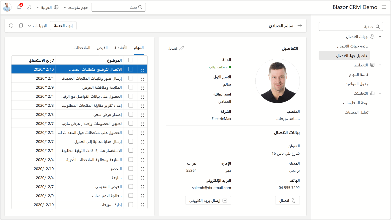 RTL — Application localized for Arabic
Blazor Icon Library — Official Release
The DevExpress Blazor Icon Library (introduced as a CTP in v26.1) will be ready for production use in v26.2. We expect to introduce the following new features and enhancements.
Icon Library Support Across the Suite
You will be able to use library icons across all DevExpress Blazor components with user-defined icon support. We will add the IconUrl parameter to the following components and UI elements:
- Editor Buttons
- Progress Bar
- Toast
- Scheduler Forms
Flexible Icon API
We will extend our icon API so you can specify any combination of icon parameters (style, set, and size). The API will determine unspecified values based on current theme and size mode.
@* finds the most appropriate Delete icon for the current theme / size mode *@
<DxRibbonItem IconUrl="@Icon.Delete" />
@* same as above, but ensures that the Filled icon style is used *@
<DxRibbonItem IconUrl="@Icon.Delete.Filled" />
@* looks for the Fluent icon regardless of the current theme *@
<DxRibbonItem IconUrl="@Icon.Delete.Fluent.Filled" />
Note: The API above is a work in progress and may change before release.
Additional Fluent Icons
We will expand the library's Fluent icon set with 400+ icon metaphors currently available only in our Desktop Classic set.
Public CSS Variable Rework
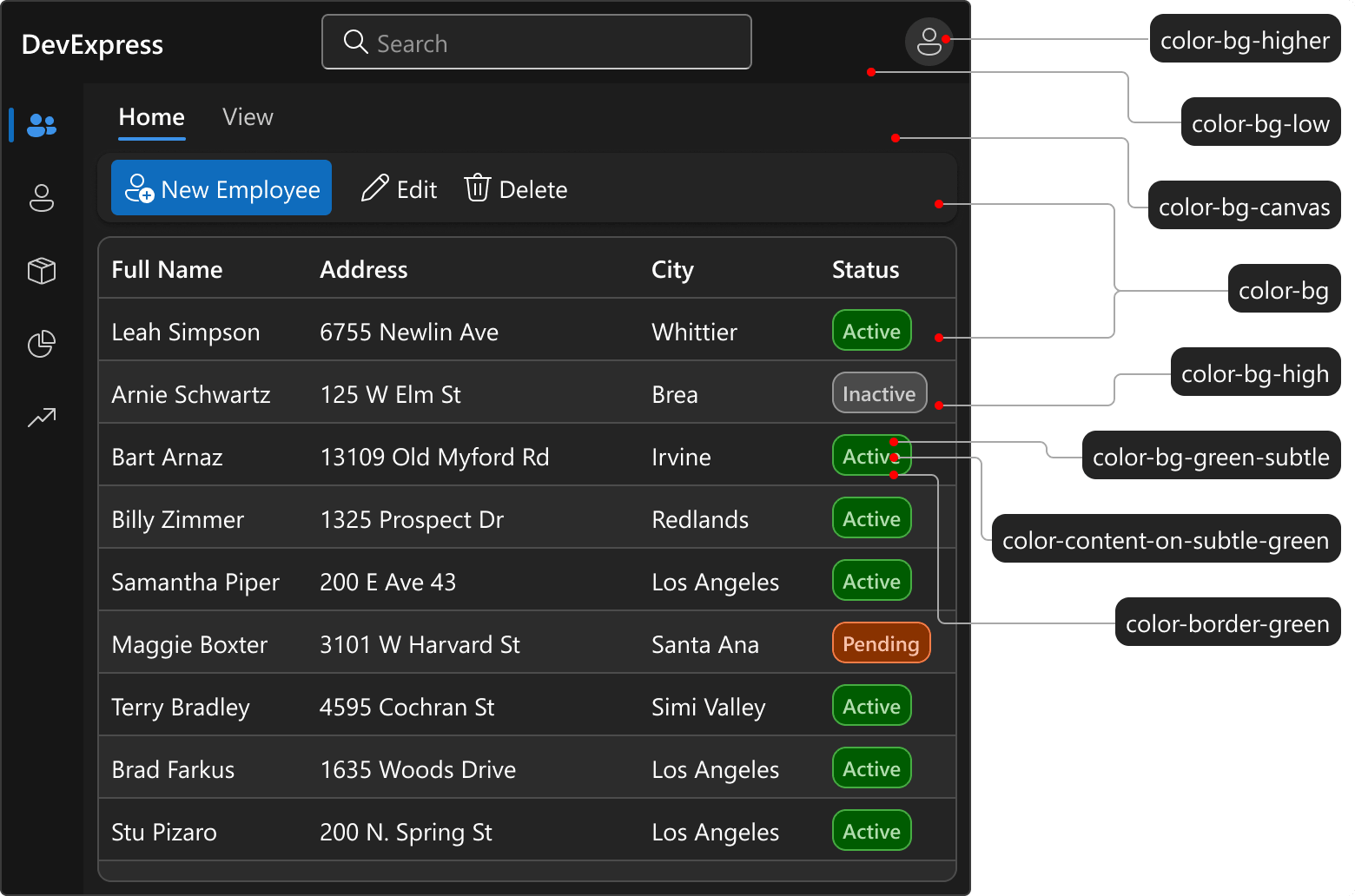
Our Fluent theme exposes its design system as --dxds-* CSS variables. You can override them to restyle DevExpress components, or reference them in your own CSS to align custom styles with the theme.
With v26.2, we plan to rework this variable set with two goals: prepare the design system for future themes (such as Material) and introduce clearer variable names with broader coverage.
Role-Based Names
Variable names will clearly indicate purpose. We will also add variables for surface levels not covered by the current set. The following table lists examples of upcoming changes:
| Current Variable | New Variable | Description |
|---|---|---|
--dxds-color-surface-neutral-default-rest |
--dxds-color-bg |
Default surface background |
--dxds-color-content-neutral-default-rest |
--dxds-color-content |
Default text color |
--dxds-color-surface-neutral-subdued-rest |
--dxds-color-bg-canvas |
Application background behind content surfaces |
--dxds-color-border-neutral-subdued-rest |
--dxds-color-border-subtle |
Low-contrast border color |
--dxds-color-content-utility-blue-subdued-on-surface-rest |
--dxds-color-content-on-subtle-blue |
Text color on a subtle blue surface |
| — | --dxds-color-bg-high |
Background for surfaces above the base level (badges, alternating rows, and chat bubbles) |
| — | --dxds-color-bg-highest |
Background for highest-level surfaces |
 Design Tokens Preview
Automatic Migration
The DevExpress Project Converter will update CSS variable names to their new form automatically when you upgrade to v26.2.
Blazor AI Chat
Built-in Reasoning Visualization
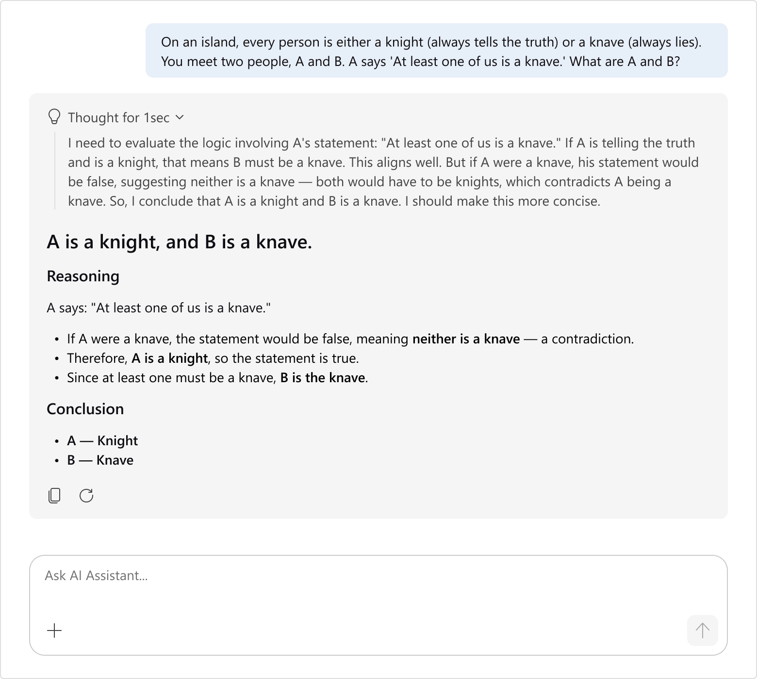
The DevExpress Blazor AI Chat component will automatically display reasoning from supported AI models (no custom template or extra work required). Users can review the model's reasoning, verify that it followed required steps, and identify potential errors before acting on the response.
 AI Chat — Reasoning visualization
Built-in Tool Approval Visualization
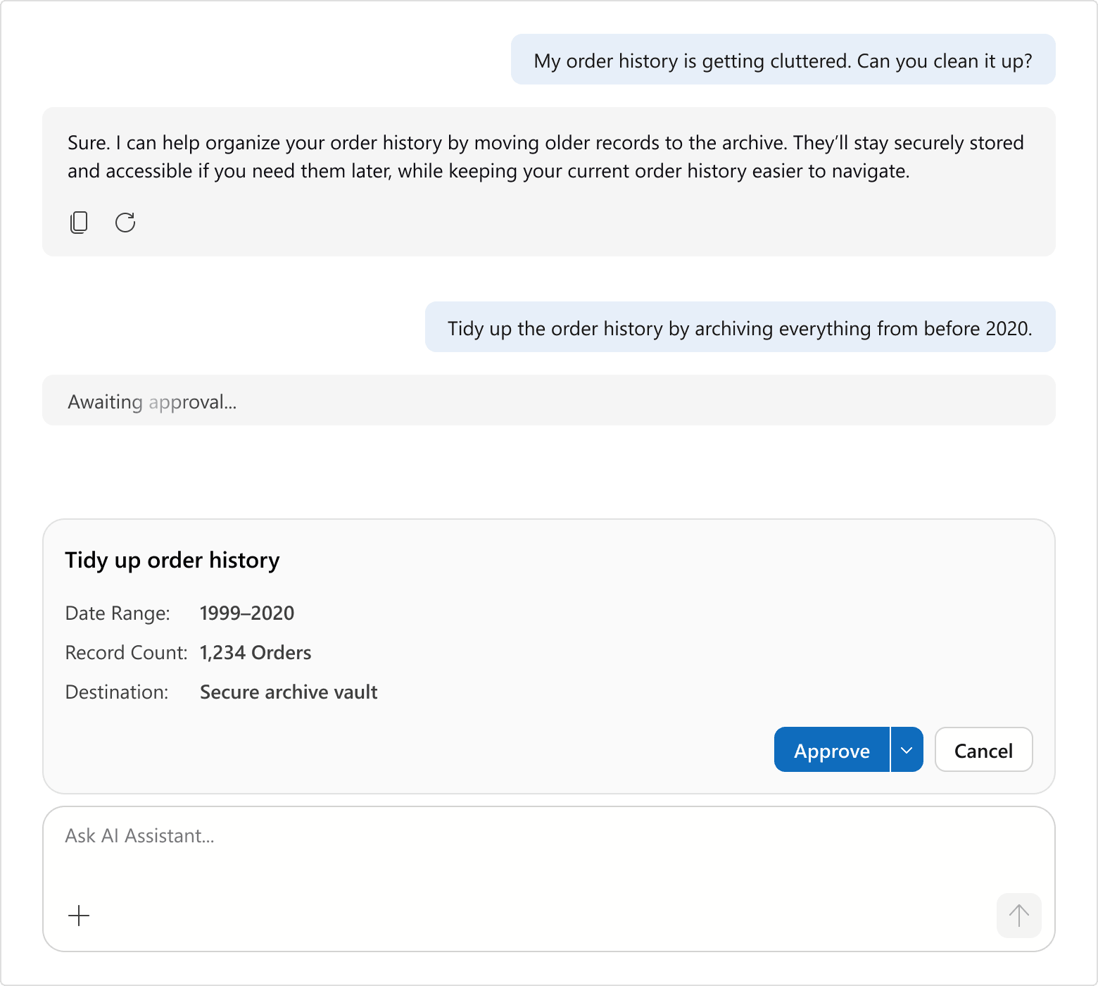
With v26.2, our Blazor AI Chat will include a built-in confirmation interface for human-in-the-loop tool calls (no custom template required). Users can review and approve/reject an operation before it executes — for instance, before an AI agent updates a CRM record or sends a marketing email.
 AI Chat — Tool approval visualization
Pre-Attached Resources
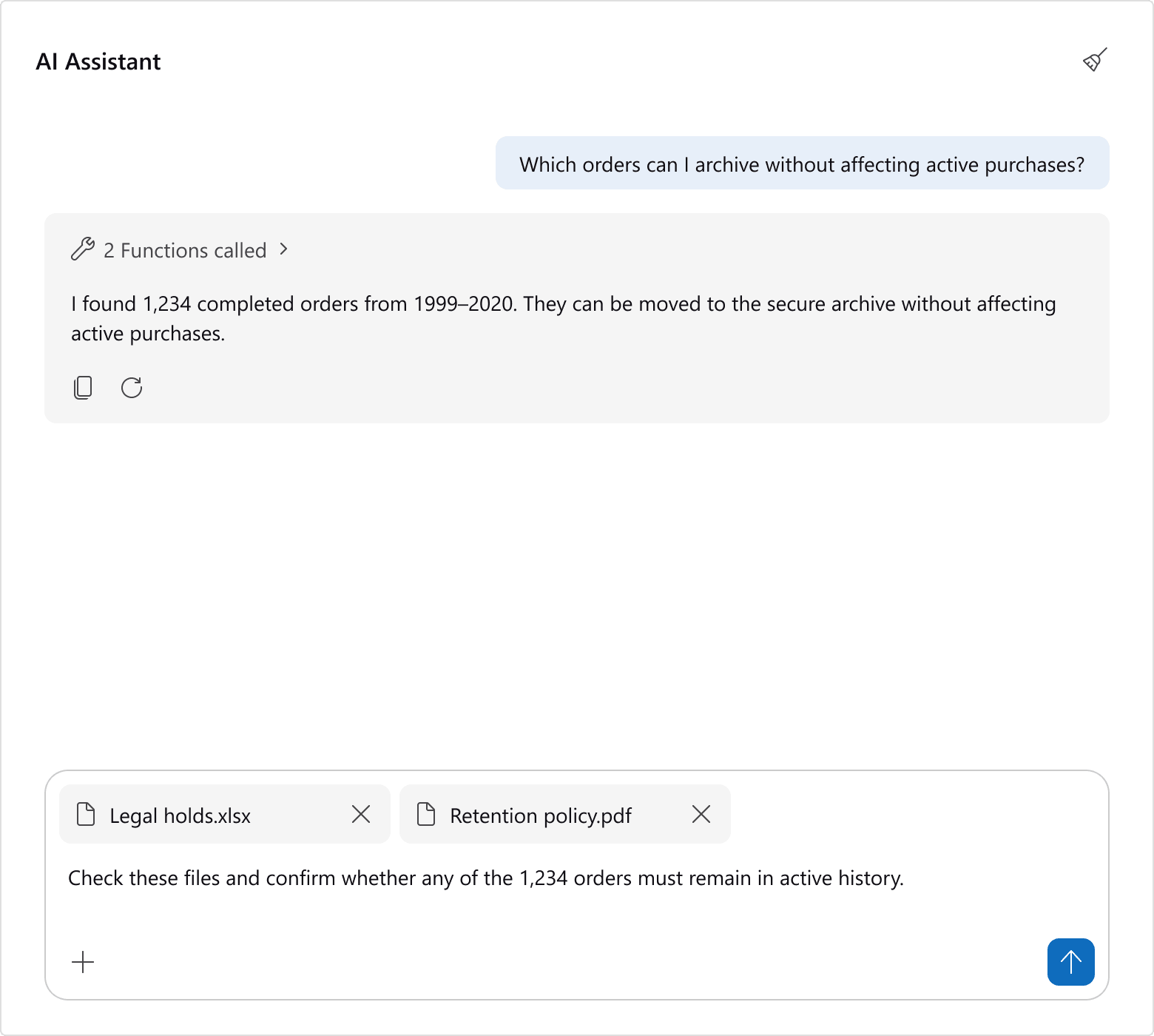
You will be able to pre-attach AIChatResource items to DevExpress Blazor AI Chat in code (so they are available as AI context when the chat session starts). Pre-attached resources will appear alongside manually selected items, and users will be able to add additional resources via the picker or file upload.
Clear History API
A new ClearHistoryAsync method will allow you to clear DevExpress Blazor AI Chat history from code. You can use it to replace the built-in header button with a custom Clear button placed anywhere in your UI.
UI/UX Enhancements
When using DevExpress Fluent themes, our Blazor AI Chat will use fully circular icon buttons and a redesigned Send button. We will refine corner radii for input and prompt areas and introduce more consistent spacing between messages and input elements. Classic themes will remain unchanged.
 AI Chat — UI/UX enhancements
Blazor Grid & TreeList
Filter Row — Criteria Selector Menu
We expect to add a built-in Criteria Selector Menu to both DevExpress Blazor Grid and TreeList components. This menu will allow users to select a filter condition (Contains, Equals, Greater Than, and others) directly in the Filter Row, next to the filter value.
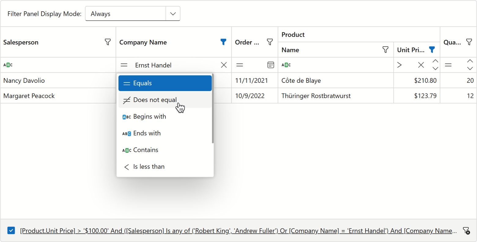 Grid — Filter Row criteria selector menu
Filter Row — On-Input Filter Binding
Filter Row Data Editors will support on-input data binding. In this mode, our Blazor Grid will apply filters as users enter text (no need to press Enter). We expect to add the same capability to the DevExpress Blazor TreeList component.
Built-in Toolbar Items
We expect to add the following toolbar items to our Blazor Grid and TreeList:
- Column Chooser
- Export Buttons (CSV, PDF, XLS, and XLSX)
- Search Box
Continuous Cell Editing
Our new Grid/TreeList EditNextCellOnEnter property activates editing of the next cell on Enter (one fewer keystroke to enter edit mode). This option is available when the EnterKeyDirection property is set to Column or Row.
Combine the property with EnterKeyDirection to choose whether Enter moves across a row or down a column. Activate EditOnKeyPress to allow users to start editing by typing.
Striped Rows
We plan to introduce an option that highlights alternating (odd) rows in DevExpress Blazor Grid and TreeList components with a different style.
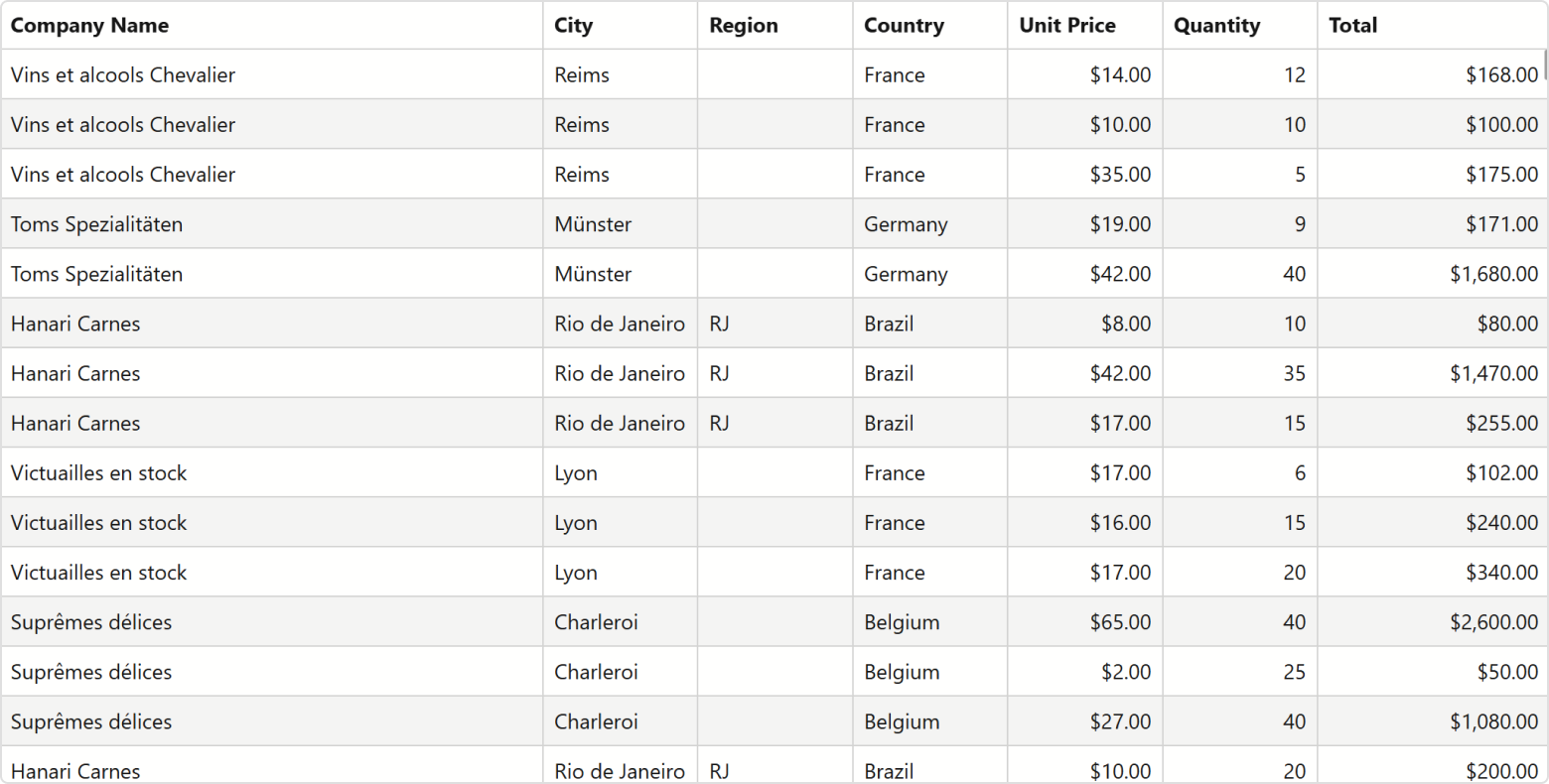 Grid — Striped rows
Custom Row Height
We expect to add a minimum row height setting for our Blazor Grid and TreeList UI components. Use it to increase/decrease row spacing and adjust visual density.
Blazor TextBox — Password Button
The DevExpress Blazor TextBox will include a built-in button to display/hide a password. Users will be able to verify the value they entered.
Blazor Form Layout
New Caption Position Mode
Our Blazor Form Layout will include an option to always display captions horizontally, regardless of available space.
Tab Management API
New API members will allow you to position tab headers and manage tab pages in the DevExpress Blazor Form Layout at runtime:
TabsPosition— Specifies tab header position.AllowClose,AllowTabReorder— Allow users to close and reorder tabs.TabClosing,TabReordering— Allow you to handle tab closing/reordering actions.TabPageEnabled— Allows you to disable a tab page.
Localization / Globalization
Improved Localization Support with AI-powered Translations
We expect to ship complete built-in localizations for a selected set of languages in the new DevExpress Localization Tool. Professional translators have already translated and reviewed approximately 80% of our German localization. To broaden language coverage while maintaining translation quality, we plan to leverage AI-powered translation workflows. The workflow will not rely on direct translation alone - it will also consider additional context:
- Usage context - how each string is used, collected from our source code.
- Established Microsoft terminology (obtained from the Microsoft Terminology Collection).
Web Localization Service — Supported Versions Limited to v23.2+
User translations for v23.1 and earlier releases will no longer be available through the Localization Service UI (view, edit, download, create). These translations will be retained by DevExpress should you require them. You can request your old translation archives via the DevExpress Support Center.
Product-Tailored AI Skill Updates
We expect to extend and update the DevExpress AI Agent Skills repository based on user feedback (for multiple implementation tasks and AI coding assistants, such as GitHub Copilot, Claude Code, Cursor, and JetBrains AI Assistant).
The repository includes folders for different DevExpress products. Navigate to the dx-blazor directory to locate Blazor-specific AI Agent Skills coding assistants with built-in knowledge of Blazor components, its capabilities, related APIs, best practices, and code examples.
Blazor 2026 Strategy — Status Update
Our v26.1 roadmap outlined several strategic directions for 2026, including areas where we needed additional groundwork before committing to a specific release.
Icon Library
The first phase shipped in v26.1, when we introduced the DevExpress Blazor icon library as a CTP. In v26.2, the library will ship officially with a more flexible API, broader component coverage, and an expanded Fluent icon set.
RTL Support
RTL support did not ship in v26.1, but remained part of our 2026 plans. It will ship as a Community Technology Preview in v26.2.
Styling and Layout Foundations
The App Bar and Side Bar will address application-level navigation, while the CSS variable rework will make customization and styling more flexible. DevExpress CSS helper classes and the lightweight primitive components we described earlier this year (Card, Badge, Avatar) will not ship in v26.2. We plan to revisit them in a future release.
In the meantime, you can use public CSS variables from the DevExpress Design System to create custom CSS classes that match our Fluent theme. The following example demonstrates this approach: Blazor — Create Primitive CSS Classes Using Public CSS Variables.
New Themes
Our v26.1 roadmap discussed two options for new modern themes: Material and a classic-inspired theme for customers who prefer a look and feel closer to Blazing Berry. We plan to start with Material and currently target 2027 for its release.
Material will not ship in v26.2 because it depends on the CSS variable rework described above. Once we complete this work, we will be able to build Material — and future themes — on the same foundation.
Classic Themes
Blazing Berry, Office White, Purple, Blazing Dark, and our Bootstrap-based themes will remain available. We will not deprecate or remove them until our modern theme lineup offers a suitable range of alternatives. Fluent already offers an alternative in some cases, and we plan to introduce additional modern themes in future releases. Classic themes will not receive new styling capabilities or support right-to-left layout.
Pivot Table & Pivot Grid
We plan to start working on chart integration and drill-down support for the DevExpress Blazor Pivot Table. While we cannot yet commit to either feature for v26.2, we will continue to ship our older Pivot Grid component. Once our Blazor Pivot Table supports both these features, we will deprecate the older Pivot Grid component.
Security
Our v26.1 roadmap included plans to introduce SBOMs for DevExpress Blazor packages. We released these as a preview in May 2026 and plan to make them generally available in v26.2.
We continue to monitor third-party dependencies for vulnerabilities and apply updates promptly. We are also improving how we audit and manage these dependencies and conduct security testing throughout development. Our security documentation describes these practices in detail.
Accessibility
v26.1 delivered over 45 accessibility enhancements across our Blazor components, including Windows high-contrast mode support in our Fluent themes, screen reader support for the Rich Text Editor, and broader ARIA support and keyboard navigation across the suite. v26.1 What's New includes the full list.
For v26.2, both our Blazor App Bar and Side Bar will include keyboard navigation support, ARIA roles, and high-contrast mode in their first release.
Performance
v26.1 delivered performance improvements across our Blazor component libraries, including significant optimizations to the DevExpress Blazor Grid. The performance demo now handles one million rows and one thousand columns. v26.1 What's New lists these optimizations.
We plan additional performance improvements in v26.2 but do not have specific details to share as of the date of this post.
Your Feedback Matters
If you have questions or suggestions about the plans outlined above, feel free to share your thoughts in the survey below or submit a support ticket via the DevExpress Support Center.
