WPF — Year-End Roadmap (v26.2)

Thank you for your continued support and for sharing your WPF development needs with us. In this blog post, I'll outline the WPF features and enhancements we expect to ship in our year-end release (v26.2 — December 2026).
The roadmap focuses on two areas: a modern, Fluent-based look and feel for WPF applications, and broader AI-assisted development capabilities. We also plan to deliver enhancements across other WPF controls and features, including native DateTimeOffset support and new Data Grid customization options.
.NET 11 Support
DevExpress WPF controls will support .NET 11 (both v26.1 and v26.2) following Microsoft's official release.
Minimum Supported .NET and Visual Studio Versions
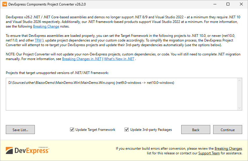
Automatically Re-target DevExpress-based Projects to .NET 10 and Update 3rd Party NuGet Packages
For .NET/.NET Core, we recommend using the DevExpress Project Converter to update all DevExpress-related and third-party project references, packages, and configurations automatically. See also a related Breaking Change notice.
Separate NuGet Packages for Different .NET Versions (.NET 10, .NET 11, etc.)
Today, third-party dependencies are automatically patched after a detected vulnerability (for example, a vulnerability in System.Security.Cryptography.Xml) only for the minimally supported .NET version (today it's .NET 8). Today (with v26.1, v25.2, v25.1, v24.2), manual version pinning (Solutions #1 or #2 from this article) may still be required for .NET 9/10-based projects depending on their exact TFM and project SDK. We will provide .NET-specific dependency groups in DevExpress NuGet packages, which will simplify use of v26.2.
Security — SBOMs and CRA Readiness
If you deliver software in the EU, the Cyber Resilience Act (CRA) will require a Software Bill of Materials (SBOM – an inventory of every component inside your solution) as part of your conformity documentation. The CRA and its associated regulatory regime will go into effect on December 2027. Each software application/solution manufacturer must fulfil SBOM-related obligations. DevExpress-authored SBOMs will help customers document/inventory DevExpress libraries used within a DevExpress-powered app.
- Components embedded inside a package. Some DevExpress NuGet packages bundle fonts and third-party JavaScript libraries. Package metadata has no way to declare them, so a scanner never reports them — even though their licenses and vulnerabilities are as real as those of any declared dependency.
- Developer dependencies. Libraries we use to build our products never reach users, so we mark them with
scope: "excluded". We list these libraries regardless, because all vulnerabilities should be documented.
WCF Dependency Will Be Removed from XPO and Printing Core Libraries
These core libraries currently include references to WCF (Windows Communication Foundation), a standard library with a well-documented history of vulnerability disclosures in its dependencies ("thanks" to System.Security.Cryptography.Xml). We will remove these WCF references from DevExpress.Xpo core and DevExpress.Printing.Core libraries in v26.2. .NET Framework users will use the new DevExpress.Xpo.Services and DevExpress.Printing.Remote libraries instead (if you need this advanced and rarely used WCF functionality). The Project Converter will update project references automatically, so you should not encounter upgrade-related issues.
Fluent Theme and Modern Application UI
A major focus for our next major release (v26.2) is a modern, Windows 11-based appearance for all DevExpress-powered WPF applications. Our implementation involves a new Fluent Theme, Mica material support, modernized Accordion Control, and a Fluent icon set.
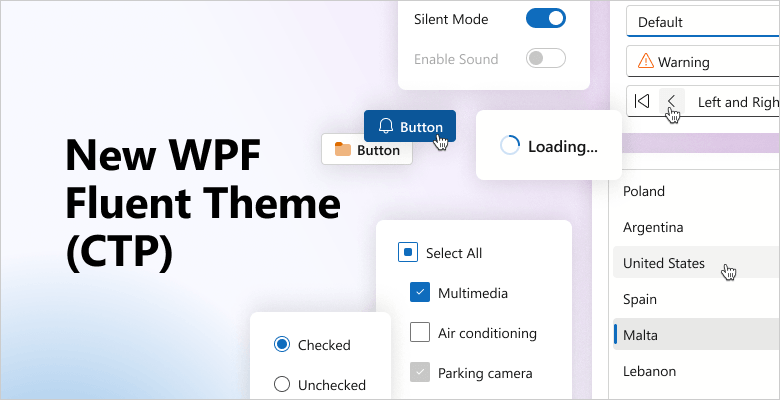
WPF Fluent Theme (CTP)
With v26.2, we will add Fluent Theme support to our WPF Grid Control, WPF Property Grid, Dock Layout Manager, Themed Window, and other major DevExpress WPF component libraries.
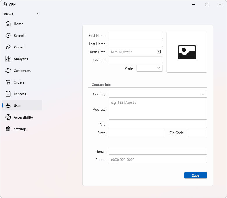
Mica Window Support
Our ThemedWindow will support Mica material. Navigation controls and Ribbon tabs will render transparently to reveal the window's Mica effect and reproduce the look and feel of Microsoft Office applications.
Accordion Control — A Modern Appearance
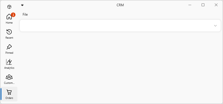
The DevExpress WPF Accordion Control will ship with a modern appearance designed to match layouts found in Microsoft Teams, Microsoft Store, and other apps. Capabilities will include:
- Teams-like compact view mode.
- Badge support in both expanded and collapsed states.
- Filled or custom glyphs for selected and hovered states.
- Item switch animation.
These capabilities will be available in our Template Kit.
Fluent Icons
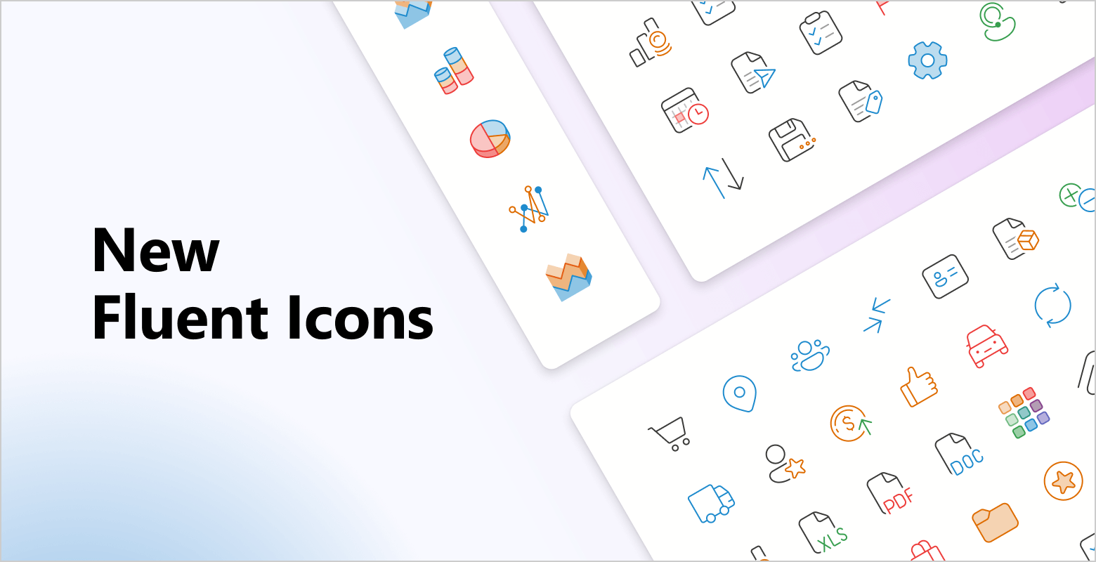
We will continue to extend our Fluent Icon set and integrate it across our WPF control library.
Global Switch
You will be able to switch to the Fluent Icon set across all DevExpress WPF controls. A public API will let you control the SVG image used for each icon, and a global option will switch the icon set app-wide. The new icons will be used in our demos and the Template Kit.
Comprehensive Icon Library
The DevExpress Icon Library includes more than 13,000 icons, and we'll continue expanding it with additional Fluent assets to support additional usage scenarios. To simplify navigation, we will group icons by the following attributes:
- Set — Fluent, Desktop Classic, Blazor
- Style — Regular, Filled
- Color — Monochrome, Multicolor
- Size — 16, 20, 24, 28, 32, and 48 (different sizes ensure that lines aren't too thick when SVG icons are scaled)
These icons and settings will be available at design time in our enhanced Image Picker.
Size-Based Image Selection
AI Chat Control
Workflow Visualization Support
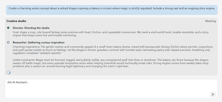
Beyond single-agent chat, we hope to introduce built-in visualizations for multi-step workflows when using our WPF AI Chat control. A single workflow can include multiple agents, parallel steps, tool calls, and tool-approval requests. The visualization will display details for each step, so users can follow the process.
AG-UI Demos
Agent–User Interaction (AG-UI) is an event-based contract between an AI agent and the user interface. Beyond plain text, it carries tool calls, state snapshots, state deltas, approvals, and activity events.
We will ship a set of WPF demos you can use as a starting point for your own application. The demos will highlight the following capabilities of our WPF AI Chat Control when connected to an AG-UI backend:
- Visualized tool-call results — backend tool-call results appear as structured UI instead of raw text.
- Interactive multi-step flows — the agent guides the user through a multi-step process and renders interactive elements at each step.
- Human-in-the-loop actions — the agent prepares an action, such as placing an order, but runs it only after the user approves, edits, or rejects it.
- Interaction with view components — the agent reads and updates the state of view components outside the chat control.
Appearance Customization
Currently, WPF styles cannot modify our AI Chat Control's internal elements. With our next release, the control will expose an API to override appearance resources.
Agent Skills
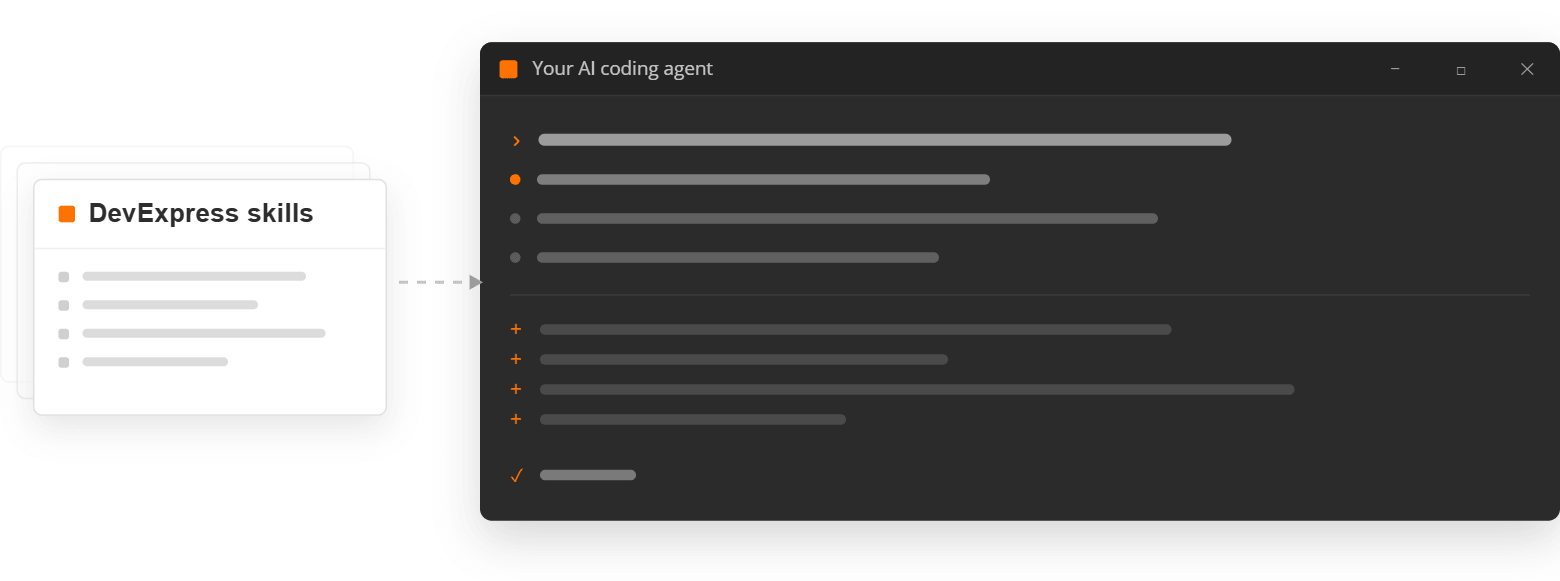
We are developing enhanced AI agent skills to help you build DevExpress WPF applications using AI coding agents (such as Claude Code and GitHub Copilot). The skills will encode DevExpress best practices for architecture, performance, accessibility, and other common development tasks. Our initial skill catalog will include:
- Appearance Customization — modify a control's appearance using built-in APIs or overridden theme resources.
- UI Automation Test Creation — write UI Automation tests.
- Accessibility Remediation — audit a view and apply accessibility fixes.
- Performance Optimization — apply performance best practices.
- Dependency Injection Integration — introduce DI into a project.
- MVVM Framework Implementation — implement MVVM design patterns using the DevExpress MVVM Framework.
DateTimeOffset Support
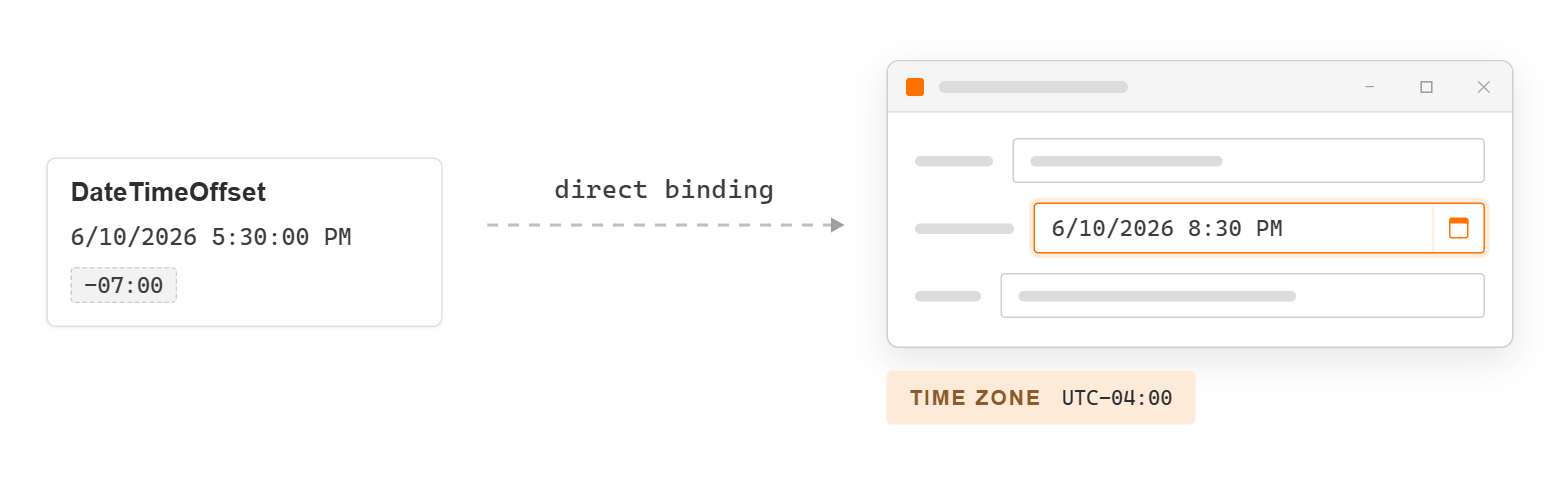
We will support DateTimeOffset in core DevExpress controls to eliminate manual conversion of DateTimeOffset to DateTime when working with local time zones. You will be able to specify the time zone and conversion to a local date will occur automatically. In this mode, users will see a simple date/time value without the offset portion (as if it were a DateTime object).
DateTimeOffset offers the following advantages compared to DateTime:
Local and global time support: Suitable for usage scenarios that require both local machine time and UTC (such as logging systems).
Clear semantics: The
DateTime.Kindproperty is not serialized (which can lead to incorrect usage).DateTimeOffsetalways includes an offset (for example, 6/10/2025 5:30:00 PM -07:00).Web service compatibility: Many services return dates as
DateTimeOffset. Once supported, conversion to DateTime will no longer be required.
WPF Data Grid
Validation Icon Customization
Data Grid cells/rows can display error icons when values fail validation. New customization properties will allow you to replace the validation icon or modify its size and margin.

Separator Customization
Our Data Grid will expose dedicated brush and thickness properties for cell separators. You will be able to set specific columns apart with a distinct separator or match separator appearance to your application's visual style.

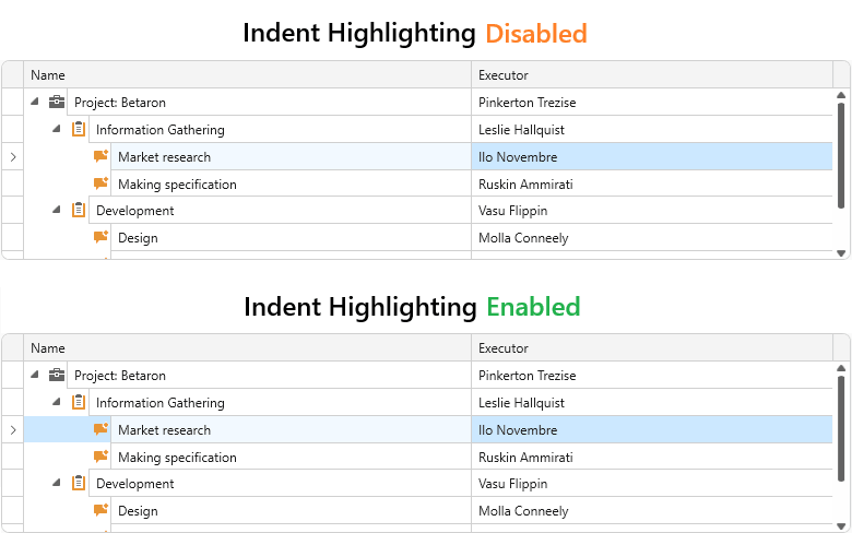
WPF Tree List Indent Highlighting
Once you enable indent-highlight, the DevExpress WPF Tree List will highlight the node indent region when focused. This visual cue makes the active node easier to track in a deep hierarchy.
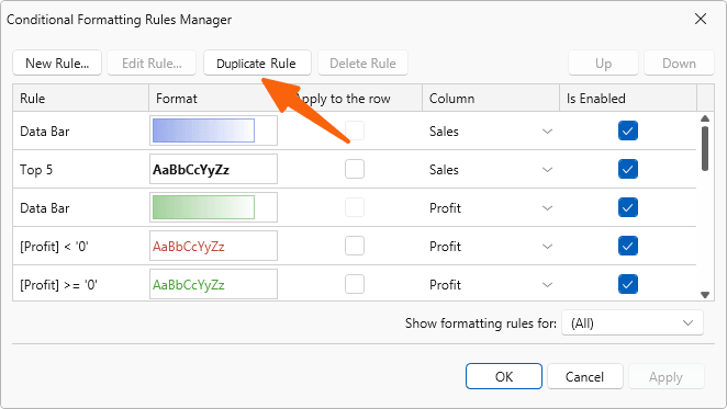
Duplicate Conditional Formatting Rules
When our WPF Data Grid includes many columns, applying similar conditional formatting rules to multiple columns is time-consuming. We will add a Duplicate command to Conditional Formatting Rules Manager (to simplify rule reuse without recreating them from scratch).
DXTabControl — Delayed Tab Caching
Interfaces with many tabs often require a tradeoff between startup time and tab-switch performance. Caching all tabs at once slows initial startup, while caching each tab on first use delays the first switch to that tab. We'll add delayed caching to load and cache remaining tabs asynchronously after the first tab appears on-screen.
Localization / Globalization
Improved Localization Support with AI-powered Translations
We expect to ship complete built-in localizations for a selected set of languages in the new DevExpress Localization Tool. Professional translators have already translated and reviewed approximately 80% of our German localization. To broaden language coverage while maintaining translation quality, we plan to leverage AI-powered translation workflows. The workflow will not rely on direct translation alone - it will also consider additional context:
- Usage context - how each string is used, collected from our source code.
- Established Microsoft terminology (obtained from the Microsoft Terminology Collection).
Web Localization Service — Supported Versions Limited to v23.2+
User translations for v23.1 and earlier releases will no longer be available through the Localization Service UI (view, edit, download, create). These translations will be retained by DevExpress should you require them. You can request your old translation archives via the DevExpress Support Center.
