As you may know, we recently introduced an entirely new DevExpress Blazor Grid component in June (available as a CTP version). We continue to improve the capabilities of our new grid and expect to reproduce all the functionality supported by our existing Blazor data grid in short order.
This post summarizes the new features/enhancements we’ve made to the DevExpress Blazor Grid in our most recent minor release (v21.1.5).
If you're ready to switch to the new Grid component right now, please refer to this
migration guide.
Filter Row
Our Blazor Grid now ships with filter row support – a quick and easy way to incorporate data filtering within your Blazor app. This row displays in-place text editors for all data columns within a given Grid. When a user moves focus into the filter row’s editor, the Grid creates a filter condition based on editor value and applies this condition to the corresponding column.
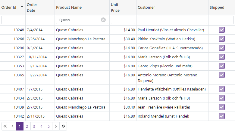
To activate the filter row, enable the ShowFilterRow option.
<DxGrid Data="@DataSource"
        ShowFilterRow="true">
  @*...*@
</DxGrid>
Documentation | Demo
Customization
We added the following new options to help you customize our Blazor Grid's filter row:
- FilterRowOperatorType - Specifies the operator used to create a filter condition based on filter row value (Equals, Contains, StartsWith, Greater, Less, and so on).
- FilterRowValue - Specifies the initial value in the filter row editor.
- FilterRowEditorVisible - Specifies whether to display the filter row editor.
You can also display your custom editor within a filter row cell (instead of our predefined text editor). To display a custom editor, define a column's FilterRowCellTemplate.
<DxGrid Data="@Data"
        ShowFilterRow="true">
  <Columns>
    <DxGridDataColumn FieldName="OrderId" DisplayFormat="d" SortIndex="0">
      <FilterRowCellTemplate>
        <DxSpinEdit Value="(int?)context.FilterRowValue"
                    ValueChanged="(int? v) => context.FilterRowValue = v"
                    ClearButtonDisplayMode="DataEditorClearButtonDisplayMode.Auto" />
      </FilterRowCellTemplate>
    </DxGridDataColumn>
    <DxGridDataColumn FieldName="OrderDate" DisplayFormat="d">
      <FilterRowCellTemplate>
        <DxDateEdit Date="(DateTime?)context.FilterRowValue"
                    DateChanged="(DateTime? v) => context.FilterRowValue = v"
                    ClearButtonDisplayMode="DataEditorClearButtonDisplayMode.Auto" />
      </FilterRowCellTemplate>
    </DxGridDataColumn>
    <DxGridDataColumn FieldName="ProductName"
                      FilterRowValue='"Queso"'
                      FilterRowOperatorType="GridFilterRowOperatorType.Contains" />
    @*...*@
  </Columns>
</DxGrid>

Documentation | Demo
Filter in Code
You can now set filter options in code. Call the FilterBy method to filter Grid data and the ClearFilter method to reset the applied filter.
<DxGrid Data="@Data"
        ShowFilterRow="true"
        @ref="MyGrid">
  <Columns>
    @*...*@
    <DxGridDataColumn FieldName="UnitPrice" DisplayFormat="c2" />
  </Columns>
</DxGrid>

<DxButton Click="@(() => MyGrid.FilterBy("UnitPrice",
GridFilterRowOperatorType.Equal, 12))">Filter By "Unit Price"</DxButton>
<DxButton Click="@(() => MyGrid.ClearFilter())">Clear Filter</DxButton>

@code {
  object Data { get; set; }
  IGrid MyGrid { get; set; }
  // ...
}
Command Column
Our Blazor Grid now includes a new column type - command. At present, this new command column will only display a Clear button in the filter row. Users can click this button to reset the filter applied to the Grid.
We will extend the command column's functionality to support data management buttons – used to create, edit, and remove data rows.

To display a command column, declare a DxGridCommandColumn object within the Columns template.
<DxGrid Data="@Data"
        ShowFilterRow="true">
  <Columns>
    @*...*@
    <DxGridCommandColumn />
  </Columns>
</DxGrid>
You can also display custom content within the column's filter row cell. To do custom content, define the FilterRowCellTemplate.
Documentation | Demo
API Changes
Our Blazor Grid now includes two types of columns: data and command columns.
We made the following API changes to avoid confusion with column names:
- To add a data column to the Grid, you should now use the DxGridDataColumn class instead of the DxGridColumn class.
- The DxGridColumn is now labeled as an
abstractclass because it contains the base API for both data and command columns.
We've also renamed the following templates:
Group Footer Summary
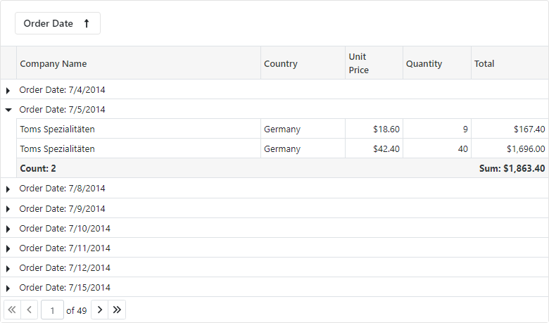
With v21.1.5, you can display group summary values in group footers. To display summary values in group footers, set the summary item's FooterColumnName property to the name of a group footer column.
<DxGrid Data="@Data"
        ShowGroupPanel="true">
  <Columns>
    @*...*@
  </Columns>
  <GroupSummary>
    <DxGridSummaryItem SummaryType="GridSummaryItemType.Sum"
                        FieldName="TotalPrice"
                        FooterColumnName="TotalPrice" />
  </GroupSummary>
</DxGrid>
Documentation | Demo
Group Footer Templates
Our Blazor Grid now includes the DxGridColumn.GroupFooterTemplate and DxGrid.ColumnGroupFooterTemplate properties. These properties allow you to customize group footers as requirements dictate.
Group Footer Display Mode
By default, our Blazor Grid will display group footers when the corresponding groups are expanded and contain either summary values or custom template content.
You can now modify the manner in which group footers are displayed by defining the new GroupFooterDisplayMode property. Simply use one of the following options: Always , Never , or IfExpanded.
<DxGrid Data="@Data"
        ShowGroupPanel="true"
        GroupFooterDisplayMode="GridGroupFooterDisplayMode.Always">
  @*...*@
</DxGrid>
For consistency, we also renamed the ShowFooter option to FooterDisplayMode so it closely matches GroupFooterDisplayMode. The FooterDisplayMode property allows you to manage the visibility of the Grid's footer section.
Column Name
We also introduced a Name property for all Grid columns. Use this property to specify a unique identifier for a given column (once named, use it to reference the column when creating total or group summaries).
This property will be helpful for columns where the FieldName property is not specified (command columns or data columns with custom display templates).
Free DevExpress Products - Get Your Copy Today
The following free DevExpress product offers remain available. Should you have any questions about the free offers below, please submit a ticket via the
DevExpress Support Center at your convenience. We'll be happy to follow-up.