.NET MAUI — Early Access Preview (v23.2)

Our next major release (v23.2) is a couple of months away. In this post, I'll describe new features we included in our Early Access Preview (EAP) build. See also full .NET MAUI — Year-End Roadmap (v23.2).
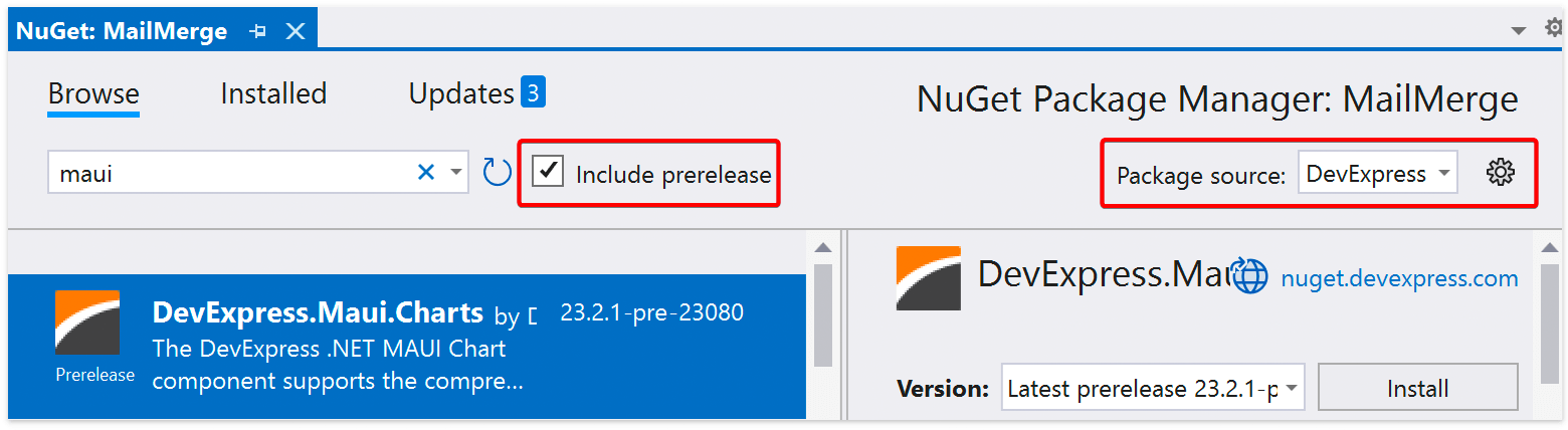
If you own an active Universal Subscription, feel free to install our .NET MAUI EAP packages at your convenience from NuGet. Make certain to check the “Include prerelease” option within NuGet Package Manager.
As always, we welcome your feedback. Should you encounter issues with the EAP or would like to share your EAP-related thoughts with us, simply create a new DevExpress Support Center ticket. We’ll be happy to follow up.
Early Access and CTP builds are provided solely for early testing purposes and are not ready for production use. This build can be installed side by side with other major versions of DevExpress products. Please backup your project and other important data before installing Early Access and CTP builds.
This EAP may not include all features/products we expect to ship in our v23.2 release cycle. As its name implies, the EAP offers an early preview of what we expect to ship in two months.
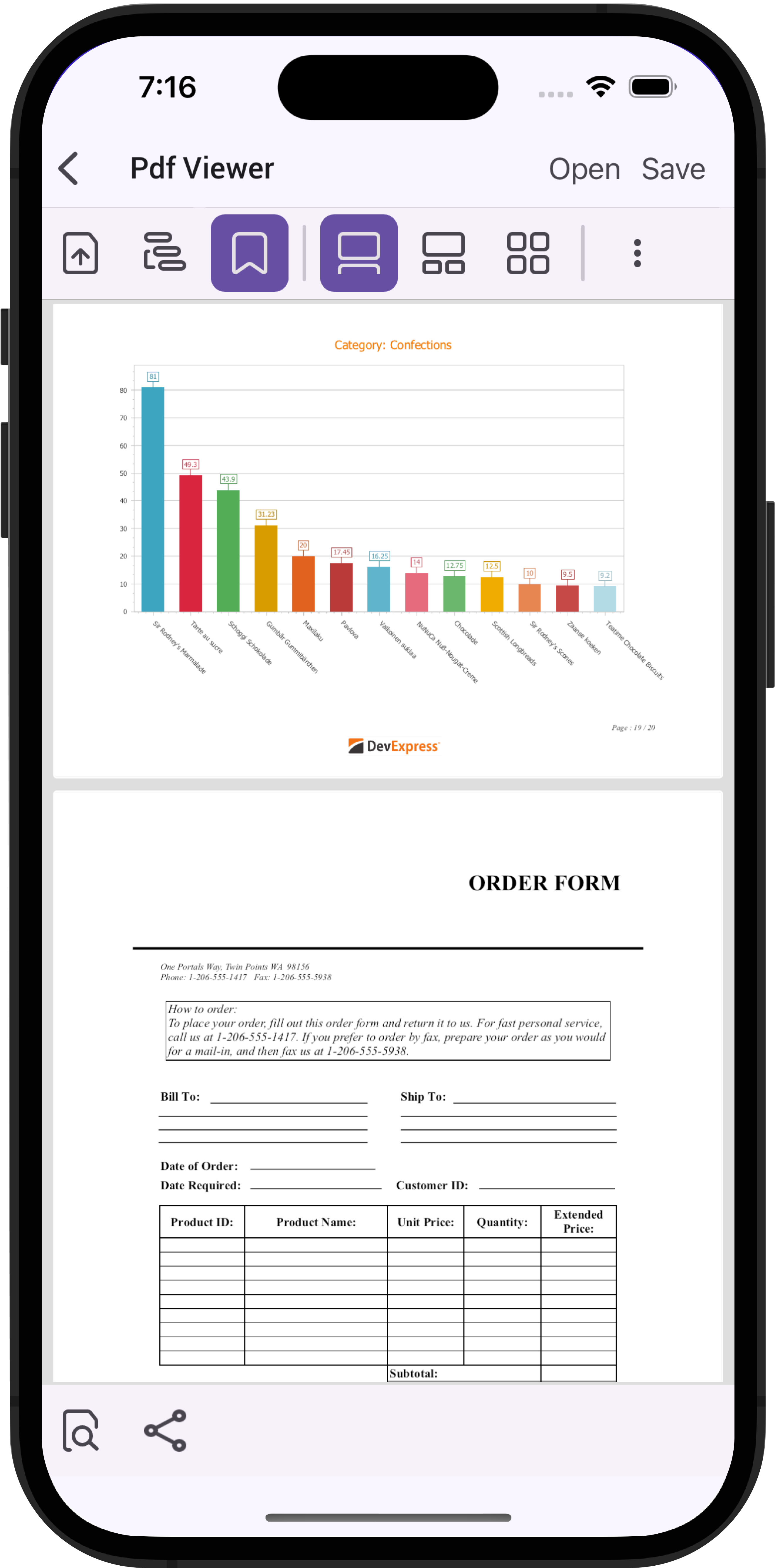
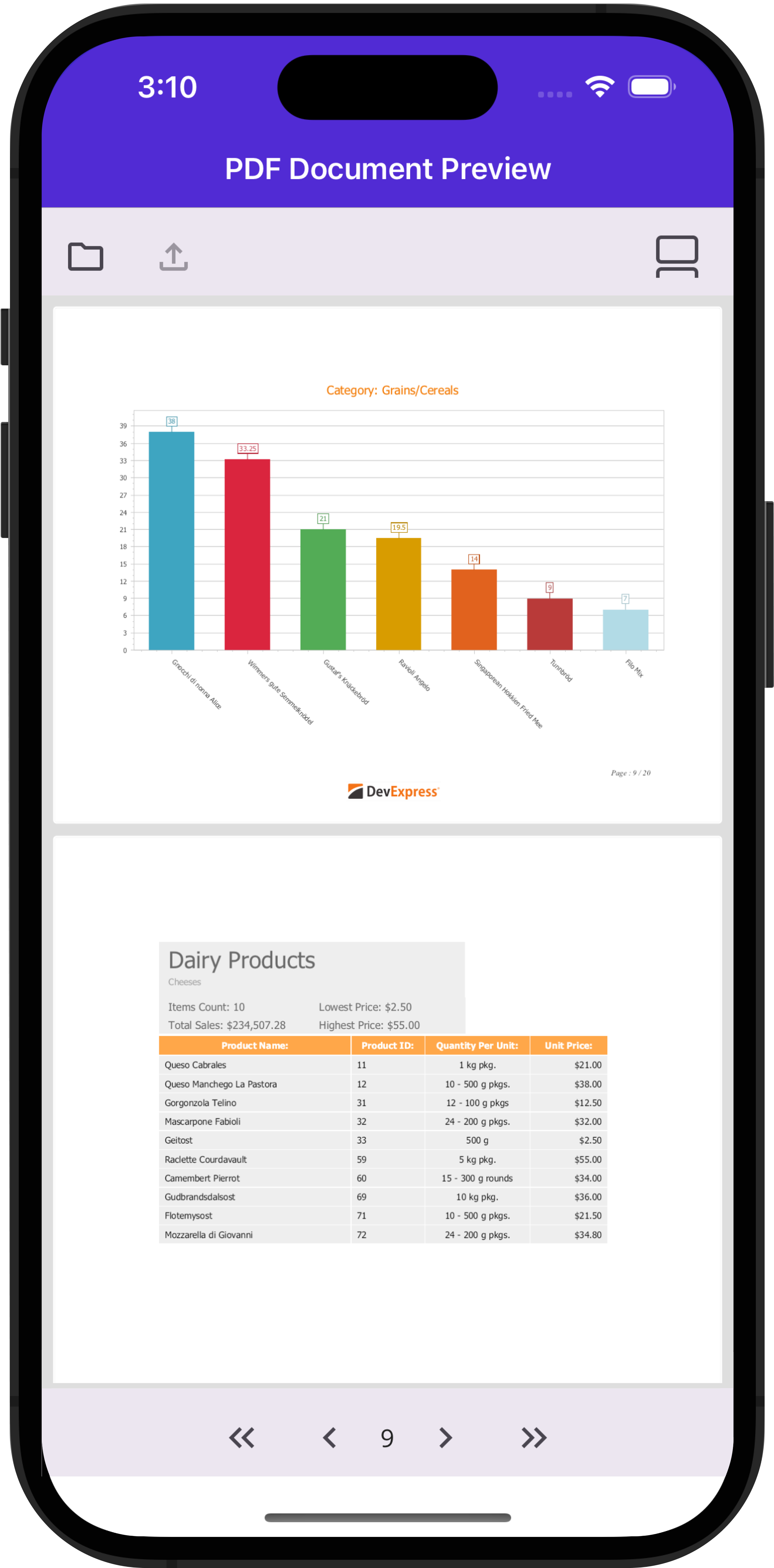
New .NET MAUI PDF Viewer Control
You can now navigate through PDF documents via our new PDFViewer control. Our early access preview build includes the following built-in features:
- Open and display PDF documents
- Document navigation, including scroll and clickable table of contents
- Save and share files
- One page and two-page layouts
New .NET MAUI Image Edit Control
We added a new Image Editor Control to the DevExpress .NET MAUI library. With it, users can format selected images to address app-specific requirements. The following image actions/features are already available:
- Crop
- Rotate
- Mirror vertically/horizontally
- Zoom

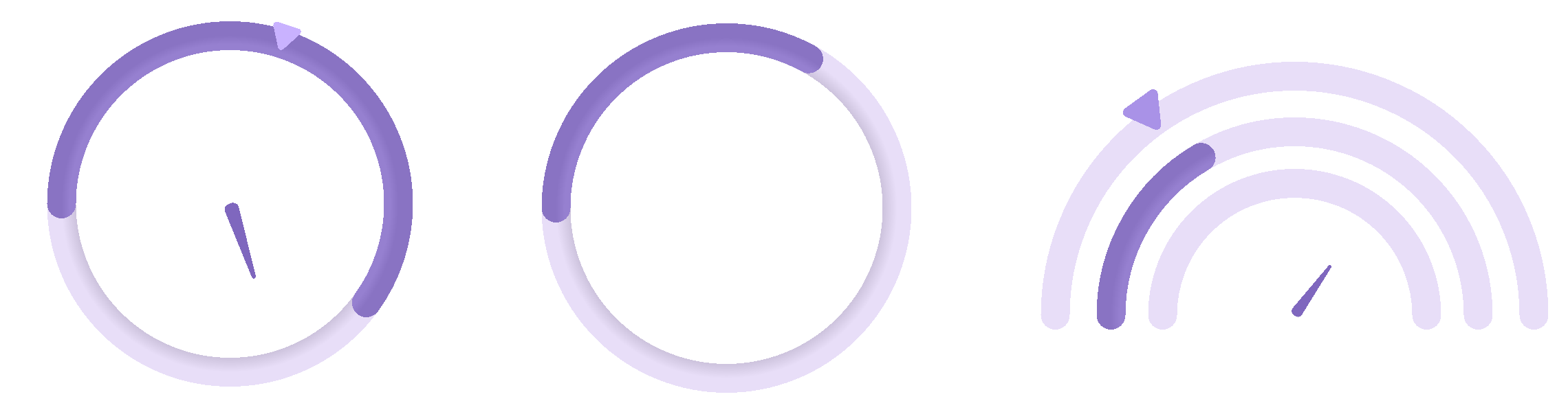
New .NET MAUI Circular Progress Bar and Gauge Control
To help visualize multiple progress lines on-screen, v23.2 will include a new Circular Progress Bar Control. You will be able to add custom content to the Circular Progress Bar Control and inform users about actual progress value/indicator purpose. You can visualize multiple ranges, add scales, tick marks and labels via a simple API:
<ContentPage ...
    xmlns:dxg="clr-namespace:DevExpress.Maui.Gauges;assembly=DevExpress.Maui.Gauges">
       <dxg:CircularGaugeControl>
           <dxg:ArcScale MajorTickmarkCount="0" MinorTickmarkCount="0" ArcWidth="14"
           StartAngle="180" SweepAngle="360"  ShowStart="false" ShowEnd="false"
           StartValue="0" EndValue="100">
                <dxg:ArcScale.Indicators>
                    <dxg:MarkerIndicator Value="30">
                        <dxg:MarkerIndicator.Brush>
                            <LinearGradientBrush StartPoint="0,5" EndPoint="0,5">
                                <GradientStop Color="#D7BFFF" Offset="0.9" />
                                <GradientStop Color="#C9B2FF" Offset="0.1"/>
                            </LinearGradientBrush>
                        </dxg:MarkerIndicator.Brush>
                    </dxg:MarkerIndicator>
                </dxg:ArcScale.Indicators>
                <dxg:ArcScale.ArcBrush>
                    <RadialGradientBrush Center="0.5,0.5">
                        <GradientStop Color="#C8BED8" Offset="0.9"/>
                        <GradientStop Color="#E8DEF8" Offset="1"/>
                    </RadialGradientBrush>
                </dxg:ArcScale.ArcBrush>
                <dxg:ArcScale.Ranges>
                    <dxg:ArcScaleRange StartValue="0" EndValue="60" BrushWidth="14">
                        <dxg:ArcScaleRange.Brush>
                            <RadialGradientBrush Center="0.5,0.5">
                                <GradientStop Color="#9680D0" Offset="0.95"/>
                                <GradientStop Color="#8973C3" Offset="1"/>
                            </RadialGradientBrush>
                        </dxg:ArcScaleRange.Brush>
                    </dxg:ArcScaleRange>
                </dxg:ArcScale.Ranges>
                <dxg:NeedleIndicator Value="70">
                    <dxg:NeedleIndicator.Brush>
                        <LinearGradientBrush StartPoint="0,5" EndPoint="0,5">
                            <GradientStop Color="#6750A4" Offset="0.9" />
                            <GradientStop Color="#7F67BE" Offset="0.1"/>
                        </LinearGradientBrush>
                    </dxg:NeedleIndicator.Brush>
                </dxg:NeedleIndicator>
            </dxg:ArcScale>
        </dxg:CircularGaugeControl>
</ContentPage>
New .NET MAUI Toolbar Menu Control
Our new Toolbar allows you to arrange multiple buttons in a compact manner (and save mobile screen real-estate by doing so). You can dynamically manage Toolbar items and display the most relevant actions based on current context. The following Toolbar Items are available in this EAP:
- Button
- Navigation Button
- Toggle Button
- Separator
- Group