WPF Controls 2020 Roadmap - Your Vote Counts

It's that time of year again - time to collect feedback and refine our 2020 Roadmap. If you're currently using our WPF product line or expect to do so next year, please take a moment to review our un-official 2020 Roadmap and share your thoughts with us. We expect to publish our official 2020 WPF Roadmap early next year.
And don’t forget to check out the following blog posts for information on other DevExpress WPF-specific products:
Table of Contents
- .NET 5 Support
- .NET Core 3.0 and 3.1
- New Controls and Features
- Data Grid
- Data Grid and TreeList - Common Features
- Pivot Grid
- Data Editors
- Themes
- Ribbon and Toolbars
- Scheduler
- Diagram
- Gantt
.NET 5 Support
.NET 5 is scheduled for release in November 2020. You can expect full .NET 5 support across our WPF product line around this date. We also hope to release beta versions built for .NET 5 a few months in advance.
.NET Core 3.0 and 3.1
We introduced official support for .NET Core 3 in our v19.2 release cycle. In 2020, we will extend the capabilities of .NET Core 3 designers and incorporate enhancements that simplify app deployment.
WPF Project Templates
Visual Studio's New Project dialog will feature project templates for .NET Core. Basic templates will be available as a minor update in our v19.2 release cycle. In 2020, we will extend this list with other templates such as a Dependency Injection application.

Designer Extensions
Since .NET Core uses a new surface isolation architecture for the WPF designer, most of our designer extensions are currently available only for .NET Framework. We are working on the following designer features for .NET Core:
- Smart Tags.
- Selection of non-visual elements (Data Grid columns, Toolbar & Ribbon items).
- Applying application themes from App.config to all designer previews.
- Configuration wizards (Chart Designer, Diagram Designer, Feature Browser for the Data Grid).

Other Plans
.NET Core 3 remains one of our top priorities for 2020. We will continue to work on our .NET Core offering. We hope to improve performance, simplify the deployment process, and create additional learning resources. Your feedback will help us focus on areas that require attention.
New Controls and Features - We Need Your Feedback
We are considering the following new controls and features for our WPF product line:
- Image Editor;
- Syntax & Code Editor;
- UI Testing Support.
We can begin work on these products/features in 2020, but this will affect the features we incorporate into existing WPF controls. What is more important for your applications? Please tell us what's most important to you and your team below?
WPF Image Editor
Unlike the existing ImageEdit, the Image Editor is a standalone control built specifically to preview and edit images. It may include the following image editing and presentation features.
Image Viewer features:
- Zoom and Scroll;
- Pan;
- Touch gesture support.
Image Editor features:
- Rotate;
- Resize;
- Crop;
- Copy/Paste image regions;
- Draw text;
- Draw custom shapes;
- Undo/Redo.
The Image Editor can also include a Toolbar or Ribbon interface integrating its viewing and editing functionality.
WPF Syntax & Code Editor
A text editor to help you visualize code files, edit configuration files/scripts, or view logs. It may include the following features:
- syntax highlighting;
- folding regions;
- built-in syntax highlighting for popular file formats and programming languages;
- dynamic suggestions.
UI Testing Support
DevExpress controls support the UI Automation framework for screen reader tools. This allows you to create basic UI tests with any testing tool that uses UI Automation to access visual elements. However, since screen reader tools only use a portion of the UI Automation API, some test cases are not supported out-of-the-box and need to be implemented with custom code.
We can extend support for UI Automation in our most popular controls (such as the Data Grid, Data Editors, and Ribbon). In addition, we can make certain that DevExpress WPF controls are fully compatible with the Appium and WinAppDriver approach recommended by Microsoft.
WPF Data Grid
Virtual Sources - Data Editing
Infinite and Paged sources will support data editing via Edit Entire Row. End-users will be able to press the data grid's Update button after entering cell values to post changes to a data source asynchronously.
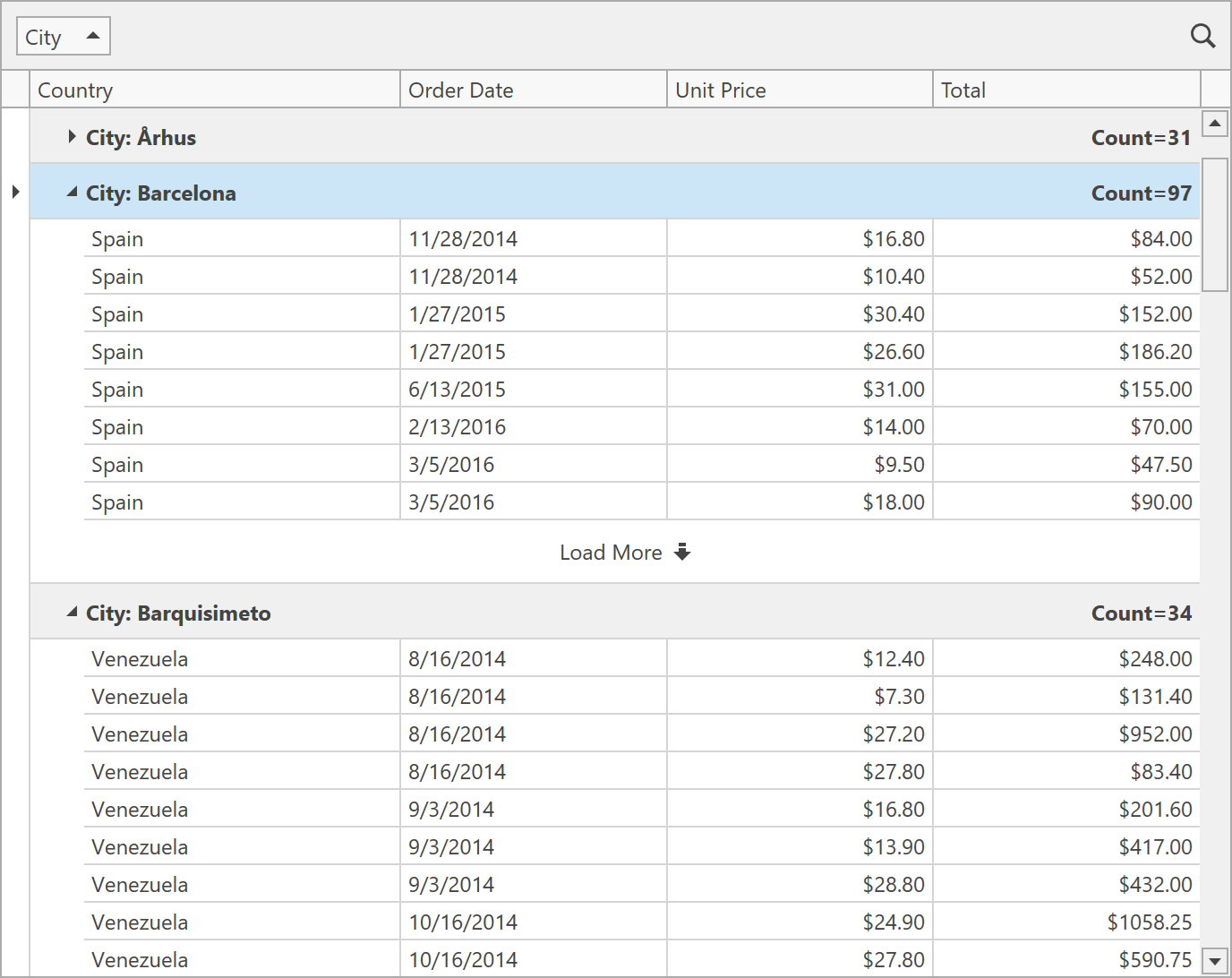
Virtual Sources - Grouping
We expect to deliver industry-first data grouping support for virtual data sources. Though not a trivial task, we've researched options and believe we can add data grouping support for Infinite data sources in 2020. To reduce the number of records needed on the client, every group row will display a button that loads more rows at the bottom.
Virtual Sources - Miscellaneous Enhancements
We hope to remove a number of limitations currently imposed by Infinite and Paged sources:
- Keeping the selected row and scroll position after a refresh.
- Updating individual rows.
- Calculating custom Total summaries.
WPF Data Grid and TreeList - Common Features
New Filter Panel
This feature was initially planned for 2019 but we postponed it to polish Excel-Inspired filters and enable them by default. The new Filter Panel will display separate tokens with filters for each column (making it easier to read and manage).
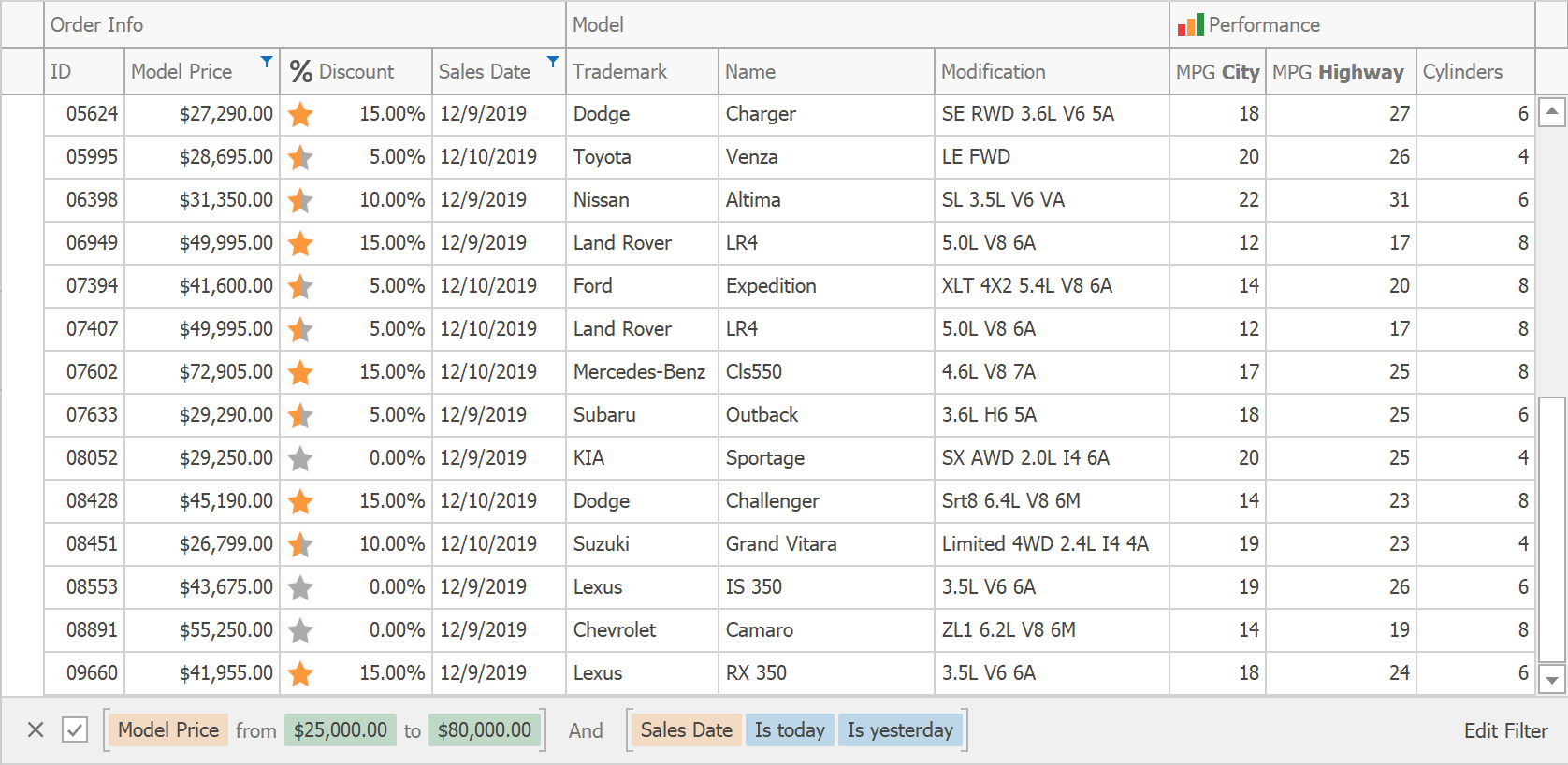
If an applied filter does not fit within the screen area, detailed information will be displayed within a popup.
Conditional Formatting - Disable Cells and Rows
New Conditional Formatting rules will allow developers and end-users to disable rows and cells (or make them read-only) based on a specific condition.

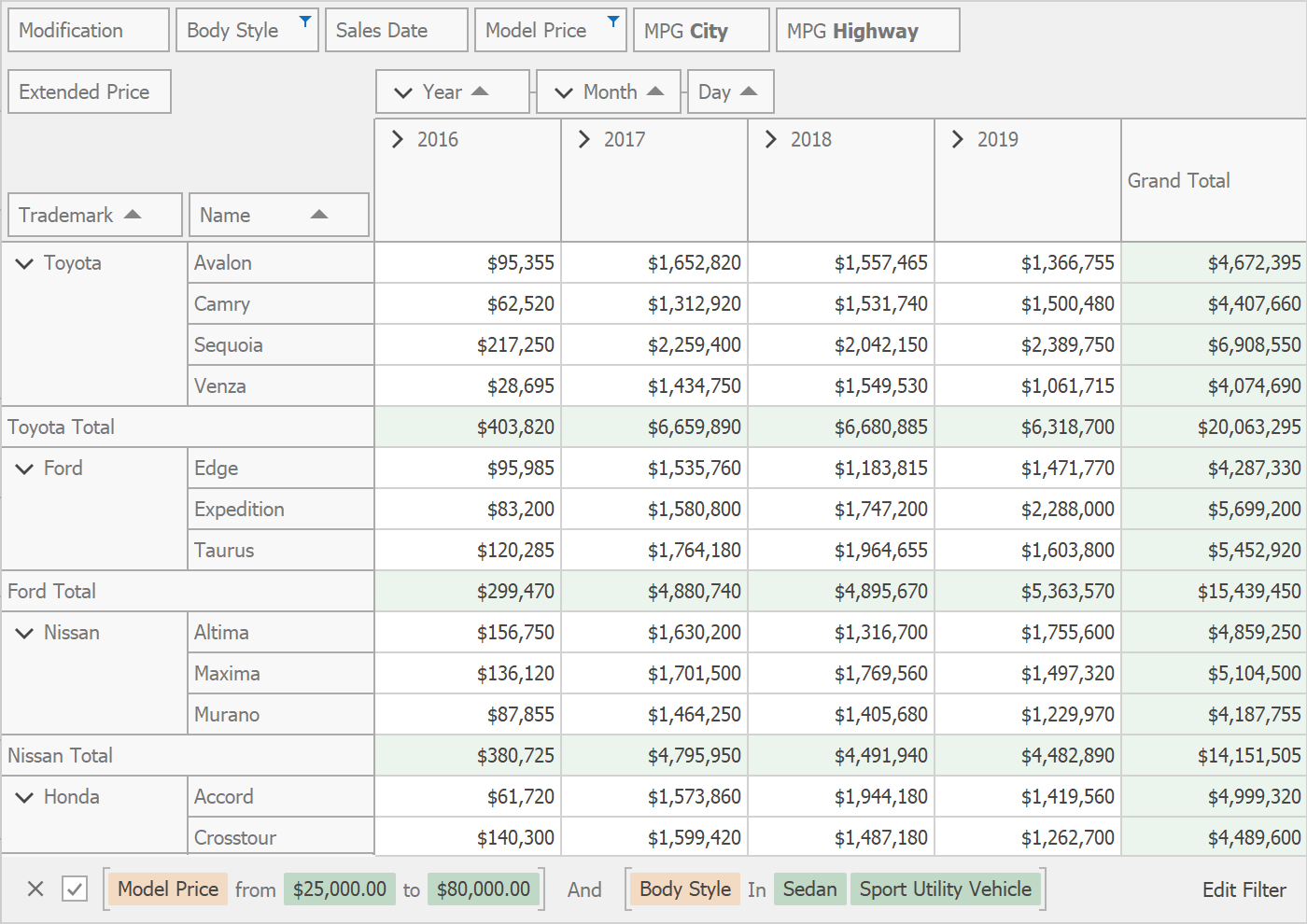
Automatic Column Best Fit
Our WPF Data Grid and WPF TreeList can both calculate the optimal width for columns based on header text and content. To do this, you either need to call the BestFitColumn/BestFitColumns method or click a corresponding item in a column's context menu. With this new feature, the Data Grid and TreeList will automatically calculate optimal width for columns when loading data or when underlying data changes. To make this possible with large data sources, we will research possible optimizations for the Best Fit process and introduce a new mode wherein optimal width is calculated based on visible data and recalculated again during scrolling.
Optional Features
WPF Tree View
At present, you can customize our TreeList control so that it looks like a Tree View - hide headers and row indicators, disable cell navigation, configure horizontal scrolling. However, customizing the TreeList requires time and knowledge of our API. We can provide a separate control that looks like a Tree View and inherits the best TreeList features - performance, formatting API, and rich filtering options.
New Summary Editor
The Summary Editor within our WPF Data Grid and TreeList does not display custom summary items, and does not allow end-users to customize summary for selection and formatting at runtime. We can rewrite the Summary Editor to support all these features.
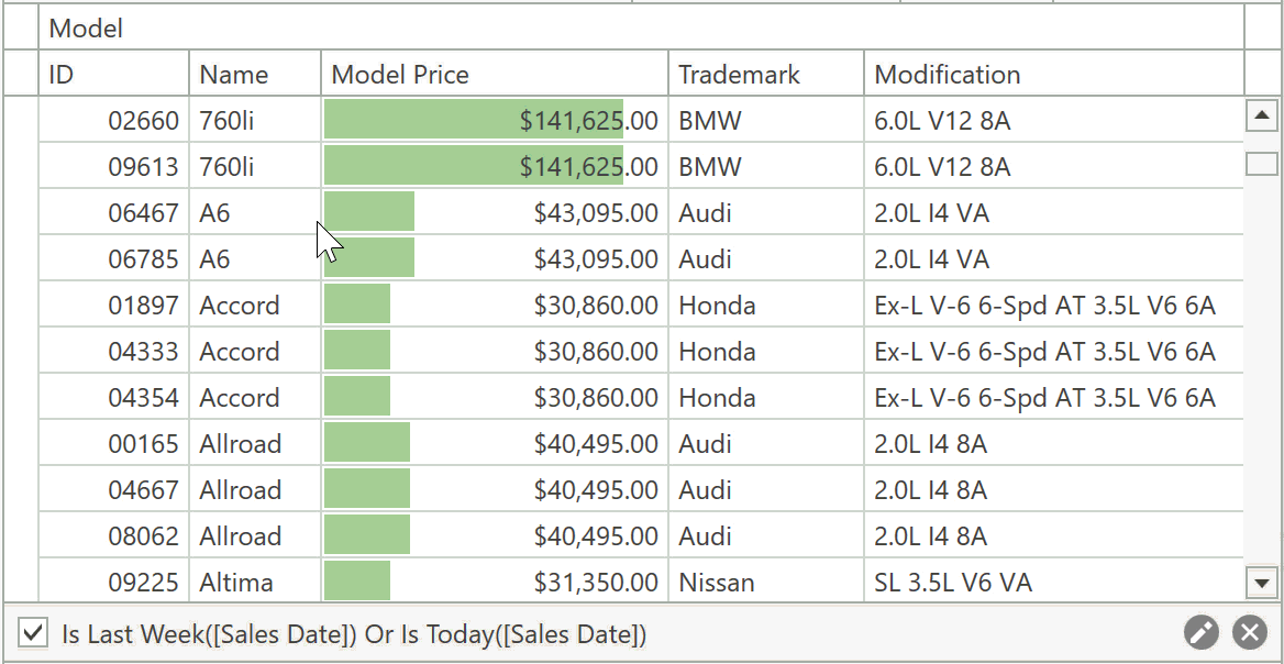
Search Panel Suggestions
We can enhance the Search Panel in the Data Grid and TreeList so that it displays a drop-down window with the following suggestions:
- previous search queries;
- search syntax suggestions (e.g., type ":" to search in a specific column);
- unique values from specific columns;
- user-defined custom items.

WPF Pivot Grid
New Filter Panel
After implementing the new Filter Panel for the Data Grid and TreeList controls, we will enable it for the Pivot Grid. The new Filter Panel will contain separate tokens with filters for each column (instead of displaying the entire filter string as plain text).
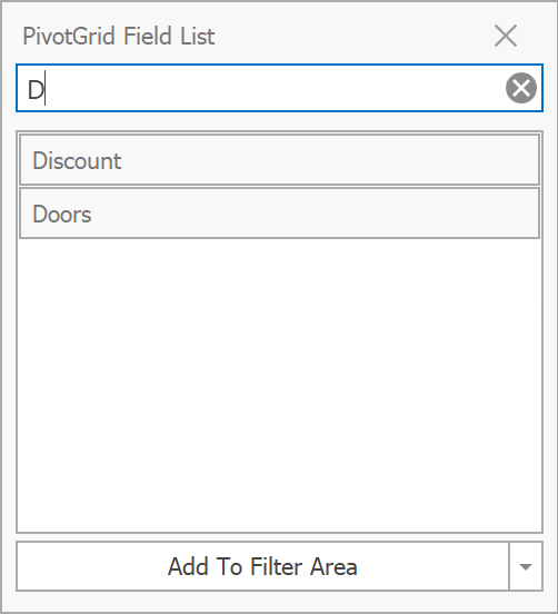
Customization Form Search
The Pivot Grid's Customization Form will display a search box that allows end-users to filter the list of available fields.
Summary Filter Popup
Data Field headers will display a filter button that invokes a popup window that allows end-users to configure summary filters.
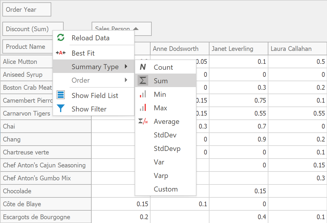
Context Menus for Summary Type and Group Interval
New context menu items will allow end-users to change summary type and group interval at runtime.
WPF Data Editors
Date Navigator Enhancements
We expect to rewrite the visual portion of our Date Navigator so that it is more customizable and lightweight. We will also introduce the following features:
- Touch support.
- An API to define available views (e.g., show only months and years).
- Improved keyboard navigation.
- An API to define the Date Navigator's visible range.
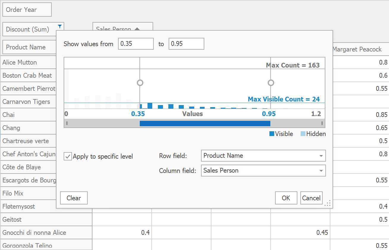
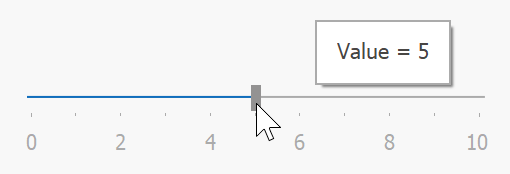
TrackBarEdit Enhancements
TrackBarEdit will draw labels alongside ticks and display a tooltip with the current value when a user drags the thumb.
WPF Themes
Visual Studio 2019 Themes
We will release a set of new themes inspired by Visual Studio 2019.
Appearance Properties Support
We hope to simplify appearance customization for our most popular controls (Data Grid, Data Editors, Ribbon and Toolbars). We expect to support the following appearance properties:
- Background;
- BorderBrush;
- BorderThickness;
- CornerRadius;
- Padding.
Fluent Design - In-App Acrylic Effect
In addition to Background Acrylic implemented in v19.2, we hope to add the In-App Acrylic effect in 2020 (reveals elements or a background image beneath the topmost control).

Fluent Design - Reveal Highlight Effect Enhancements
We expect to add the support for dark and white themes to our Reveal Highlight API and move it out of CTP.

Theme Designer - .NET Core 3 Support
You can already use theme libraries built against .NET Framework in your .NET Core apps (see .NET Core 3 Support). In 2020, we hope to support themes built against .NET Core 3 and run Theme Designer previews under .NET Core.
WPF Ribbon and Toolbars
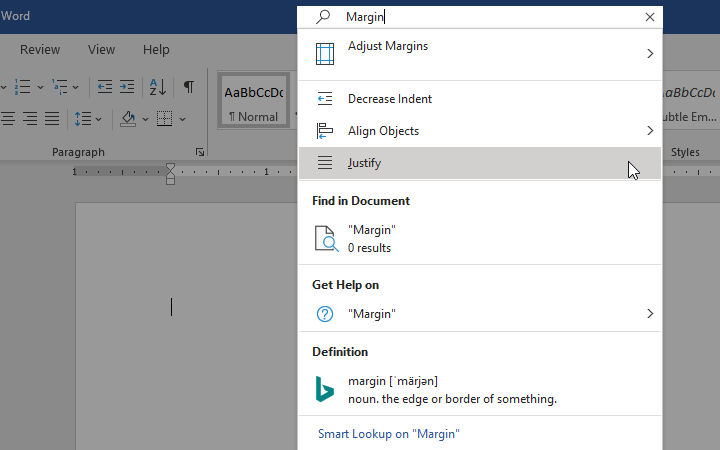
Search Item
The Search Item automatically retrieves Ribbon and Toolbar items from your application and allows end-users to locate these items by name or keyword. You can exclude specific items from search results or define custom items that will only appear within the Search Item. Search Item can be displayed in the window's title bar or next to Ribbon's page headers.
Bar Item Appearance Options
Ribbon and Toolbar items will include an API to customize control appearance (background, foreground) for Normal, Checked, and Hover states.
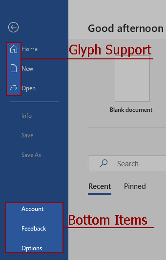
Ribbon - Backstage View Enhancements
Ribbon's Backstage View will support glyphs for individual items and will be able to display items at the bottom.
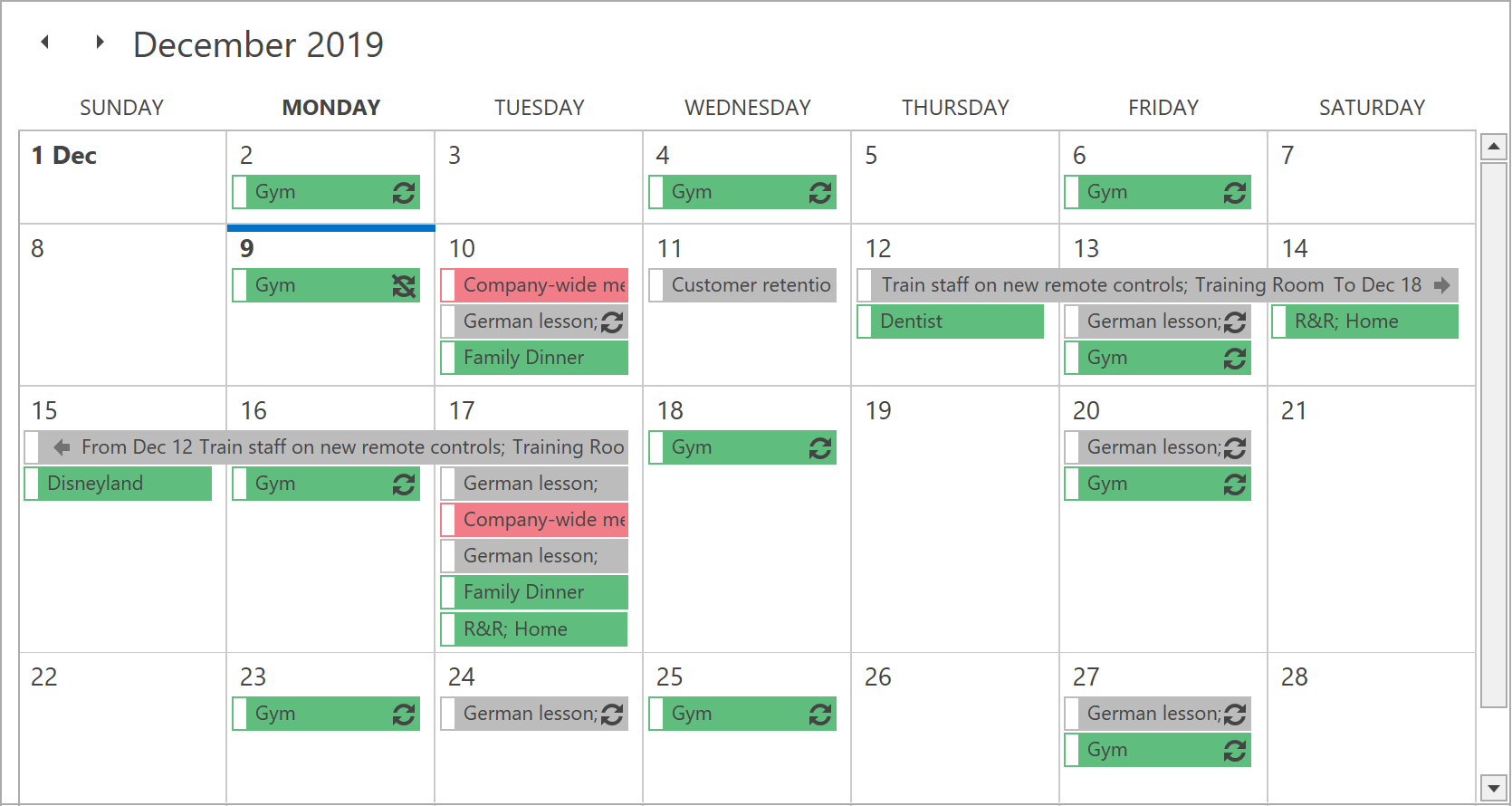
WPF Scheduler
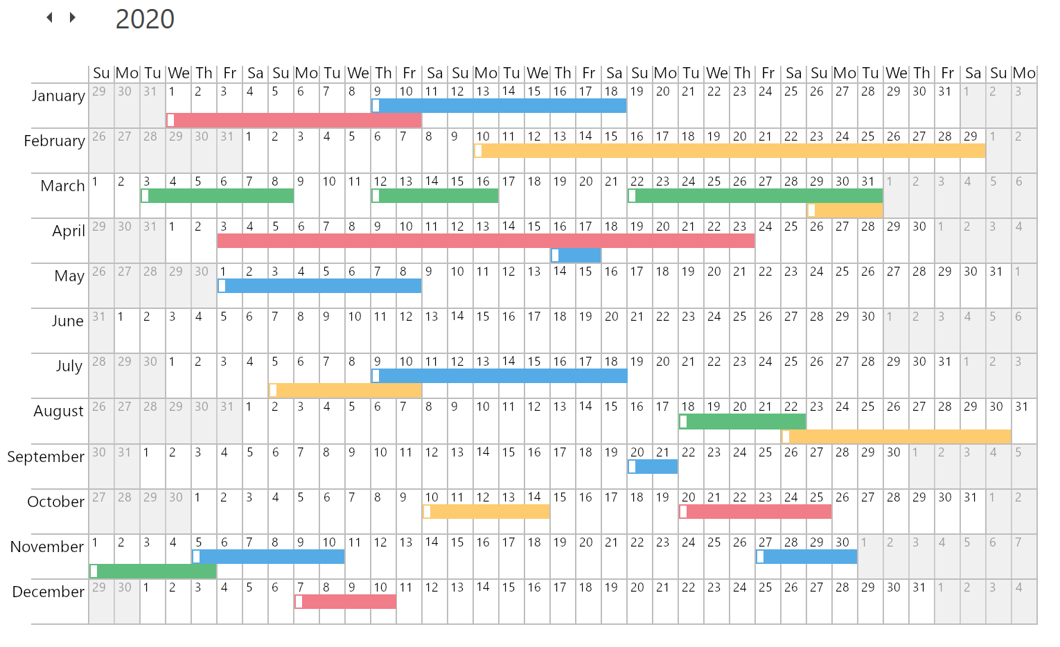
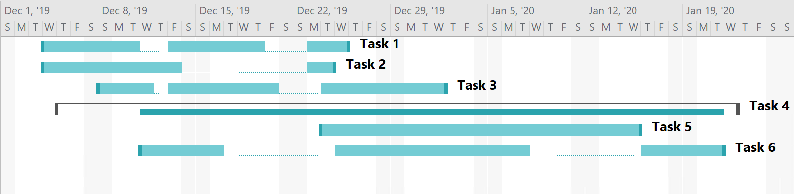
New Timeline View Layout
We hope to rewrite the visual portion of the Timeline View and introduce new dynamic time scales, per-pixel horizontal scrolling, and smooth zoom to the mouse pointer. The overall experience will be similar to scrolling and zooming in the Gantt control:
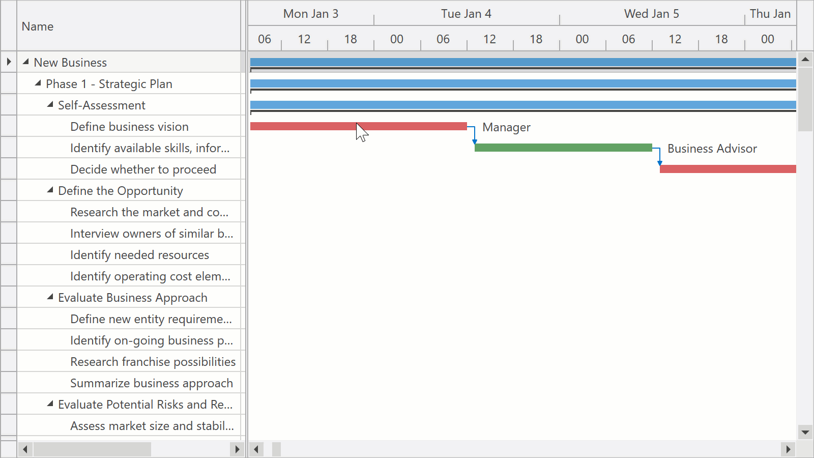
Unlike the Gantt control and our current Timeline View implementation, the new Timeline View will limit horizontal scroll range depending on the current zoom factor. For example, when the time scale displays days, you will be able to scroll within a month before zooming out or switching to the next month in the Date Navigation Panel. Limiting the horizontal scroll range will help us calculate the resource height for the entire range so that resources don't change height during scroll operations.
In addition to improved zooming and scrolling, the new Timeline View layout will provide a more flexible way to control resource height. You will be able to define the minimum and maximum height for your resources, and the Scheduler will calculate actual height for each resource (based on appointments contained within the displayed range). If appointments exceed the maximum resource height, resources will display a button that expands the resource even further.
On-Demand Data Loading
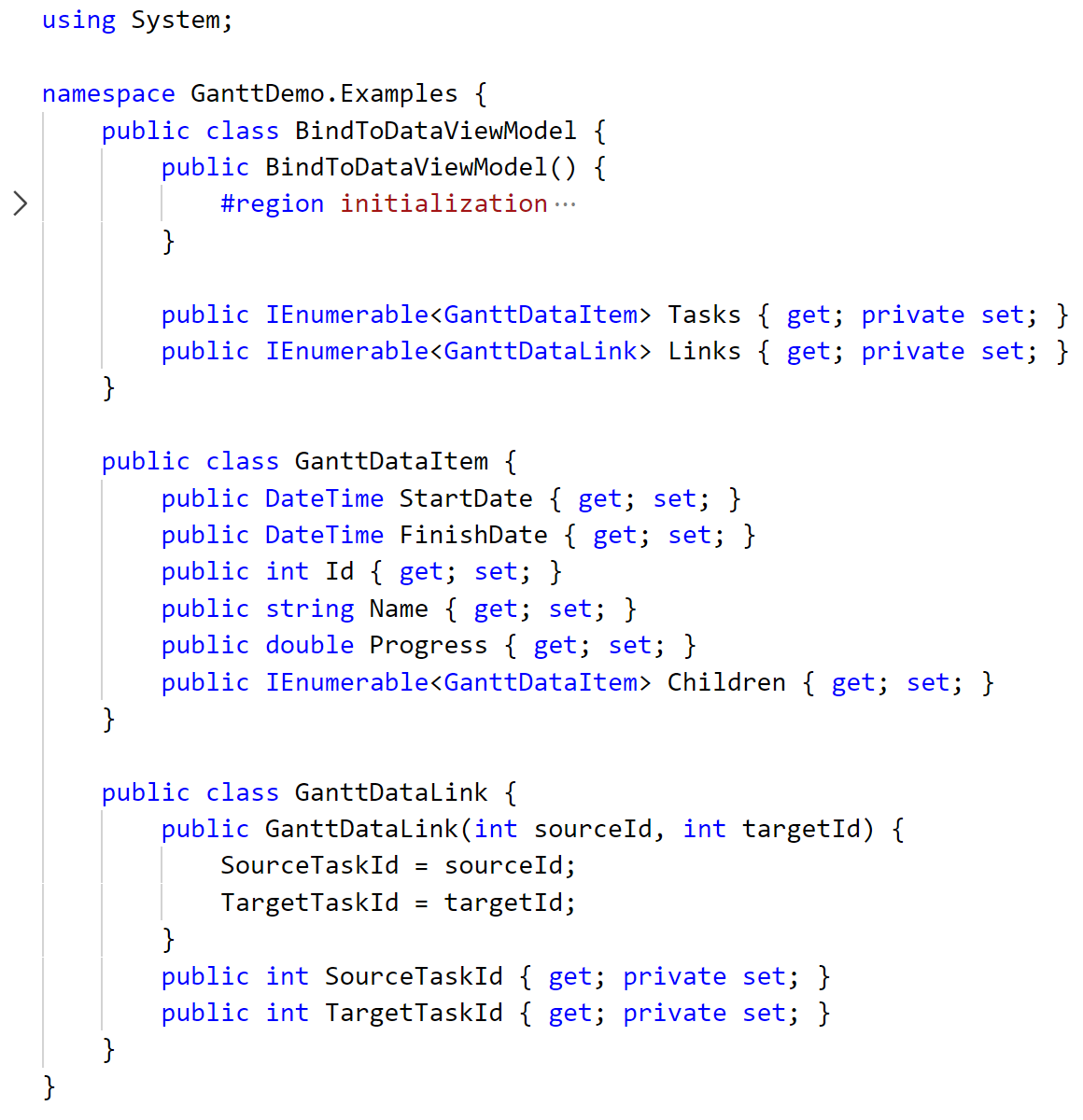
With this feature, our WPF Scheduler will request data only for the visible range and will make additional queries after scrolling. Loaded data will be cached to reduce the number of requests.
scheduler.FetchAppointments += (d, e) => {
    e.AppointmentsSource =
        from x in dbContext.Appointments
        where (((x.QueryStart >= e.Interval.Start && x.QueryStart < e.Interval.End) || (x.QueryEnd >= e.Interval.Start && x.QueryEnd < e.Interval.End))
                || (x.QueryStart < e.Interval.Start && x.QueryEnd >= e.Interval.End))
                && e.ResourceIds.Contains(x.ResourceId)
        select x;
};
On-demand data loading can significantly increase the loading speed for applications with large data sources.
Appointment and Time Region Filtering
Our WPF Scheduler will include an API that allows you to dynamically hide appointments and time regions. You will be able to handle events to describe your custom filtering logic.
scheduler.FilterAppointment += (d, e) => {
    e.Visible = object.Equals(e.Appointment.StatusId, 1);
};
In addition, the new FilterString and FilterCriteria properties will help you bind your Scheduler to the Filter Editor or to Filter Elements for advanced filtering scenarios.
Optional Major Features
Year View
A new view that displays the entire year with months at the left side and weekdays on top. This view will help you visualize and overview holidays or major events for a given year.
One Month View
A new view that displays a single month. In this view, weeks can contain a different height (based upon the number of appointments contained within the week). If all weeks fail to fit the screen, a vertical scroll bar will be displayed.
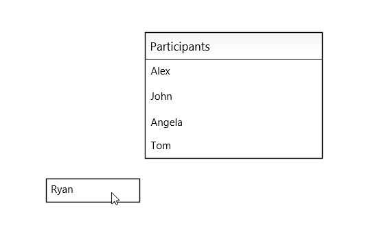
Outlook-Inspired Tabbed Interface for Resources
With this feature, resources can be displayed as tabs and merged to display appointments from different resources on the same canvas.
Optional Minor Enhancements
Support for Multiple Time Indicators
The WPF Scheduler will be able to display multiple Time Indicators simultaneously and will include an API to control position.
Editing Restrictions
The WPF Scheduler will include an API to make elements read-only:
- read-only appointments will display a corresponding icon;
- read-only time regions will prevent end-users from creating or moving appointments into them;
- read-only resources will make all associated appointments read-only.
Support for Holidays
You will be able to define named holidays within our WPF Scheduler. Holiday names will be displayed in column headers or as read-only all-day appointments.
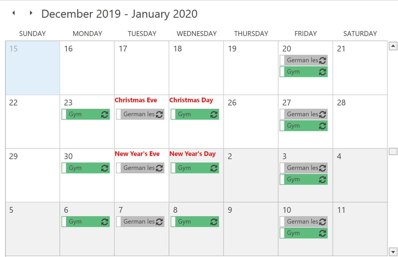
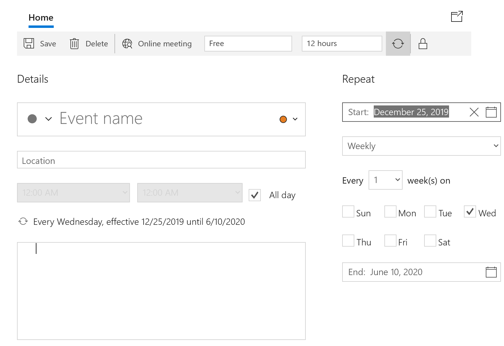
New Appointment Window
We can redesign our existing Appointment Window to make it more customizable and user-friendly. One of our ideas is to display recurrence editors on the same form - much like it's done in the Windows Mail app.
WPF Diagram
List Item
A new container item that arranges its child items in a list. End users can add, remove, and reorder items in this list.
Text Tool
A new tool that allows you to add labels to a diagram by clicking an empty region and entering the appropriate caption via the keyboard.

WPF Gantt
Backward Scheduling
The Backward Scheduling API will help you manage projects that have a specific deadline. You will be able to plan backwards, scheduling each task from the deadline to the beginning of the project.
Printing - Research
We will investigate whether we can use our existing Printing classes to print our Gantt control. If existing Printing classes are insufficient, this feature will likely be postponed.
Optional Features
Task Splitting
You will be able to split a task into as many sections as needed to temporarily interrupt work.
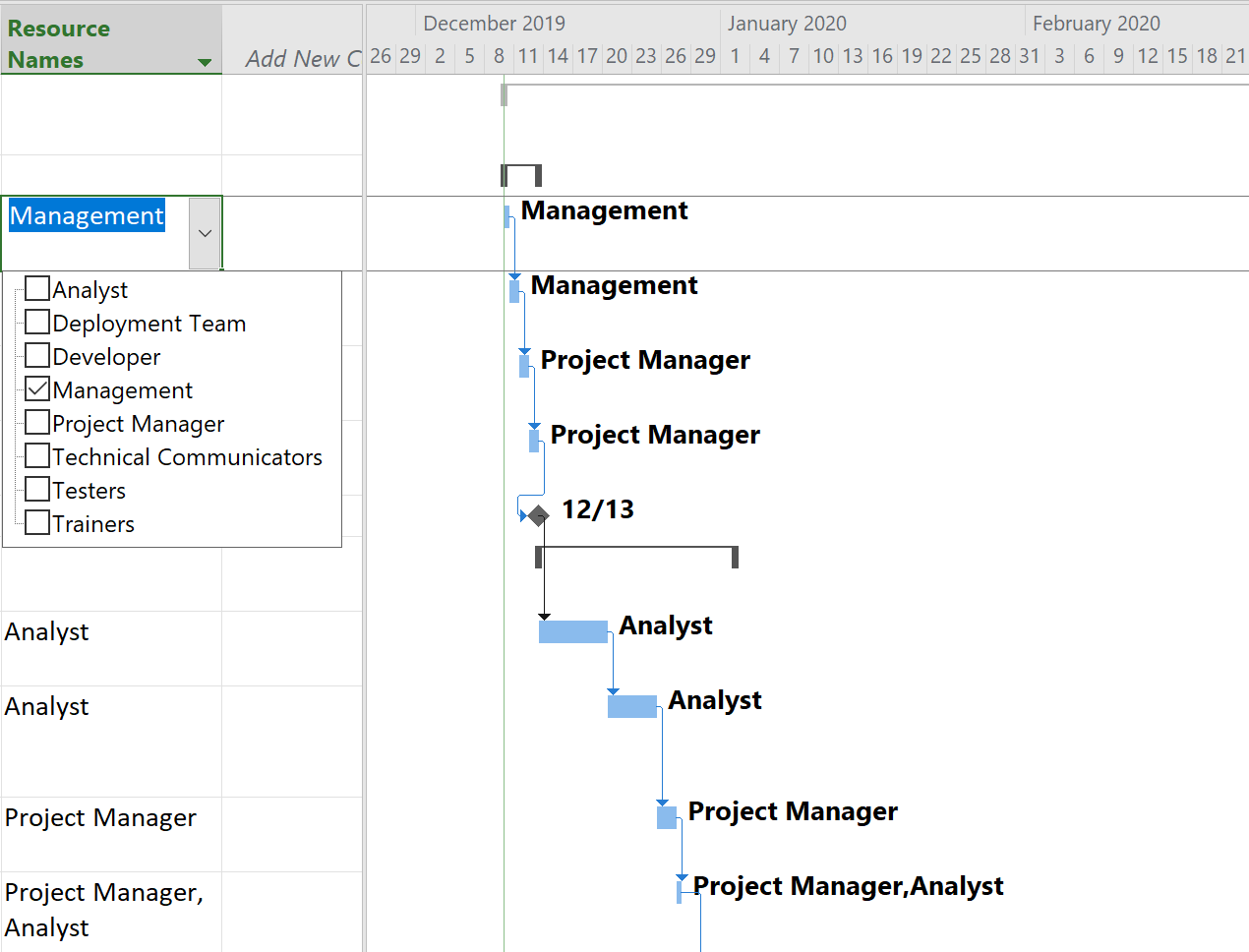
Resources
You will be able to assign resources to tasks and specify the percentage of time a resource spends on a task. The Gantt control will automatically schedule tasks based on the resource availability.
As always, we thank you for your continued support and for choosing our WPF products for your development needs. We look forward to your feedback.
