First of all, thank you very much for your support! We have had lots of comments telling us to keep these tips and tricks coming and it feels great to know the information is helpful to you!
It is getting harder all the time to find features that fit the description of being easily overlooked - after all, we also pride ourselves of having highly useful documentation and great samples! Nevertheless, here is a fourth installment of the series.
In case you missed the previous posts, here is a list:
Create and Modify Vector Skin Palettes in Code
With the introduction of vector skins, using the Skin Editor is no longer the only way to modify color schemes. You can create and modify palettes (sometimes called swatches) from code!
For instance, to create a new palette, you start with an SvgPalette object. Specify its color values, and add it to the CustomSvgPalettes collection on the skin. Here is a sample:
// obtain a vector skin
var currentSkin = Skins.CommonSkins.GetSkin(this.LookAndFeel);

// create a new palette
SvgPalette svgPalette = new SvgPalette();

// set up primary palette colors
svgPalette.Colors.Add(new SvgColor("Paint", Color.FromArgb(30, 58, 102)));
svgPalette.Colors.Add(new SvgColor("Paint High", Color.FromArgb(17, 72, 113)));
// ...

// set up icon colors
svgPalette.Colors.Add(new SvgColor("Red", Color.FromArgb(252, 109, 119)));
svgPalette.Colors.Add(new SvgColor("Green", Color.FromArgb(83, 186, 122)));
// ...

// add a new swatch for this palette
currentSkin.CustomSvgPalettes.Add(new SvgPaletteKey(0, "Glacier"), svgPalette);

// If you have a Ribbon Palette Selector gallery, you need to either
// add new swatches before the InitializeComponent method call,
// or initialize the Ribbon gallery after the swatches were added

InitializeComponent();

// apply the custom swatch
this.LookAndFeel.SetSkinStyle("The Bezier", "Glacier");
Here’s what the result looks like. Note that the custom Glacier palette is automatically available in the Ribbon Palette Gallery.

Prioritize Appearances
Compound controls like the WinForms Data Grid, the WinForms Tree List or the WinForms Vertical Grid provide several Appearance settings for focused rows, odd and even rows, selected cells, and other items. Technically, these appearances form a hierarchy that defines the order in which settings are applied. By setting Options.HighPriority to true on an appearance, you move it to the top of the list.
treeList1.Columns["Employee"].AppearanceCell.Options.HighPriority = true;
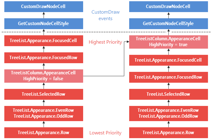
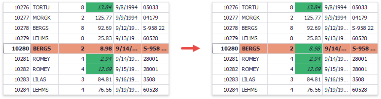
As an example, consider a situation where you have a Conditional Formatting rule in combination with an appearance configuration for the focused row. By default, the FocusedRow appearance takes precedence over the appearance associated with the conditional formatting rule.
As you can see from the image of the hierarchy above, it would be possible to apply the appearance from one of the custom draw and custom style events (RowStyle, RowCellStyle, CustomDrawCell, etc.), since these always have a higher priority than appearances. The following snippet assumes that a rule called freightRule exists and applies it in an event handler:
private void GridView1_RowCellStyle(object sender
  DevExpress.XtraGrid.Views.Grid.RowCellStyleEventArgs e) {
  GridView view = sender as GridView;
  var freightRule = view.FormatRules["freightRule"];
  if (view.IsRowSelected(e.RowHandle) && e.Column.FieldName == "Freight" &&
    freightRule.IsFit(e.CellValue, view.GetDataSourceRowIndex(e.RowHandle))) {
    e.Appearance.Assign(
      ((FormatConditionRuleAppearanceBase) freightRule.Rule).Appearance);
  }
}
However, once you understand about appearance priorities, you can alternatively configure the property HighPriority on the appearance associated with the rule.

Of course you can still set this up from code if you prefer - again, assuming the rule exists already:
var freightRule = view.FormatRules["freightRule"];
var appearance = ((FormatConditionRuleAppearanceBase) freightRule.Rule).Appearance;
appearance.Options.HighPriority = true;
In both cases, you will now see that the appearance associated with the conditional format rule overrides that of the focused row:
HypertextLabel Formatting
A HypertextLabel used as an in-place editor enables simplified HTML formatting for data cells in data-aware controls. To supply the editor with an HTML template, you need an unbound column and the corresponding event handler (e.g. CustomUnboundColumnData for the Data Grid).
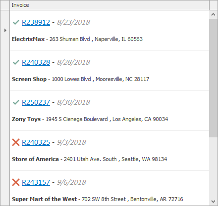
Run the XtraEditors - HypertextLabel demo for a live sample of the image above (note that the link works only if you have the DevExpress Demo Center v17.1 or newer installed).
Service Row Handles in the Data Grid
Those who work with the Data Grid know that the control assigns a row handle, a simple numeric value, to each data row. The value is used to identify the rows, and you can retrieve these handles from many properties and methods on a View, like FocusedRowHandle or GetVisibleRowHandle.
It can often appear that the row handles are equal to index values into the bound datasource. However, there are also special row handle values, which is why it’s important to retrieve data rows using helpers like GetRow or GetDataRow.
The class GridControl includes six static fields that define special row handle values. These identify the following service row types:
AutoFilterRowHandle - the Automatic Filtering RowNewItemRowHandle - the New Item RowInvalidRowHandle - a handle that is returned when an attempt to retrieve a particular row failsExternalRowHandle, ExternalRowHeaderHandle, ExternalRowFooterHandle - row handles for data rows, group rows, headers and footers of Detail Views.
The special handles are useful when you need to distinguish regular data rows from service rows, or check whether a row retrieval operation was successful. As an example, the following snippet iterates through all rows visually below the currently selected row. The iteration stops when no more rows can be retrieved.
public void TraverseRowsBelow() {
  int handle = gridView1.FocusedRowHandle;
  while (handle != GridControl.InvalidRowHandle) {
    // do something with the handle or the row
    handle = gridView1.GetNextVisibleRow(handle);
  }
}
This CellValueChanging event handler tracks input values in the cells of the Auto Filter Row:
private void GridView1_CellValueChanging1(object sender,
  DevExpress.XtraGrid.Views.Base.CellValueChangedEventArgs e) {
  if (e.RowHandle == GridControl.AutoFilterRowHandle) {
    string val = e.Value.ToString();
    // handle the input value
  }
}
What Say You?
As before, we are always interested in any thoughts you have about these tips! Which one did you like best this time?
Free DevExpress Products - Get Your Copy Today
The following free DevExpress product offers remain available. Should you have any questions about the free offers below, please submit a ticket via the
DevExpress Support Center at your convenience. We'll be happy to follow-up.