WPF Controls - 2019 Roadmap - Your Vote Counts

It’s that time of year – time to reflect on accomplishments and prepare for the upcoming year. Thanks to your great feedback, we’ve compiled a list of features we hope to deliver this year. Though this list is not yet final, we do want to share it with you and solicit additional feedback.
Please note that this is not an all-inclusive list of features for 2019. If you are interested in our plans for DevExpress Office-inspired libraries (RTF, Spreadsheet), the DevExpress Reporting platform, or our Analytics tools, please refer to the appropriate blog post for more information:
- Office File API, Office-inspired Desktop UI Controls
- WinForms and WPF Reporting
- WinForms, WPF and ASP.NET Charting
- WinForms and WPF Diagram
.NET Core 3 Support
We've just released v18.2.4 that supports the Preview 1 version of .NET Core 3 (see Visual Studio 2019 and .NET Core 3 Support). Throughout 2019, .NET Core 3 will remain a primary focus area. Together with Microsoft, we will work on known issues and change our control implementation where necessary. Our goal is to provide you with a stable and well-tested component set by the time .NET Core 3 is released.
New Controls
Breadcrumb
We will be working on a new Breadcrumb control in 2019. It will help simplify app navigation and allow you to construct hierarchical navigation paths.

The Breadcrumb’s API will generate data on the fly and will support data binding.
Time Picker
Our new Time Picker control will allow you to edit time values. It will be a standalone control that can also be integrated into our existing DateEdit.

TimeSpan Editor
TimeSpanEdit is a text box that allows you to edit TimeSpan values (duration). You will be able to use it as a standalone editor or within container controls such as the DevExpress WPF Data Grid and WPF Gantt.
We have yet to finalize plans for the TimeSpanEdit control and are not certain whether it will ship with a dropdown (in addition to a text box). Let us know whether you’d like to see a dropdown for this control in the comments section.
Data Grid & Tree List – Common Features
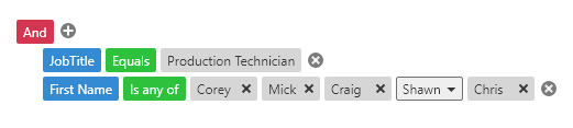
New Filter Panel
We hope to improve the DevExpress WPF Filter Panel to make it more intuitive and easier to use. Currently, it displays a string representation of applied filters (as plain text). This approach works well for simple filters with one or two filter clauses. Complex filters are hard to read and will be truncated if they don’t fit on-screen. The new Filter Panel will display separate tokens with filters for every column (making it easier to read and manage).

If an applied filter does not fit within the screen area, tokens will be collapsed and will display detailed information in a popup.
Filter Editor – New Design, Customization API, and more
In our v18.2 release cycle, we released a new Filter Editor. We plan to extend and improve this control in 2019 with the following features:
- A hierarchy for bands or nested properties in the field selector.
- Advanced customization API.
- Support for Aggregate operations (e.g., "Accounts.Sum(Amount) < 100").
We will also modify the Filter Editor’s appearance and give it a more modern look & feel:
Once these enhancements are complete, we will use the new Filter Editor in the Pivot Grid and DevExpress Reports.
Grouped Filters
With Grouped Filters, you will be able to display values from multiple columns in the Excel-style Filter Dropdown.
Conditional Formatting Filters
Conditional Formatting Filters will be available both in the Filter Dropdown and Filter Editor. They will allow you to filter data based on Conditional Formatting rules defined for a column.
We will also create a dedicated Filter Element for Conditional Formatting Filters.
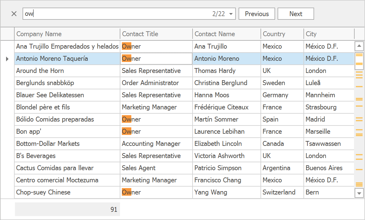
Search Enhancements
The Search Panel will display the total number of matches and the index of the current match. We will rework the Search Panel’s buttons to make them more compact.
We have some ideas for search performance optimization. If all goes well, the search will work significantly faster in grids with many columns and rows.
“No Records” Text Block
This is a small but often requested feature – the Data Grid and Tree List will display a text block in the data area when it displays no records, or if a filter/search query yielded no results.

Data Grid
Master-Detail Search
The Search Panel in the master grid will search and filter data in all detail grids as well. You will be able to navigate between matches in both master and detail records to quickly locate information.
Tree List
New Item Row
The WPF Tree List will display an additional empty row at the top or bottom. You will be able to enter data into the empty row to create new nodes and then drag them anywhere in your hierarchy.

New Filter Mode
With our new filter mode, the Tree List will display all child nodes when their parent nodes meet the applied filter criteria.
IsEnabled CheckBox Binding
You will be able to disable node check boxes for specific nodes based on your business logic.
Pivot Grid
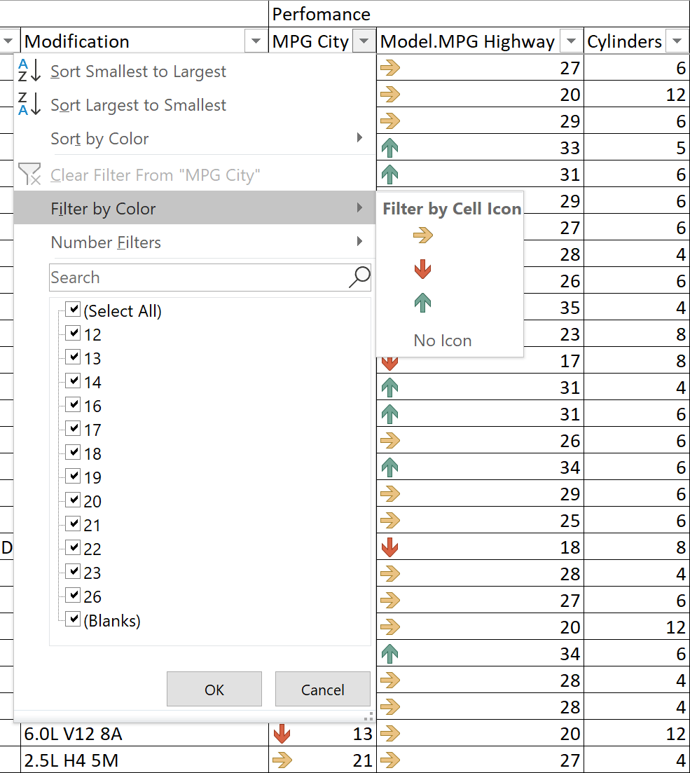
Excel-style Filter Dropdown
Our WPF Pivot Grid will support a new Excel-Style filter dropdown. It will allow you to search for filter values, select multiple values simultaneously, and display values from multiple columns in a hierarchy. You will also be able to define more complex filters for a given column using the Filters tab.

New Filter Editor
The Pivot Grid will use the new Filter Editor developed for the Data Grid. It will support all new filtering features (record count display, predefined filters, aggregate operations), will be more customizable and modern in appearance.
New Filter Panel
Like the Data Grid and Tree List, the Pivot Grid will feature a new Filter Panel that displays filter clauses for different columns as removable tokens. The new Filter Panel can collapse tokens and display more information within a dropdown.
Themes
Fluent Design – Acrylic Material and Reveal Highlight Effect
We will support the following Fluent Design elements in 2019: Acrylic material and Reveal Highlight effect. We will implement these features for our Themed Window and Hamburger Menu controls so you can deliver apps that mimic the user interface of Microsoft’s Windows 10 Mail app.
If we see enough interest for Fluent Design, we will implement the Acrylic material and Reveal Highlight effect in other Windows 10-inspired controls in the future.
Office 2019 Themes
We will release a set of Office 2019-inspired themes for our WPF UI Controls. Like other modern themes, they will ship with lightweight templates for our most popular controls and will support color palette customization in the Theme Designer.
Color Presets
Office 2019 themes will introduce a new concept to our WPF themes – Color Presets. Themes that support Color Presets will be able to switch their color scheme dynamically at runtime (much like our WinForms Bezier theme). This will allow you to use one theme with an unlimited number of color presets. It will help you extend end-users options without affecting the size of the deployed package.
For the last few years, we’ve been focused on themes inspired by popular Microsoft applications – Office and Visual Studio. Needless to say, the appearance of these Microsoft-inspired themes doesn’t leave much room for experimentation. Some of you have asked that we ship themes that look different from those found in Office and Visual Studio. We know that the DevExpress WinForms Bezier theme was well-received and believe that certain applications can benefit from more informal themes such as Dracula. Also, we periodically get requests for themes inspired by popular design concepts – Material Design and Fluent Design. We would like to hear your opinion on themes:
Theme Designer Enhancements
Since appearance and personalization is a popular request, our team will continue to improve our Theme Designer tool. We expect to introduce the following enhancements in 2019:
- An incremental build process that significantly reduces the time to build a theme.
- A Command Line Interface to build your custom themes without opening the GUI.
Ribbon
Office 2019 Style and Simplified Ribbon
Our WPF Ribbon control will introduce a new Office 2019 style that that closely matches the Ribbon in latest Microsoft products. We will also ship a Simplified Ribbon option, allowing you to collapse the Classic Ribbon into a single row.
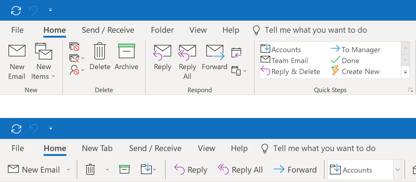
By default, the Simplified Ribbon will use the same set of Bar Items defined for the Classic Ribbon. You won’t need to write any additional code to use it.
Important note: Microsoft Outlook uses separate 20x20 icons for its Simplified Ribbon. Since we don’t want you to create a new set of 20x20 icons to start using our Simplified Ribbon mode, we decided to stick with 16x16 by default and use additional margins to achieve the same Ribbon size. For those of you who have 20x20 icons, we also plan to create an API that allows you to define an additional 20x20 icon for each Bar Item used in Simplified Ribbon mode.
Scheduler
Printing
We expect to rework our WPF Scheduler’s print functionality. This will include a new WPF Preview window, updated printing templates, customization API, and more.

Design Changes – Outlook-inspired UI
The Scheduler’s UI will change so that it is more modern and matches the user experience of Microsoft Outlook. The enhancements we hope to ship in 2019 include:
- Resource headers will look like tabs and will use resource colors.
- Date headers will also use resource colors and will look slightly different.
- Appointments will use resource colors if no label is specified.
- Navigation buttons will look different and will also use resource colors.
- Empty cells will look the same for all resources (white in most themes).
- We will add a header with the current date and navigation buttons at the top.

Special Slots
Special slots will allow you to define dates or time areas and highlight them on the Scheduler’s surface.
Clipboard Support
The Scheduler will support Cut, Copy, and Paste operations within one control, between controls in the same application, and between multiple applications using the Scheduler.
Gantt
Automatic Task Scheduling
This functionality is crucial for proper data editing in the WPF Gantt control. Whenever you update a task or load a data source with incomplete data into the Gantt control, the Gantt control will automatically calculate Start/Finish dates for all dependent tasks. For example, you will be able to create a set of dependent tasks and define how much time is needed to complete each task. The Gantt control will then arrange tasks on the timeline and decide when each task should start and end.
Worktime Duration
The Gantt control will take non-working hours and holidays into account when calculating task duration. For example, with the default configuration, a task with a Duration of 16 hours will span two days on the timeline and will display ‘2 days’ in the tree list area.
Task Interaction
You will be able to drag-and-drop tasks to change Start Date, resize tasks to change Duration, change task Progress, and draw a line from one task to another to create a dependency.
Editing Enhancements
We will create dedicated editors for the Duration and Predecessors columns in the Tree List area so that end-users can easily enter TimeSpan values and select predecessor tasks from a dropdown list.
Striplines
The Gantt control will allow you to highlight specific regions in the Gantt area to indicate an event or an important event (a weekly meeting, release date, etc).
Critical Path
The Gantt control will automatically calculate and highlight the critical path in the Gantt area. The critical path will automatically update whenever you move tasks or change duration and progress.
Dependency Lag
Every dependency will include an optional Lag value (positive or negative) that indicates the amount of time that should pass before the dependency effects a connected task.
The features listed above should address the requests you’ve submitted to us. Some of you have also asked for a Resource View - a control that displays a list of resources and task list for every resource (to help evaluate resource load).

We believe that a Resource View is a separate control. It will require significant manpower to develop. We’ve decided not to implement the Resource View for now and would like to hear your opinion. If we commit to the Resource View, we will have to cancel many tasks for other controls (for example, the Kanban Board).
